5 min read
When Does Minimalist Packaging Work? A Practical Guide
Discover when minimalist packaging works on the shelf, the real production costs involved, and design mistakes that can ruin sales.
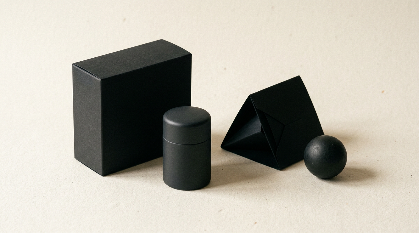
Minimalist packaging does not mean lack of effort, but removing visual noise to highlight the true quality of a product. On today's overcrowded shelves, a clean design can catch the eye faster than an explosion of aggressive colors and fonts. However, minimalism isn't suitable for every brand or consumer type, and misapplying it can lead to dropped sales.
Does minimalist packaging just mean putting a logo on a white box?
No, minimalism in packaging does not mean the absence of design, but extreme discipline in choosing essential elements. A simple white box without calibrated typography or tactile premium finishes looks cheap, not minimalist. When a customer sees a simple package, their attention shifts instantly to the details: cardboard quality, the precision with which a professional logo is printed, text spacing, and how the box opens. In packaging projects, minimalism only works when every remaining element plays a clear role. If you strip away illustrations and bright colors, you must invest in special finishes like debossing, foil stamping, or selective UV coating. Without these execution details, a minimalist package becomes a generic, personality-less box.
When does minimalist packaging actually work on the shelf?
Minimalist packaging works on the shelf when the product category is dominated by cluttered, noisy packaging. When all your competitors use 3D graphics, bright red discount badges, and aggressive script fonts, a clean package becomes a visual oasis that captures attention within the first 2 seconds. It also works exceptionally well for categories such as organic cosmetics, craft beverages, personal care items, and gourmet food. In these niches, buyers associate visual simplicity with ingredient transparency and attention to detail. However, for this strategy to work, the product must have a clear point of differentiation communicated through 2-3 key words on the front, without technical jargon.
In which industries does minimalist packaging fail most often?
Minimalist packaging frequently fails in fast-moving consumer goods (FMCG) aimed at impulse buyers or in markets where the buying decision relies directly on intense visual stimulation. Here are four concrete situations where minimalism lowers conversion:
- Toys and children's products, where saturated colors and characters are essential to attract young kids.
- Cheap detergents and cleaning supplies, where buyers seek visual promises of cleaning power through graphic explosions.
- Low-cost impulse snacks and sweets, where cravings are triggered by appetizing product photography.
- Generic dietary supplements in pharmacies, where a lack of visible technical details creates distrust. In these cases, minimalism is often perceived as a lack of information or a lower-quality product.
How does minimalist packaging affect printing and production costs?
Minimalist packaging can reduce printing costs by using fewer Pantone or CMYK colors, but it often increases base material costs. Because you cannot hide manufacturing defects behind heavy graphics, you are forced to use high-density cardstocks (over 350 gsm), textured papers, or premium recycled substrates. For instance, while printing a standard full-color box might cost €0.40 per unit at a 3,000-unit print run, a minimalist package on double-thick cardstock with matte foil can reach €0.85 per unit. You save on ink volume and prepress setup, but you invest more in container texture and finishing dies.
What visual ingredients do I need if I strip away heavy graphics?
If you strip away heavy graphics, you need an impeccable visual architecture backed by a strong brand identity. The primary elements carrying the weight of the design are typography, text hierarchy, and white space (negative space). The chosen font must offer flawless legibility even from 1.5 meters away from the shelf. Contrast between the title and technical data (weight, ingredients) must be mathematically calculated. Additionally, the physical shape of the package becomes a brand element itself: a bottle with sharp shoulders or a box with a magnetic closure can easily replace any complex illustration.
How do I convey premium product value if the packaging is very simple?
The value of a premium product in a simple package is conveyed through tactile sensory experience and detail precision. A professional graphic design service focuses on premium finishes that aren't visible in a flat photo but are felt upon touching. We are talking about raised spot UV, soft-touch lamination, or subtle embossing. Furthermore, how the product is presented inside the box (a structured cardboard or velvet insert) completes the luxury perception. Premium shoppers seek understated refinement; for them, the absence of graphic ostentation is ultimate proof of brand confidence and quality.
Is minimalism a good choice for products sold exclusively online?
Yes, minimalism is highly effective in e-commerce, but it requires screen adaptation. A clean package looks great in product photos on a presentation site or online store because it doesn't create visual clutter when scaled down on mobile phones. However, online buyers cannot feel the cardboard texture. Therefore, you must compensate with high-resolution 3D renders and lifestyle imagery. Additionally, if you apply GEO / AEO / AIO optimization techniques for visibility in AI assistants and search engines, clear, direct packaging text helps algorithms understand exactly what your product sells without confusion.
How do I test if my minimalist packaging works before mass production?
Testing minimalist packaging is done through physical prototyping and real or digital shelf simulations. Before sending a 5,000-unit run to print, complete these concrete steps:
- Print a 1:1 scale mock-up and place the package on a shelf alongside your top 5 market competitors.
- Perform a legibility test: stand 2 meters back and check if the product name and main benefit are easy to read in 3 seconds.
- Ask 10 people in your target audience for feedback without revealing the contents, assessing what price expectations they form.
- Review the work in the context of your design collection or portfolio to ensure it maintains a coherent line with the rest of the brand. These steps reduce the risk of launching a package that blends into invisibility on the shelf.
What common mistakes destroy minimalist packaging?
The most common mistake is sacrificing legibility by using ultra-thin fonts or low color contrast (such as light grey text on a white background). Another mistake is crowding the back of the packaging with dense, unformatted blocks of text, creating a severe mismatch between a clean front and an unreadable back. Finally, using cheap, thin paperboard that creases during transit immediately destroys the illusion of elegant minimalism, turning the packaging into a damaged, unprofessional container.
What's Next?
If you want to determine whether minimalist packaging is the right strategic fit for your product line, you need an objective analysis of your market and brand positioning. I can help you develop a packaging concept tailored to real production standards and commercial goals. Send me a message via the contact page, and we will discuss your project requirements, from box structure to special print finishes.