5 min read
When Does Minimalist Packaging Actually Work?
Discover when minimalist packaging design is effective, how it impacts printing costs, and which shelf errors to avoid.
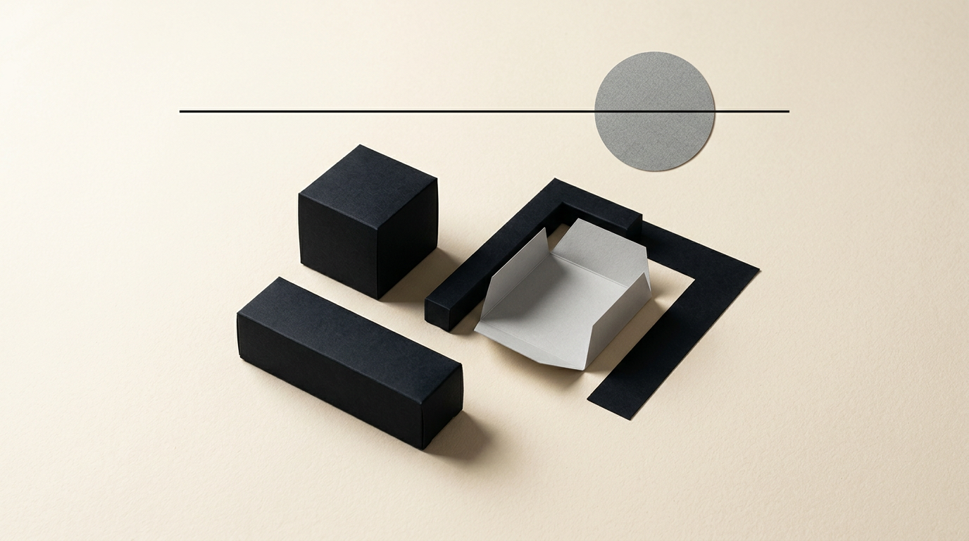
Minimalist packaging design is not just about leaving white space on a box; it is the strategic removal of unnecessary elements to highlight the essential message. In today's market, a clean aesthetic can convey premium quality, but applied incorrectly, it risks making the product invisible on the shelf. Below, I have gathered direct answers to the most common questions regarding the correct implementation of this style.
Is minimalism suitable for any type of product?
No, minimalism is not a universal solution and works best in categories where consumers seek simplicity, transparency, or premium refinement. Products in niches such as organic cosmetics, dietary supplements, craft beverages, or gourmet foods benefit enormously from an airy layout. Conversely, in the budget fast-moving consumer goods (FMCG) market—like low-cost cleaning supplies or kids' snacks—minimalism can mistakenly communicate an incomplete or austere product. When developing a full identitate vizuală, I first analyze the price segment and the buyer's psychological expectations. If the target audience associates busy graphics with promotions or high volume, a minimalist approach will lower the shelf conversion rate.
How does minimalism help a new product stand out on the shelf?
Minimalism helps a new brand by creating a strong visual contrast in an environment overloaded with information. When ten competing products use loud colors, bold fonts, and promotional badges, a clean package automatically becomes the shelf's focal point.
An effective minimalist design achieves the following concrete advantages on retail shelves:
- Reduced visual processing time: shoppers understand the category and main benefit in under 2 seconds.
- Isolation of key elements: the brand name and main ingredient do not get lost in a cluttered background.
- Instant premium look: removing graphic noise increases perceived brand value without altering the product itself.
- Color differentiation: using a single dominant color or negative space creates a distinct block of color on the shelf.
Does minimalism reduce printing and production costs?
Yes, a well-structured minimalist design can reduce printing costs by 15% to 35%, depending on the techniques chosen. By reducing the number of spot colors (Pantone) and eliminating complex multi-color processes, you simplify file preparation and decrease ink consumption. Additionally, leaning toward simple structural shapes reduces die-cutting costs and minimizes paperboard or foil waste. However, minimalism shifts the pressure onto substrate quality. If you use cheap 250g board without finishes, a minimalist design will look unprofessional. Professional design grafic services for packaging include print file optimization, selecting the right substrate (recycled paper, textured board), and choosing tactile finishes (spot UV, foil stamping) that compensate for the lack of graphics.
Why do some minimalist packages fail on the market?
Minimalist packaging fails primarily due to confusion between simplicity and a lack of useful information. If a shopper does not understand what the box contains, how to use the product, or what sets it apart from competitors, they will opt for a familiar alternative. Another common mistake is generic styling: using a standard Sans-Serif font on a plain white background makes the product look like a generic supermarket brand lacking personality. Minimalism only works when every remaining millimeter has a clear purpose, and the typography, material texture, and proportions are executed flawlessly. Without a strong visual anchor or brand story, minimalism becomes sterile and invisible to consumers.
How do I combine minimalism with legal labeling requirements?
Integrating legal requirements without compromising aesthetics is achieved by strictly separating the Principal Display Panel (PDP) from secondary faces. The front side should be reserved exclusively for the brand and key benefit, while all technical details are organized on the back or side panels.
Effective strategies for managing mandatory information include:
- Rigorous typographic grids: aligning nutritional tables, ingredient lists, and barcodes into clean column structures.
- Compact technical fonts: selecting legible fonts at small sizes (6-8 pt) specifically designed for micro printing.
- QR code integration: redirecting extended details (complex instructions, batch backstory) to a dedicated web page.
- Icon harmonization: redrawing recycling and certification symbols in a unified monochrome style consistent with the brand identity.
When should a complex logo be simplified for packaging?
Simplifying or modifying a logo becomes necessary when fine details get lost when printing on small surfaces or textured materials. A complex logo with gradients, thin lines, or detailed illustrations is hard to reproduce on a 3x3 cm label or through techniques like embossing. If you plan to transition to clean packaging, a dedicated creare logo service can deliver a secondary version (an icon or simplified variant) optimized for packaging. This essentialized version retains brand recognition while allowing the package to breathe and ensuring excellent legibility from a distance.
How does minimalist packaging affect online sales versus in-store sales?
In e-commerce, minimalist packaging performs exceptionally well because it is easy to photograph and remains legible in product thumbnails. On a mobile phone screen, a 200x200 pixel image of crowded packaging turns into an unreadable blur of text, whereas minimalist packaging with crisp typography and high contrast communicates instantly. However, the online experience does not end with the product photo; the physical package delivered to the customer reinforces the purchase decision during unboxing. If you run a site de prezentare or an online store, featuring minimalist packaging through 3D renders or professional product photography can increase conversion rates by up to 20%.
What materials and finishes work best with this style?
Minimalism derives its strength from the tactile and structural quality of the packaging, compensating for the lack of illustrations with premium textures. Uncoated boards, handmade paper with visible fibers, natural kraft paper, and frosted or molded glass containers are ideal substrates. Regarding finishes, the focus shifts to subtle production details: deep debossing, selective UV coating on matte areas, or blind embossing. These elements deliver a distinct sensory experience when the customer holds the product, turning visual simplicity into a tactile purchasing argument.
What's next?
If you want to apply a minimalist style to your product packaging without risking lost shelf visibility or missing legal details, the first step is reviewing your current portfolio. Successful packaging design combines clean aesthetics with production feasibility and market demands. Check out my portofoliu page to view real packaging and branding projects, and if you are ready to modernize your products, reach out directly through the contact page for an initial evaluation.