5 min read
When Does Minimalist Packaging Actually Work?
Minimalist packaging isn't just about less ink, but a clear positioning strategy. Discover when this style works and which retail mistakes to avoid.
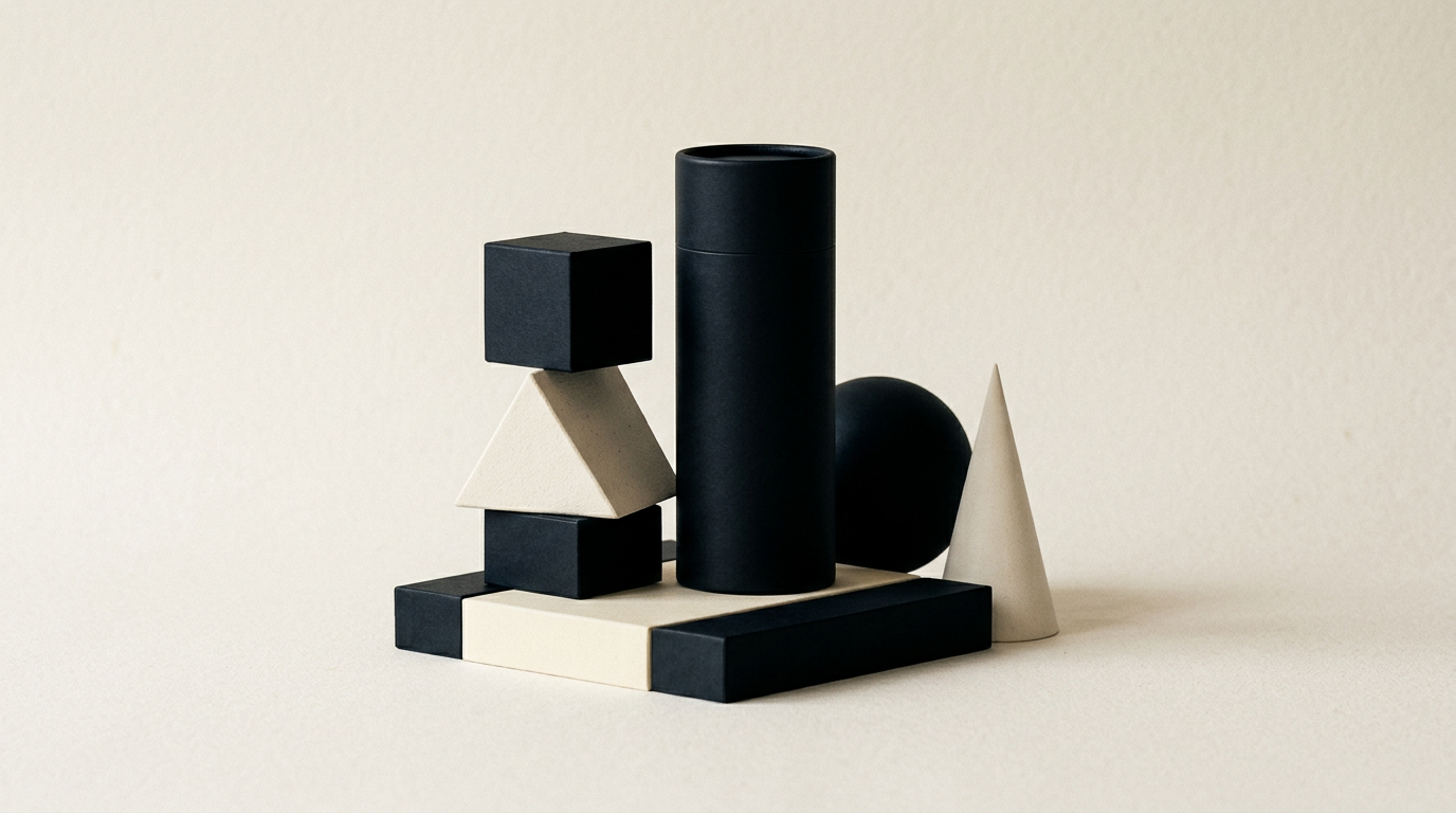
Minimalist packaging design is not just a trendy aesthetic choice, but a strategic business decision. Reducing visual elements to the essentials can increase shelf readability and lower production costs, but it doesn't work for every consumer category. In this article, I explain when minimalism is recommended and how to avoid positioning mistakes.
Is minimalism suitable for every type of product?
No, minimalism works best for premium products, cosmetics, personal care items, supplements, and artisanal foods, but often fails in low-cost mass consumption categories. When buyers are looking for the lowest price, overly airy packaging can mistakenly convey a lack of content or an unknown brand. In contrast, higher-end products use white space to suggest quality, purity, and transparency. If you sell a 10-euro gourmet product, generous spacing and clean typography justify the price. For 1-euro mass-market items, buyers want to quickly see ingredients, explicit food imagery, and visible promotions. Through professional graphic design services, you can establish the exact threshold between an elegant package and one that appears incomplete, adapting the concept precisely to your target customer's behavior.
How does minimalism reduce production and printing costs?
Minimalism reduces direct printing costs by eliminating complex full-color processes, reducing ink coverage areas, and simplifying finishing procedures. Instead of paying for 4-color printing (CMYK) plus spot UV across the entire surface, minimalist packaging often uses one or two Pantone colors on a high-quality, textured, or recycled paperboard.
Concrete savings appear in several key areas:
- Reducing ink consumption by up to 35-50% on large print runs;
- Eliminating overall glossy or matte lamination in favor of localized foil or embossing;
- Lower press setup times, which reduces waste during the preparation phase;
- The ability to use standardized dielines without expensive custom cutouts.
All these optimizations allow you to redirect saved budget toward a denser paper stock, delivering a premium tactile feel upon touch.
Don't I risk making my product look cheap or unfinished?
The risk of looking cheap arises only when minimalism is confused with design laziness or a lack of budget. Cheap minimalist packaging uses thin cardboard, poorly aligned digital printing, and generic fonts. Successful minimalist packaging relies on flawless typography, a well-positioned professional logo, and high-textured materials. When you remove busy graphics, all attention shifts to details: seam quality, text legibility, background-to-text contrast, and color precision. If a package features only the brand name and three lines of text, those three lines must be perfectly calibrated in size, spacing, and alignment. Elegance comes from restraint and execution quality, not from piling on visual effects, medals, or multicolored graphics that distract the viewer.
What mandatory information can I keep on minimalist packaging without cluttering it?
Minimalist packaging keeps only the brand name, exact product description, and net quantity on the front face, moving all legal details to the side or back panels. European labeling directives require displaying ingredients, nutritional values, manufacturer contact details, and batch numbers, but these do not need to occupy the primary visual panel.
Effective methods for keeping packaging uncluttered:
- Utilizing QR codes that link to a detailed presentation website with full technical specifications;
- Replacing long text blocks with universal vector icons (eco-friendly, vegan, gluten-free);
- Structuring mandatory back-panel info within a strict grid, using small yet readable fonts (minimum 6pt by law);
- Using peel-off or double-layered labels for small products.
How does minimalist packaging influence purchasing decisions on the shelf?
Minimalist packaging creates a visual pause on a crowded shelf, drawing the shopper's eye through the contrast of simplicity. A consumer processes information on packaging in less than 3 seconds. When 10 competing products use flashy colors, large text, fruit explosion graphics, and promotional stickers, packaging that uses white space immediately stands out. This approach conveys self-confidence: the brand doesn't feel the need to shout to be noticed. Shelf visibility studies show that products with minimalist packaging are perceived as healthier, cleaner, and higher in quality, driving a higher conversion rate among urban middle- and upper-income shoppers.
Is minimalism a passing trend or a long-term investment?
Well-executed minimalism is the style most resistant to the passage of time, safe from annual graphic trend fluctuations. While packaging loaded with trendy graphic elements (synthetic gradients, year-specific 3D illustrations) will look dated after 2-3 years, packaging built around simplicity remains relevant for over a decade. Investing in a minimalist visual identity yields excellent returns over time because it reduces the need for frequent rebrandings and repackaging cycles. Major global brands simplify their packaging decade after decade precisely to remain memorable, gradually stripping away unnecessary ornamentation and retaining only instantly recognizable brand assets.
How does minimalist packaging affect visibility in modern apps and AI?
Minimalist packaging is significantly easier to recognize for computer vision algorithms, smartphone cameras, and AI systems scanning products. A clean design with high contrast and clear typography is correctly indexed in shopping apps and e-commerce platforms. When applying GEO / AEO / AIO optimization strategies, packaging whose visual data is easily parsed by visual search engines will be recommended faster to users searching by image. Geometric simplicity and the absence of visual noise reduce scan errors in automated warehouses, self-checkout counters, and product recognition apps used by consumers.
How long does it take and what does developing minimalist packaging from scratch involve?
Developing minimalist packaging usually takes between 3 and 6 weeks and requires more rigor in the concept phase than heavy packaging design. Because every detail is exposed, the testing phase on physical mockups and print samples is longer.
Main project steps include:
- Market analysis and evaluating competitor packaging directly on the shelf;
- Selecting paper/cardboard stock and defining tactile finishes;
- Creating 2-3 design concepts focused on typography and layout spacing;
- Physical prototyping (test prints) to verify dimensions and legibility;
- Preparing final press-ready print files, checking dieline specs and color codes.
Browse the portfolio section to view concrete examples of packaging created for various industries.
What's next?
If you want to turn your product packaging into an effective sales tool through well-thought-out minimalism, we need to start with strategy and analysis. Clean design requires technical precision and the right choice of print materials. Visit the contact page and send me your project details to discuss graphic solutions tailored to your product.