5 min read
Which Packaging Mistakes Cost You Real Money in Production?
Discover the most common technical and design packaging mistakes that lead to financial losses and how to avoid them before printing.
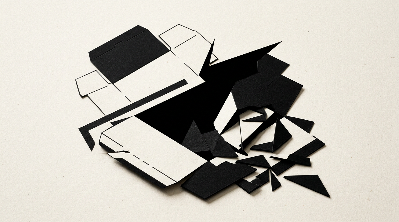
A poorly designed package is not just an aesthetic issue, but a direct financial loss caused by scrapped print runs, delivery delays, and products rejected by retailers. As a freelance graphic designer, I have seen dozens of brands lose thousands of euros due to simple omissions in print file preparation. In this article, I directly answer the most common questions regarding packaging mistakes that can severely damage your budget.
Why does reprinting packaging cost so much if I only got one text wrong?
Reprinting an entire run due to a typo or an incorrect barcode means paying twice for printing plates, paperboard, ink, and labor. In offset or flexographic printing, the setup cost is fixed regardless of whether you print 100 or 10,000 units. A simple spelling mistake on 5,000 boxes means scrapping the cardboard and redoing the entire process, generating losses of €1,500–€4,000 depending on finishes. To avoid these costs, a professional design grafic service includes rigorous DTP verification and a signed press proof before machines start running. Double-checking text with at least two people is the golden rule in packaging.
Why do colors on the printed box look different from what I saw on screen?
On-screen colors use the RGB color space, while printing uses CMYK or specific Pantone spot colors. If a file is sent in RGB, the printer's software automatically converts the colors, leading to dull, washed-out, or completely altered results. For instance, a vivid blue on a monitor can turn into a muddy purple on recycled cardboard. When developing a full identitate vizuală, we establish precise Pantone codes for packaging, so your brand color remains identical on boxes, labels, or a site de prezentare. Here are key reasons for color variations:
- Automatic RGB to CMYK conversion without manual color channel adjustments.
- Different ink absorption on coated, glossy, or recycled kraft paper.
- Failure to use spot colors (Pantone) for critical brand elements.
What happens if I don't follow the dieline dimensions provided by the printer?
Ignoring or altering dieline specifications leads to crucial graphic elements being cut off or packaging folding incorrectly. Dielines define precisely where to cut, fold, and leave a 3–5 mm bleed. If text is placed too close to the trim line, a tiny 1 mm shift during die-cutting can chop off the first letter of a word. Furthermore, if you fail to leave glue areas free of ink, the adhesive won't hold, causing boxes to pop open during handling. Dieline errors halt automated packaging assembly lines, triggering heavy delay penalties.
How does material selection affect final costs and shelf durability?
The wrong material can destroy your product in transit or unnecessarily inflate production costs by up to 40%. Paperboard that is too thin (e.g., 250 gsm instead of 350 gsm or micro-flute corrugated) collapses under the weight of stacked pallets. For cosmetics or beverages, packaging must withstand humidity, oils, or friction. Here is how material choices impact budget and appearance:
- Coated paperboard delivers vibrant colors but requires lamination to prevent cracking along fold lines.
- Kraft paper adds an eco-friendly look but absorbs heavy ink, darkening pastel shades.
- Special finishes like foil stamping or spot UV double costs if applied incorrectly over large unverified areas.
Why isn't putting a logo on a standard box enough to sell better?
A generic box with a pasted logo fails to build a brand experience and feels like a cheap product, impossible to stand out on retail shelves. Consumers judge product quality within the first 3 seconds based on packaging appearance. If you invested in professional creare logo, your packaging must continue that narrative through structure, texture, visual hierarchy, and clear messaging. Strategically designed packaging immediately explains what the product is, who it is for, and why it's worth the price. Without a custom 3D graphic concept, your product gets ignored next to competitors with tailored packaging.
What are the most common readability and typography mistakes on packaging?
The biggest mistakes are using font sizes under 6 points, poor contrast between text and background, and selecting decorative fonts that are hard to read. On small packaging like supplement labels, buyers need to read ingredients and usage instructions quickly. Placing white text on a light yellow background or using thin script fonts on kraft board renders text unreadable. Additionally, converting fonts to outlines is mandatory before printing; otherwise, the printer's prepress system will substitute missing fonts with standard ones, ruining your layout.
Which mandatory legal details are most frequently forgotten on labels and boxes?
Omitting recycling symbols, incorrectly sized EAN-13 barcodes, or manufacturer identification details can lead to severe fines and retail recalls. Every product category has strict labeling regulations regarding net weight, ingredient lists, allergens, batch numbers, and expiration dates. Check my portofoliu projects to see how I integrate these technical and legal requirements without compromising visual design and messaging space.
How can I test packaging before committing to a 10,000-unit production run?
The only foolproof method to prevent financial disaster is producing a physical prototype (dummy) and an ISO-certified color proof. Never rely solely on 3D screen renders for final production approval. A physical sample lets you insert the actual product to test fit, closure, and flap durability. A certified color proof shows the exact ink shades on your chosen paper stock. A sample costs under €50–€100, while fixing a ruined 10,000-unit print run can easily exceed €5,000.
How does well-structured packaging design impact digital search visibility?
Today, products don't live on physical store shelves alone; they feature prominently in e-commerce images, social ads, and visual search engine results. Packaging with a clear visual hierarchy and readable text helps search engines index your product accurately online. Using structured copy on packaging supports geo-aeo-aio optimization for AI assistants and visual recognition algorithms. When AI engines scan your product image, crisp typography and direct benefit messaging determine how easily your product surfaces in generative search results.
What's Next?
Packaging is the first physical handshake between your brand and the buyer. A single prepress error or dieline mistake can turn your investment into a costly headache. If you need flawless graphic and technical packaging design prepared for error-free printing, I can help. Head over to the contact page to discuss your packaging project and get a clear, practical evaluation.