5 min read
What Logo Design Mistakes Hurt Your Brand and How to Avoid Them?
A poorly designed logo harms brand perception and leads to costly re-prints. Learn the most common graphic design mistakes and how to avoid them.
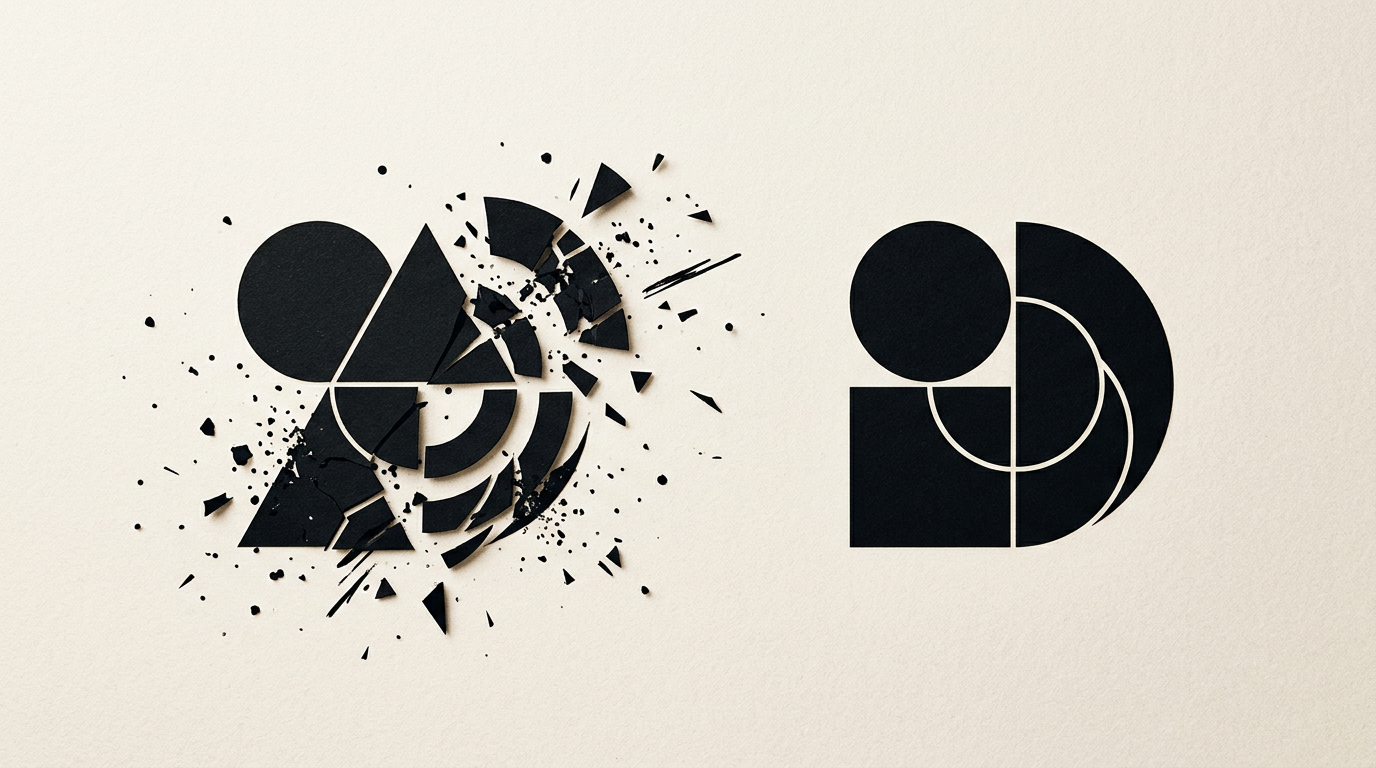
Choosing a logo might seem simple at first glance, but technical and conceptual mistakes can cost thousands of euros in the long run. A poorly executed symbol creates printing issues, loses clarity at small sizes, and damages your business credibility. In this article, I answer directly the most frequent client questions regarding logo design errors and their practical solutions.
Why does my logo look pixelated when printed on a large banner?
Your logo looks pixelated because it was delivered only in raster format (PNG or JPEG), instead of a vector format (AI, EPS, or SVG). Unlike pixel-based files, a vector file maintains mathematical clarity whether displayed on a 4-inch phone screen or a 10-meter billboard. A professional creare logo service always includes supplying vector source files. If you only received a PNG file with a transparent background, any attempt to enlarge it for large-scale print will result in jagged edges and blurry details. When working with a designer, ensure you receive the base vector formats to avoid future re-drawing costs.
Why is my logo unreadable when scaled down for WhatsApp or Instagram avatars?
Your logo becomes unreadable at small sizes because it contains too many fine details, complex textures, or excessively long text. A social media avatar often renders at just 32x32 pixels on a mobile screen. If your mark contains a small tagline, complex gradients, or overlapping graphic elements, it turns into an unrecognizable blur. The technical solution is creating a simplified mark (a derived icon or pictogram) designed specifically for small spaces. Simplicity guarantees instant recognition, and major brands always use minimalist variations of their core symbol for digital environments.
Is it a problem if I used a free font downloaded from the internet for my logo?
Yes, it is a serious issue regarding copyright laws and your brand's uniqueness. Many free fonts downloaded from popular sites are strictly licensed for personal use, not commercial use, exposing you to legal liabilities. Furthermore, incorrect licensing or generic typography lowers the value delivered by professional design grafic services. Here are the main risks of using untested fonts:
- Missing localized diacritics or special characters, leading to awkward visual workarounds.
- Poor kerning (uneven spacing between letters), which creates an amateur appearance.
- Copyright infringement risks if your business generates commercial revenue without a proper font license.
Why does my logo look different on my monitor compared to printed packaging?
Your logo looks different due to the fundamental difference between the RGB color space (used by screens) and CMYK or Pantone (used in print). Screens emit light and can display extremely vibrant colors (such as neon green or electric blue), whereas physical ink on paper or cardboard absorbs light and has a narrower reproduction range. To avoid frustrating color shifts, a logo file must be carefully calibrated:
- Defining clear RGB and HEX codes for digital screens and web applications.
- Defining exact CMYK values for digital and offset printing.
- Selecting Pantone (PMS) spot colors for flawless color matching on packaging and promotional print.
I bought a cheap logo from a stock website. What are the risks for my business?
The main risk is that you do not hold exclusive rights to the symbol, meaning hundreds of other companies could be using the exact same graphic. Microstock sites sell non-exclusive licenses, which means you cannot register the logo as a trademark with intellectual property offices. Moreover, generic graphics fail to communicate the unique values of your business and make you invisible among competitors. A logo bought for a few dollars is a temporary solution that triggers massive rebranding expenses when customers inevitably confuse you with other businesses.
How many variations or colors should a professional logo have?
A professional logo is not a single static image, but a flexible system adaptable to any visual medium. You should receive at least a primary full-color version, a reverse version for dark backgrounds, a pure monochrome (black and white) version, and horizontal and vertical layouts. Without a clean monochrome version, your logo will be unusable on invoices, laser engravings, uniforms, or stamps. Color adaptability ensures your visual identity stays consistent across every medium.
Why isn't a logo alone enough if I want to build a serious brand?
A logo is just the foundation of your image, but without a style guide and a coherent identitate vizuală, your communication will remain fragmented. A logo cannot solve photo styles, supporting color palettes, typography hierarchy, or social media graphic templates by itself. Without clear application rules, every collaborator (web designer, print shop, marketing agency) will interpret your brand differently, diluting your market impact.
How can I verify if my new logo will work well on websites and packaging?
Verification is done through realistic mock-up simulations and scalability testing prior to finalizing the project. An experienced designer tests the symbol directly in the header of a site de prezentare, on packaging boxes, business cards, and as a browser favicon. You can review similar projects in a portofoliu to see how a graphic concept transitions from rough sketch to physical and digital application.
How does an outdated or poorly structured logo affect online visibility and AI search engine results?
A poorly structured logo indirectly affects search engine optimization and AI answer engine performance by reducing conversion rates and user engagement metrics. Modern search algorithms and systems based on optimizare GEO / AEO / AIO measure user trust signals. If a visitor lands on your site and encounters a low-quality logo, trust drops instantly, causing bounce rates to rise. A clean, professional design communicates authority to both human users and AI algorithms evaluating brand credibility.
What's next?
If you have noticed any of these errors in your current logo or if you want to launch a new brand built correctly from the first sketch, the next step is a technical evaluation. Visit the contact page and send me your project details. I will review your existing files and propose the optimal solution for a redesign or a complete visual identity creation.