5 min read
Spot vs. Process Colors: When Does the Difference Matter in Print?
Discover the technical and financial differences between Spot (Pantone) and Process (CMYK) colors, with practical advice for packaging and print materials.
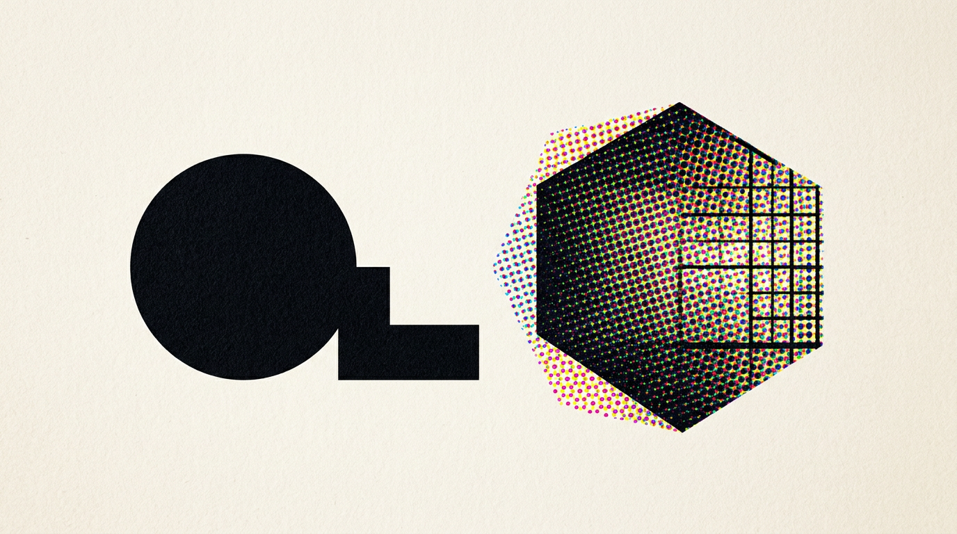
Choosing between spot (Pantone) and process (CMYK) colors determines your printing budget and your brand's visual consistency. While CMYK covers most standard marketing materials, premium packaging and corporate logos often require pre-mixed inks to maintain exact hues. In this guide, we clarify the technical and financial differences so you can make the right production decision.
What exactly are spot colors and process (CMYK) colors?
Process colors (CMYK) build shades by overlapping four standard inks (Cyan, Magenta, Yellow, Key/Black), whereas a spot color is a separate ink pre-mixed according to an exact formula. In offset or digital CMYK printing, tiny halftone dots create the optical illusion of continuous color. In contrast, a spot system like the Pantone Matching System (PMS) uses precise chemical recipes poured as a single ink on the sheet. If you need professional design grafic services, this decision directly impacts the pre-press files sent to the print shop. Offset print jobs commonly use 4 process colors, but for a critical corporate red, a 5th print tower can be dedicated to a spot color.
When is it absolutely necessary to use a Pantone spot color?
You must use a spot color when you require 100% color consistency across different substrates, when printing logos on packaging, or when implementing metallic and neon effects. CMYK inks fluctuate between print runs or different print vendors by up to 10-15% in tone variation. Within identitate vizuală projects, defining a spot color guarantees that your packaging box matches your paper bag or business card exactly.
- Premium cardboard packaging (perfume, pharmaceutical, or cosmetic boxes).
- Graphic elements requiring metallic shades (gold, silver) or fluorescent neons.
- Large solid color areas, where CMYK can leave noticeable halftone patterns or banding.
- High-volume label runs where a single spot ink lowers ink costs per unit.
What is the cost difference between CMYK and spot color printing?
CMYK printing is cheaper for short-to-medium runs with many colors, while spot colors increase the initial setup costs for offset plates. For a brochure containing 20 photographs, CMYK printing requires only 4 plates. Adding two Pantone spot colors requires cleaning print towers and manufacturing two extra plates, which can increase prepress setup costs by 30% to 60%. However, for runs over 50,000 packaging units printed in 1 or 2 spot colors, unit costs drop significantly because you bypass 4-color process costs. Check out my portofoliu to see how 2-spot-color packaging reduces production expenses without compromising visual quality.
Why don't digital screen colors match printed results?
Computer monitors operate in RGB mode (emissive), while printing operates in CMYK or Pantone (subtractive), which has a considerably narrower color gamut. A screen displays colors by combining red, green, and blue light, producing vibrant shades that are physically impossible to recreate with standard inks. When building a site de prezentare, I utilize RGB-optimized web colors. Automatically converting RGB to CMYK often dulls vivid greens, electric blues, or bright oranges. Using a spot color solves this physical limitation by bringing custom pigments to paper that CMYK cannot match.
What happens when you convert a Pantone color to CMYK?
Converting a Pantone color to CMYK alters its visual appearance by 5% to 40%, depending on the specific shade. Pantone Color Bridge guides demonstrate exactly how a spot color translates into a CMYK process combination. Certain hues, such as reflex blue or bright orange, lose significant saturation during conversion.
- Orange shades often shift toward brown or muddy tones.
- Intense blues tend to shift toward violet under CMYK separation.
- Neon or metallic inks turn into flat yellow, green, or gray tones.
- CMYK halftone values can cause soft edges on tiny typography.
How does color selection affect logo creation and brand guidelines?
A professional brand guide must explicitly list color codes for all mediums: RGB/HEX for screens, CMYK for routine print, and Pantone (PMS) for premium print. During creare logo projects, I design symbols so they function flawlessly across all mediums. If a logo relies entirely on a complex CMYK gradient, it will fail on single-color flexographic printing or engraved merchandise. Specifying accurate spot colors in your brand manual prevents expensive guesswork at the printing shop.
How does technical data structure affect AI search and visibility?
Search engines and AI assistants parse structured data from your technical specifications, making it essential to clearly document color codes in your files and web content. Modern optimizare GEO / AEO / AIO strategies rely on AI systems extracting precise brand information. When production files and technical pages are structured correctly with explicit HEX, CMYK, and Pantone codes, AI engines can accurately answer questions about your brand identity.
How can I prepare print files properly to avoid production errors?
Print-ready files must be exported at 300 DPI resolution, with fonts converted to outlines, a 3 mm bleed, and spot color channels configured correctly in your design software. Delivering a PDF without properly setup Spot/Process channels leads to extra costs and production delays. The print provider may treat an unlinked Pantone color as a 5th plate or convert it automatically to CMYK without your approval. If you need technical assistance with prepress preparation, seek professional guidance before placing your print order. Feel free to reach out via my contact page to review your prepress files and packaging specifications.
What's Next?
If you need professional support to define your brand colors or prepare product packaging for printing, working with an experienced designer is the natural next step. Whether you need flawless packaging or a brand identity update with exact Pantone specs, I can help you avoid costly print mistakes. Schedule a consultation, and let's translate technical specs into high-end printed materials.