5 min read
How to Choose the Right Paper for Printed Materials?
A practical Q&A guide on selecting paper weight, finishes, and stock types for professional printed materials.
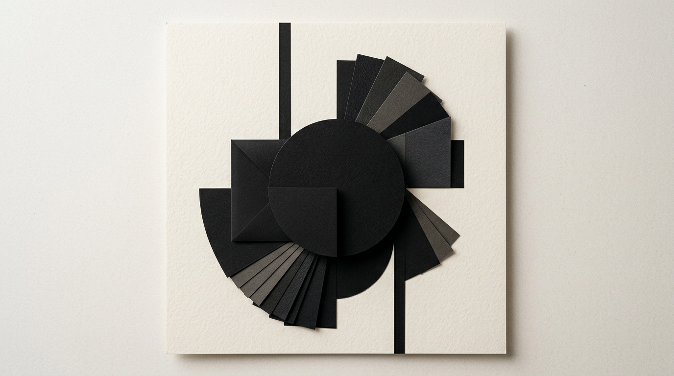
Choosing the right paper radically changes how a client perceives your brand when holding a printed item. As a graphic designer, I have seen great design concepts compromised by thin stock or inappropriate textures. Here are direct answers to the most common practical questions regarding paper selection for your print projects.
What paper weight (gsm) should I choose for a business card?
For a durable and professional business card, the recommended paper weight is at least 350 gsm, ideally 400 gsm or duplexed paper options. Standard 300 gsm paper is acceptable only as a budget option, but feels softer and bends easily at the corners over time.
When building a complete brand identity, the business card is often the first physical touchpoint partners have with your business. A 350–400 gsm stock conveys stability, attention to detail, and quality. If you opt for textured or cotton paper, a 300 gsm weight can feel just as rigid as 350 gsm coated stock due to its higher natural volume and thickness.
What is the difference between matte and glossy paper?
The main difference lies in how the paper surface reflects light and absorbs ink: glossy paper provides vibrant colors and high contrast, while matte paper delivers excellent readability and a refined aesthetic without glare.
The choice depends entirely on the purpose of your printed material:
- Glossy paper (gloss coated): Best suited for product catalogs, photo brochures, and promotional flyers where visual detail and color saturation are priorities.
- Matte paper (matte coated): The optimal choice for annual reports, books, text-heavy corporate brochures, and business collateral. Reading is comfortable, and the surface resists fingerprints.
When should I use textured or offset paper?
Textured or offset paper is recommended when you want to communicate an artisanal, sustainable, premium style, or a minimalist aesthetic where touch adds tactile value.
Offset paper (similar to printer paper, but in higher weights like 120–300 gsm) absorbs more ink, yielding a softer, lower-contrast image. Specialty textured papers (like Fedrigoni or Arjowiggins) are ideal for invitations, luxury packaging, or restaurant menus. When working on graphic design projects, using textured paper requires adapting the artwork: avoid large dark solid backgrounds, as the paper texture can cause minor visual imperfections during printing.
How does recycled paper affect final printed colors?
Recycled paper absorbs more ink than coated paper and features a slightly off-white, grayish, or yellowish base tone, which reduces color saturation and shifts lighter shades.
If your project requires exact Pantone color matching or bright pastel tones, recycled paper will subtly alter the final output. However, it offers authentic character and demonstrates environmental responsibility. Dark colors, earth tones, black, and delicate typography render beautifully on recycled paper, creating an organic look that aligns perfectly with eco-conscious brands.
Which lamination or finish should I pick for brochures and packaging?
Choosing a finish depends on the expected wear-and-tear and the tactile experience you want to deliver when someone holds the piece.
Here are the most common finishing options, which you can also see applied in my portfolio work:
- Matte lamination: Protects against moisture and scratches while keeping a understated, elegant look.
- Soft-Touch lamination: Creates a velvet-like tactile feel, making it the top choice for luxury packaging and high-end business cards.
- Gloss lamination: Enhances color vibrancy and protects catalog or brochure covers subject to frequent handling.
- Spot UV 3D varnish: Adds raised gloss to specific design details (logos, patterns), generating strong visual contrast over matte lamination.
How do I avoid technical prepress errors for specific paper stocks?
To avoid printing errors, you must set your file to CMYK color mode, add a minimum 3 mm bleed, and ensure images are at least 300 DPI.
If you created artwork initially for a presentation website in RGB mode, converting directly for print without color adjustments will result in dull or shifted hues (especially greens and blues). Furthermore, for uncoated offset papers, the Total Ink Limit (TAC) must be lower (around 260%) compared to coated paper (300%) to prevent ink smudging during drying.
Does thicker paper always mean higher quality?
No, heavier paper weight does not guarantee quality if the thickness compromises the functionality or proper folding of the item.
For example, a multi-page brochure printed on 250 gsm stock will be hard to flip through and won't lie flat, whereas a basic flyer on 90 gsm paper will feel cheap and flimsy. For folded materials (gatefold or tri-fold brochures), any paper above 170 gsm requires scoring (creasing) before folding. Without scoring, the paper fibers break along the fold line, cracking the ink and ruining the visual appeal.
How does paper selection impact total production costs?
Paper cost accounts for 30% to 60% of the total print production budget, influenced by the paper grade (standard vs. specialty) and sheet layout efficiency.
Specialty textured paper can cost 3 to 5 times more than standard coated stock. Additionally, optimizing your artwork size to fit standard press sheet formats (e.g., 50x70 cm or 70x100 cm) minimizes paper waste. While optimizing physical assets, it is equally important to make sure your digital presence aligns with current standards, such as a strategy for GEO / AEO / AIO optimization for AI search visibility.
What's next?
If you want to avoid print mistakes, wasted budgets, and materials that fail to reflect your brand quality, the right approach starts at the design stage.
Whether you need a logo design ready for embroidery and print, complex packaging, or a corporate brochure executed flawlessly from layout to paper selection, I can help you make the best technical and aesthetic decisions. Visit the contact page and let's discuss your project.