5 min read
How to Choose the Right Paper Stock for Print Projects?
A practical guide to choosing paper weight, texture, and finishes for your print materials. Learn how to avoid costly errors and achieve a premium finish.
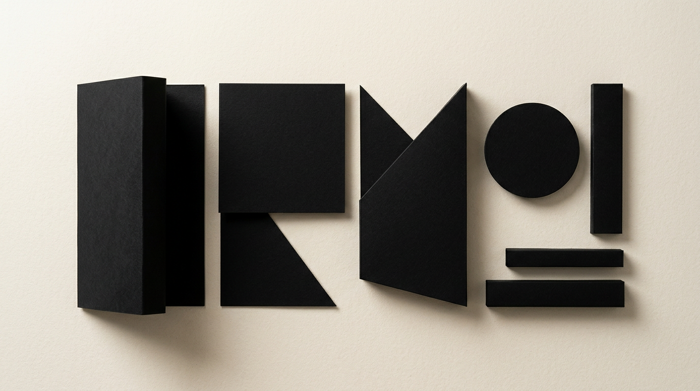
Choosing the right paper transforms a digital design file from a simple image into a memorable tactile experience. As a designer, I often see great visual concepts ruined by choosing the wrong print substrate just to save a few dollars. In this practical guide, I answer the most common client questions regarding paper weights, coatings, and finishing techniques for print.
What does paper weight (GSM) mean and which value should I choose?
Paper weight expressed in GSM (grams per square meter) indicates the density and weight of the paper, not its physical thickness. An 80 GSM paper is thin, typically used for office printers or letterheads, while a 350 GSM cardstock provides high rigidity. The choice depends directly on the functional purpose of your printed piece. Standard promotional flyers usually use 115–135 GSM, while catalog covers or presentation folders require 250–300 GSM. When I deliver design grafic services for print, I always select the exact weight based on how the end-user will handle the product. Picking the wrong weight can cause flyers to crease easily or make booklets difficult to flip through.
What is the main difference between matte and glossy paper?
The main difference lies in how the paper coating reflects light and absorbs printing ink. Glossy paper enhances color contrast and vibrancy, making it ideal for photo catalogs, magazines, and visual-heavy marketing collateral. Matte paper eliminates annoying reflections, offers an elegant aesthetic, and is significantly easier to read under direct light. If your publication contains long text passages, matte paper is the correct technical choice. Furthermore, matte surfaces allow easy writing with a pen or pencil. When crafting a full identitate vizuală for a brand, I frequently recommend matte or satin stock to convey a premium, mature image.
What paper stock is best for business cards?
For professional business cards, the minimum recommended paper weight is 350 GSM, though 400 GSM or thicker board offers a far superior tactile feel. Coated matte cardstock is the classic, reliable choice, but specialty papers like cotton or textured stock create a lasting first impression. Select your paper based on your brand attributes:
- Coated Matte Board (350–400 GSM): Cost-effective, durable, and ideal for high-volume orders.
- Uncoated / Offset Paper (300–350 GSM): Natural texture, porous feel, perfect for minimalist designs.
- Specialty Stock (Fedrigoni, Arjowiggins): Distinctive textures and deep colors, perfect after a custom creare logo process.
- Multilayer / Triplex (600+ GSM): Bonded paper layers with a colored core for extreme rigidity.
What paper should I use for folded flyers and flexible brochures?
Folded flyers require flexible paper, typically between 135 GSM and 170 GSM, to prevent paper fibers from cracking along the fold line. If you decide to use cardstock heavier than 170 GSM for a folded brochure, scoring (creasing) before folding is mandatory. For stapled booklets, 135 GSM matte inner pages paired with a 250 GSM cover offer the optimal balance between durability and production cost. For multi-page publications like annual reports, keep interior pages around 115–135 GSM so the booklet stays naturally flat when closed.
Is it worth paying extra for specialty or recycled papers?
Investing in specialty or recycled paper stock is worth it when your brand positioning emphasizes sustainability, luxury, or a unique sensory experience. Modern recycled papers feature a subtle, warm texture that conveys authenticity and environmental responsibility. Specialty cotton or textured papers turn simple presentation folders into collectible objects. If your business offers premium services, luxury packaging, or artisanal goods, the 20–40% price increase for paper is quickly offset by the higher perceived value of your products.
Why do printed colors look different compared to my computer monitor?
Colors look different because screens display graphics using the RGB color mode (emitted light), whereas printing presses use the CMYK model (ink absorbed by paper). Additionally, paper absorbency affects final results: uncoated paper absorbs more ink, making colors look darker and less saturated than on glossy coated paper. To avoid unexpected results, files must be prepared with the correct color profile (e.g., FOGRA39) and verified with a physical proof. Just as digital projects require a tailored site de prezentare or strategic GEO / AEO / AIO optimization for search engines, print projects demand precise physical prepress adjustments.
What print finishes can I apply and how do I choose the right combination?
Print finishes enhance both the physical durability and the aesthetic appeal of your printed materials. Lamination protects paper against moisture and wear, making it essential for menus, book covers, and packaging boxes. Popular finishing options include:
- Soft-Touch Lamination: Delivers a velvety, smooth texture ideal for high-end catalogs.
- Spot UV Coating: Applies a glossy layer over specific areas (logos, headlines) for high contrast.
- Embossing / Debossing: Creates raised or recessed 3D effects on heavy paper stocks (300+ GSM).
- Foil Stamping: Applies metallic gold, silver, or copper foil using heat and pressure for a striking look.
How can I avoid costly mistakes before sending my files to the print shop?
You can avoid costly printing errors by requesting a physical press proof and thoroughly checking pre-press technical specs before running the full print job. Make sure your file includes a 3 mm bleed, images at 300 DPI resolution, and converted fonts. Also, discuss paper grain direction with your print shop, especially if the product involves folding or binding. Reviewing physical print samples from my client portofoliu shows that rigorous prepress planning saves significant time and money. Direct collaboration between designer and printer eliminates 95% of common production issues.
What's Next?
Need technical and creative guidance for your next print, packaging, or branding project? Check out my portofoliu to explore recent work, or head over to the contact page to discuss your project requirements. I ensure error-free prepress files and help you select the ideal paper stock and finishes for your business.