5 min read
What Makes a Flyer Actually Worth Reading?
Discover the layout, typography, and hierarchy rules that turn an ordinary flyer into an effective sales tool.
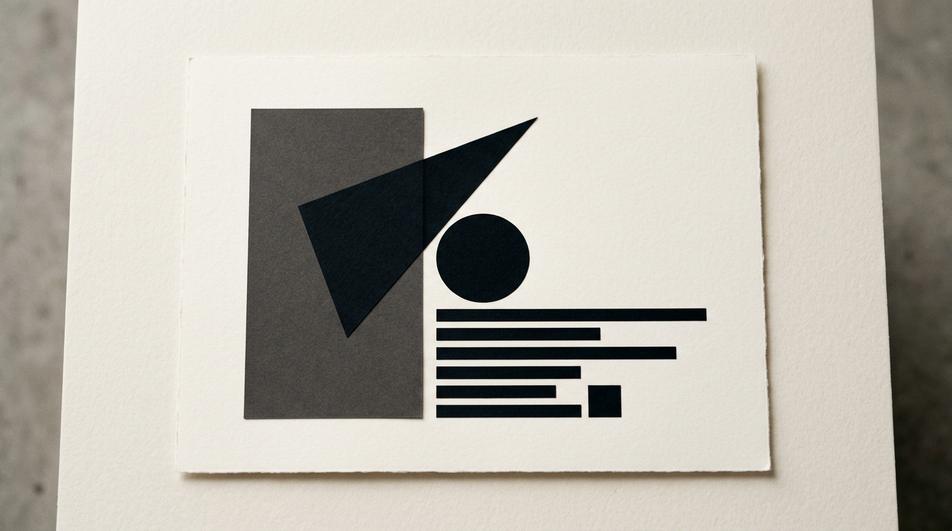
Most flyers end up in the recycling bin within three seconds because they are cluttered, unbalanced, and difficult to scan. An effective flyer doesn't try to tell your entire company story, but guides the reader's eyes toward a single clear action. As a graphic designer, I have created and tested hundreds of print layouts to define the exact rules of a printed material that converts.
Why do people throw away flyers without reading them?
People throw away flyers in the first few seconds because they lack a clear visual focal point and attempt to communicate too much information simultaneously. When a reader encounters five different typeface styles, ten bright colors, and three competing special offers on a single piece of paper, the brain instantly refuses to expend energy decoding it. In my experience with graphic design, a clean layout with flawless visual hierarchy yields a 60% higher retention rate. You either capture attention within 1.5 seconds or lose that prospective customer forever. A simple, well-spaced flyer always beats a crowded layout packed with irrelevant details.
What size and format should I choose for a flyer?
The A5 size (148 x 210 mm) is the safest choice for most street promotional campaigns or direct mail distribution. An A4 sheet is usually too large, awkward to handle, and often ends up folded messily, while custom die-cut shapes inflate printing budgets without guaranteeing higher conversions. Choosing the right format depends directly on your actual copy volume and the physical distribution channel.
- A6 (105 x 148 mm): Ideal for discount coupons, flash deals, club launches, or direct local event announcements.
- A5 (148 x 210 mm): The gold standard for introducing a local service or launching a consumer product.
- DL (99 x 210 mm): Sleek and professional, perfect for concise menus, price lists, and envelope mailers.
- Tri-fold A4: Best suited when you require structured, distinct panels for complex service breakdowns.
How much text should I put on a single page?
The golden rule for readable print design is keeping copy under 50–70 words per A5 side, organized strictly across three visual levels. Squeezing in lengthy paragraphs renders the flyer overwhelming and unreadable from a comfortable distance. Every single sentence must serve a concrete commercial purpose, much like structuring content for a high-converting presentation website. Keep your primary headline under 8 words, subheadings between 10 and 15 words, and body text split into short sentences of no more than 12 words. Always break heavy text blocks into scannable key points.
How do I use colors and fonts to grab attention?
A highly readable flyer uses no more than two font families and limits its palette to 2 or 3 complementary colors. The contrast between body text and background should remain above 70% to ensure comfortable reading under various lighting conditions. Clean sans-serif typefaces (such as Inter, Montserrat, or Helvetica) are ideal for impactful headlines and crisp body copy. If your business already operates with a defined visual identity, your flyer layout must strictly respect those core brand color values. Decorative script fonts must be avoided entirely in informational body sections.
What imagery or illustrations work best in print?
Authentic, high-resolution photographs of real products, team members, or physical locations perform significantly better than generic stock images. A sharp image focused on a single hero subject creates an instant emotional bond with the person holding the flyer. All graphic files prepared for offset or digital printing must have a native resolution of 300 DPI and use the CMYK color space. Using pixelated images instantly signals poor quality and lack of care. In my design work, I prefer replacing a mediocre photo with bold typography or a crisp, vector-based logo design that builds trust.
Where should the Call to Action (CTA) be placed?
Your Call to Action (CTA) must sit in the lower third of the flyer layout and be designed so prominently that it is impossible to overlook. Readers naturally scan printed materials from top to bottom, following an "F" or "Z" reading pattern, making the bottom zone the decisive final takeaway. A successful CTA pairs an imperative action verb with a tangible benefit or clear time restriction.
- Buy now and save 20%: Gives a clear financial incentive alongside immediate urgency.
- Scan the QR code to book instantly: Eliminates friction and shortens the customer journey.
- Bring this flyer to our store for a free gift: Provides a physical motivation to hold onto the paper.
- Visit our site to explore the collection: Seamlessly redirects offline readers into digital traffic.
How can I ensure my physical flyer works well with AI search engines?
A physical print piece should build a direct bridge between offline street promotion and your digital ecosystem using dynamic QR codes and short web links. When prospective customers scan your flyer and land on a page optimized through GEO / AEO / AIO optimization practices, search algorithms and AI engines recognize your brand's authority and contextual relevance. Ensure your printed headline, promotional offer, and target keywords align seamlessly with your online landing page copy. This visual and message consistency boosts conversion rates and solidifies trust.
What technical print errors can ruin a well-designed flyer?
The most frequent technical mistakes that ruin a great flyer design are missing print bleed (3mm extra border), working in RGB color space instead of CMYK, and placing critical text too close to the trim line (under 5mm safety margin). Additionally, selecting paper that is too thin (below 130 gsm) makes the flyer feel cheap and easily crumpled. To achieve a premium look and feel, I recommend specifying a 170–250 gsm matte coated paper stock. Optional finishes like spot UV varnish or foil stamping can add a memorable tactile experience.
What's next?
A thoughtfully designed flyer isn't an arbitrary printing expense, but a direct investment in generating new customers for your business. If you want to transform your marketing collateral into high-performing sales tools, feel free to examine my recent work in the portfolio to evaluate the design standard I deliver. For a customized consultation or a design proposal tailored to your print campaign, visit the contact page and send me your project specifications.