6 min read
How Do You Design Packaging That Stands Out on the Shelf?
A practical guide to packaging visual architecture: contrast, information hierarchy, and technical finishes that grab customer attention on retail shelves.
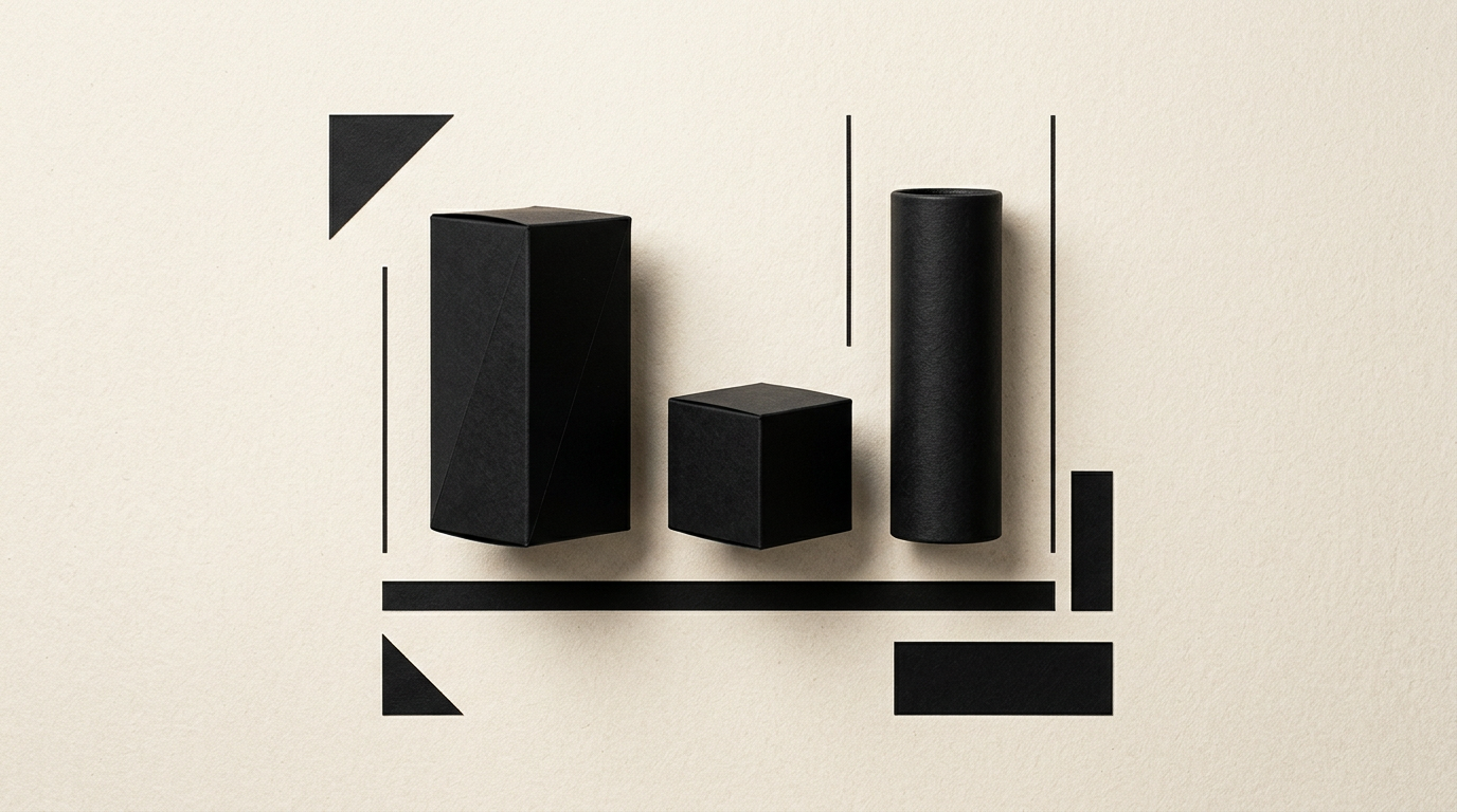
On a physical store shelf, a new product has between 1.5 and 2.5 seconds to capture a shopper's attention. Packaging design is not just about making something look pretty; it requires visual architecture, color psychology, and a strict information hierarchy. In this article, I explain the technical and design decisions that transform an invisible package into a shelf-proven success.
Why does my packaging look great on screen but disappear on the retail shelf?
Your packaging is invisible on the shelf because screens calculate colors in RGB mode with self-emitted light, while store shelves feature cold fluorescent lighting, shadows cast by adjacent products, and a cluttered visual environment. Furthermore, on a screen, you analyze packaging in isolation against a neutral background, without aggressive competitors using massive color blocks around you.
When executing a graphic design project tailored for packaging, the mandatory first step is a simulated shelf test. You must evaluate legibility from a distance of 2–3 meters and under different lighting angles. If your packaging uses muted pastel tones or overly fine typography, direct store lighting will wash out the details completely. Effective shelf packaging relies on bold geometric shapes, strong tonal contrast, and a distinct focal point that stops the eye instantly.
How do I choose packaging colors to stand out from direct competitors?
You choose colors by first analyzing the product category to identify the competitors' dominant color, which you then either avoid or use in a completely contrasting way. If every yogurt brand in the aisle uses blue and white, a splash of vibrant yellow or deep forest green creates an immediate visual break for shoppers.
To build an effective color strategy on the shelf, I recommend these practical steps:
- Identify the mandatory category color code (e.g., red for spicy, green for organic) and keep it strictly as a secondary accent.
- Apply a single primary color block across at least 60% of the front panel (color blocking).
- Test the layout in grayscale; if the visual hierarchy dissolves without color, your tonal contrast is too weak.
The main color should be easy to describe when a buyer mentions the product to someone else ("that bright yellow box on the middle shelf").
How big should the logo be on the packaging?
The logo should occupy between 15% and 25% of the Principal Display Panel (PDP), but its exact size depends directly on your brand recognition. For a new brand, consumers first look for the primary product benefit or category ("Hydrating Cream"), not an unfamiliar brand name, which is why the product title often needs to dominate visually.
If you already have a professional logo with a memorable brandmark, that symbol can extend onto the sides of the box to build recognition from any angle. The practical visibility rule is the 3-meter test: at this distance, a customer must identify the brand in the first second, and from 1 meter away, read the exact product variant. A giant logo crammed into long paragraphs only creates visual chaos and lowers overall shelf legibility.
How much information should go on the front panel?
The front panel of your packaging should feature a maximum of three information elements: the brand name, the clear product title, and no more than two key benefits. Cluttering the front face with icons, certification seals, and promotional text reduces shelf conversion rates by up to 35%, as the human brain actively avoids processing complex messages in the first few seconds.
The correct information hierarchy on the front panel includes:
- The brand name (primary visual anchor).
- The category and exact product name (e.g., "Ground Coffee 250g").
- The unique selling proposition or main differentiator (e.g., "100% Arabica, Slow Roasted").
All technical details, ingredients, nutritional values, and usage instructions belong on the back or side panels. Packaging must sell at first sight, not act like a crowded technical brochure.
How do special print finishes affect shelf visibility?
Special print finishes do not increase long-distance visibility, but they double the purchase conversion rate once the customer picks up the product. Selective UV varnish, metallic foil stamping, or embossing act as tactile triggers and light-reflecting elements, instantly signaling a premium level of quality.
When designing complete packaging, I recommend applying special finishes only to key anchor elements, such as the logo or a central graphic accent. Gold or silver foil reflects overhead store lighting as shoppers walk down the aisle, creating subtle visual motion. However, if the underlying paperboard is low quality or the printing is misaligned, special finishes look cheap. Substrate quality is the foundation upon which every premium finish is built.
How do I align physical shelf packaging with online visual identity?
Physical packaging must be a mathematically identical extension of your entire digital visual identity, utilizing the exact same fonts, illustration styles, and color palettes. A disconnect between how a product looks in online store photos and how it appears on a physical shelf creates mistrust in the consumer's mind.
When a customer first discovers a product on a presentation website or social media channel and later spots it in a supermarket, the visual transition must be instantaneous. Distinctive brand assets (patterns, label shapes, messaging tone) must remain rock-solid across all touchpoints. Additionally, physical packaging can bridge back to digital through cleanly integrated QR codes pointing to dedicated landing pages or loyalty programs.
How much does professional packaging design cost and what does it include?
Professional packaging design for a product line averages between €600 and €2,500 per SKU variant, depending on die-line complexity, range scale, and technical print specifications. The cost covers far more than artwork creation; it includes complete prepress production engineering.
A properly executed packaging design process includes:
- A visual audit of the category and direct shelf competitor analysis.
- Technical die-line creation and graphic adaptation onto unfolded 3D layouts.
- Pantone (PMS) color code selection to ensure precise print reproduction without color shifts.
- Delivery of print-ready vector files (bleeds, varnish masks, outlines).
Investing in well-optimized packaging pays for itself quickly by preventing costly print errors and accelerating product turnover on store shelves.
How do I ensure packaging looks good in AI search results and e-commerce?
To ensure your packaging performs both physically on shelves and inside visual search engines or e-commerce platforms, you need clean 3D renders and a clear product title structure. Virtual assistants and e-commerce algorithms scan the front face of packaging images and cross-reference them with the store's text metadata.
By integrating GEO / AEO / AIO optimization techniques, your product images and backend structured data help artificial intelligence identify your item accurately and recommend it to users. You can explore my portfolio to see how professional 3D packaging mockups are deployed seamlessly across visual guidelines, printed catalogs, and digital ads while maintaining high rendering standards.
What's Next?
Are you launching a new product or looking to redesign an existing package that underperforms on the shelf? Properly executed packaging design blends aesthetics, printing technology, and sales strategy. Head over to the contact page and send me your project details; together, we will analyze your dimensions, category competition, and technical requirements to create packaging that is impossible to ignore on the shelf.