5 min read
How Do You Create Packaging That Stands Out on Shelves?
Learn how to build product packaging that pops on the shelf through strategic contrast, proper finishes, and clear copy hierarchy.
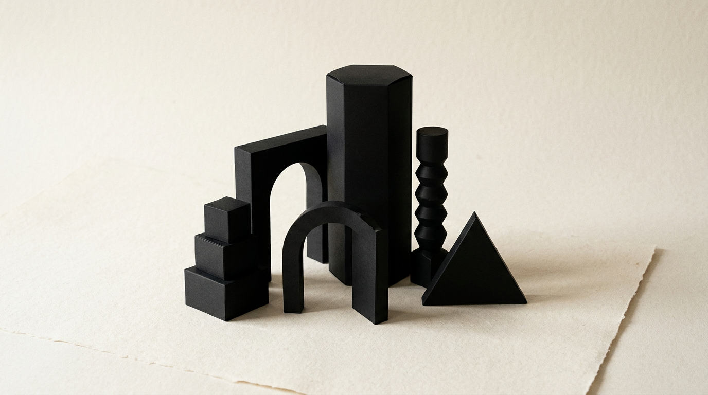
Shoppers spend an average of just 3 seconds scanning a retail shelf before making a purchase decision. Effective packaging isn't just about flashy colors; it requires a technical balance between legibility, print costs, and visual differentiation from competitors. In this guide, I answer the most frequent questions about turning a box or label into a direct sales tool.
What makes packaging instantly grab attention on a crowded shelf?
Effective packaging commands attention through structural contrast and conceptual clarity, rather than visual clutter. When ten competing products use plain white boxes with thin typography, a deep block color or an atypical container shape instantly draws the eye. Shelf differentiation is achieved by thoroughly analyzing direct competitors before launching into design grafic (graphic design). You must identify the category's dominant visual patterns and deliberately challenge them. Key factors for instant visual impact include:
- High luminance contrast between background and primary text.
- A singular, unmissable focal point (usually the brand name or hero benefit).
- Generous negative space that allows key elements to breathe.
- Strategic special finishes (spot UV, metallic foil accents).
If packaging attempts to communicate five messages simultaneously, the buyer remembers none of them in those critical 3 seconds.
Why is information hierarchy so critical on a box or label?
Information hierarchy dictates the precise order in which the human eye scans packaging details, ensuring the core value proposition hits the buyer first. Ideally, a customer should first identify the product category and brand, followed by the core benefit, and finally technical details or net weight. When packaging ignores this flow, buyers get confused and move on. A well-structured identitate vizuală (brand identity) establishes strict rules for font sizing, weight, and spacing. The product name should be readable from 1.5 meters away, while ingredient lists need smaller yet crisp typography legible at 30 cm. Testing this hierarchy is simple: perform a blur test—if you blur the package image and cannot tell what the product is instantly, the hierarchy failed.
How do you select colors and materials without inflating production costs?
Smart material selection relies on print run optimization and understanding offset or flexographic printing constraints. You do not need six spot Pantone colors and foil stamping on every panel to project a premium feel. Frequently, a sturdy 350g kraft board printed with a single rich black ink looks far more authentic and high-end than over-lacquered bleached cardstock. To keep budget parameters under control, follow these practical production rules:
- Standardize die-lines to reuse existing printing house tooling.
- Maximize the CMYK color space before adding costly special inks.
- Limit complex embellishments strictly to the Principal Display Panel (PDP).
- Match substrate selection to product environment (e.g., moisture-resistant stock for refrigeration).
An experienced packaging designer prepares production files to eliminate unnecessary paper waste on the press sheet.
What technical print mistakes ruin an otherwise great packaging design?
The most expensive packaging mistakes stem from improper pre-press file setup (DTP), which can result in discarding entire print runs. Omitting a 3-5mm bleed leads to unsightly white borders after die-cutting, while unoptimized barcodes fail automated retail scanner checks. Furthermore, embedding a vector logo (logo creation) without converting text to outlines or using images under 300 DPI destroys print sharpness. Another critical error is ignoring paper fold tolerances, which causes body text to get swallowed inside box creases. To prevent these failures, final production files must be delivered as PDF/X-4 files with separate die-cut layers, correct black text overprinting, and optimized small-text trapping.
How do you adapt packaging design for an established brand?
Adapting packaging for an existing brand requires preserving core brand equity while modernizing visual structure. You should not drastically alter signature brand colors or iconic logo shapes if existing customers rely on them for recognition. Instead, streamline graphic elements, strip away outdated effects like heavy drop shadows or cheap gradients, and refine typographic legibility. The process begins with auditing key visual assets that customers associate with your brand. When launching new product extensions, the packaging must seamlessly bridge your physical products with your digital presence, ensuring your site-prezentare (presentation website) reflects the exact same visual language.
Why are 3D mockups and physical prototypes essential before mass printing?
While 3D digital renders provide realistic multi-angle previews, physical prototypes (press proofs) are the only way to verify structural integrity and ergonomics. Packaging that looks stunning on a screen can prove difficult to open, unstable on shelves, or display skewed colors due to paper texture. Physical prototyping involves printing at 1:1 scale, manual assembly, and inserting actual products to check tolerances. Additionally, certified color proofs (Cromalins) prevent unpleasant surprises where digital red turns muddy brown on press. Without these validation steps, the risk of printing thousands of defective units increases exponentially.
How does well-designed packaging boost online e-commerce sales?
In e-commerce, packaging serves a dual purpose: capturing attention within tiny 100x100 pixel thumbnail images and creating a memorable unboxing experience that drives organic social sharing. Minimalist designs featuring bold typography and strong contrast stand out on product listing pages. When the product arrives, thoughtful details like custom inner-flap messages or QR codes linking to usage guides elevate perceived brand value. Furthermore, presenting clear, structured packaging data online supports modern search discovery, aiding geo-aeo-aio (GEO / AEO / AIO optimization) as AI search engines scan image metadata and product descriptions for automated recommendations.
How long does the complete packaging design and print prep process take?
A complete packaging design project typically spans 3 to 6 weeks, depending on structural complexity and the number of SKU variations. The first week focuses on market research, shelf analysis, and establishing design direction. The following two weeks involve developing graphic concepts and rendering 3D mockups. Once the concept is approved, the workflow moves to SKU rollouts (for additional flavors or sizes), copy finalized, and meticulous pre-press technical file prep. Rushing the DTP phase is the leading cause of printing errors, which is why this final stage requires at least 3-5 business days for thorough verification.
What’s next?
If you are launching a new product line or want to revamp existing packaging that underperforms on retail shelves, starting with a clear project assessment is key. Explore completed client work in my portofoliu (portfolio) to see real-world packaging, branding, and graphic design projects. When you are ready to build memorable, press-ready packaging that drives sales, send me your project specifications via the contact page to discuss your project roadmap.