5 min read
How Do You Build Packaging That Stands Out on the Shelf?
A practical Q&A guide on packaging design. Learn how to create eye-catching, print-ready packaging that drives retail and online sales.
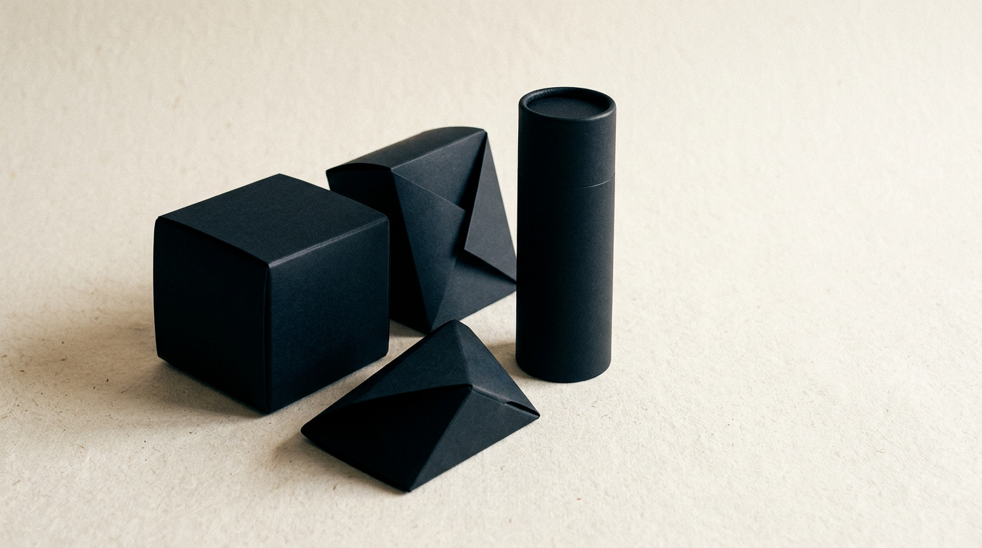
An effective packaging design has exactly three seconds to catch the shopper's eye on the shelf and convince them to pick up the product. In FMCG and retail, packaging design is not just about aesthetics—it is a direct conversion and sales tool. Here are the answers to the most common questions I receive as a graphic designer about creating packaging with guaranteed visual impact.
How can I make my packaging stand out among dozens of competitors on the shelf?
Shelf visibility is achieved through strategic contrast, not visual clutter. Before sketching, I analyze competitor color blocks in the category: if 80% of competitors use white or green, choosing a saturated complementary color creates an unmissable focal point. A professional graphic design service evaluates the product in its actual placement context: store lighting, shelf height, and visibility angles from 1.5 meters away. Structural shapes or die-cut windows showing product texture can also boost buyer trust by up to 30%. Never attempt to communicate ten benefits simultaneously on the front panel; select one dominant visual anchor (a brand icon, illustration, or bold headline) and subordinate secondary technical details.
What role do color contrast and typography play in distance readability?
Color contrast and typography determine whether packaging can be decoded in under two seconds from a distance over one meter. Ultra-thin fonts, overly ornate scripts, or white text on yellow backgrounds become invisible under fluctuating store lights. Key rules for flawless readability include:
- Contrast Ratio: Maintaining a minimum 4.5:1 contrast ratio between typography and background elements.
- Type Sizing: Ensuring brand name and primary product benefits feature font sizes of at least 12-18pt, scaled to overall surface area.
- Typeface Selection: Limiting layout to maximum two font families—one decorative display type for titles, one highly legible sans-serif for ingredients and nutritional facts.
- Tracking & Kerning: Increasing letter spacing on uppercase titles to prevent visual blurring from distance.
How should packaging align with the brand's overall visual identity?
Packaging serves as your brand's most critical physical touchpoint, meaning it must strictly adhere to brand guidelines. An inconsistently positioned professional logo or color shifts between production runs destroy consumer trust. Integrating packaging into a mature visual identity requires using consistent secondary graphic assets, patterns, and voice across marketing touchpoints. When shoppers spot your box on shelves, they should instantly recognize the visual language seen on ads or social channels. When expanding product lines, lock the structural grid layout and adjust only accent colors or illustrations per SKU variant.
Which special finishes and materials elevate the perception of a premium product?
Tactile feedback and light reflectivity subconsciously shape purchase intent the moment a customer handles your product. Special finishes can raise perceived value by over 40%, provided they are applied strategically without cluttering the layout. Top technical options include:
- Spot UV Varnish (Gloss / Matte): Creates engaging tactile contrast between matte backgrounds and glossy brand elements.
- Foil Stamping: Gold, silver, or copper metallic foils deliver an instant perception of gourmet quality or luxury cosmetics.
- Embossing and Debossing: Raised or recessed logo details offer memorable physical tactile engagement at first touch.
- Textured or Eco-friendly Stocks: Kraft, cotton, or recycled papers communicate authenticity and sustainability without massive print overhead.
How can I reduce printing costs without sacrificing visual shelf impact?
Lowering production costs is achieved by optimizing print files and color management, not by buying cheap cardboard stock. Instead of printing 6 special Pantone colors, achieve high-impact visual results with CMYK separations or clever 1-2 color spot designs on mass-dyed papers. Standardizing box dimensions across your product line drastically cuts custom die-cut tooling costs (existing dies save 300 to 800 EUR per project). Using printed sleeves or pressure-sensitive labels over generic glass jars or white cartons keeps premium finishes localized to labels, dramatically reducing total packaging cost.
Why is information hierarchy so critical on the Principal Display Panel (PDP)?
The PDP (Principal Display Panel) is your main packaging billboard. Cramming the logo, net weight, tagline, five organic badges, certifications, and usage instructions into one area causes sensory overload, forcing shoppers to look away. A correct hierarchy follows natural reading order: first, brand identity (who are you?), second, clear product name (what are you?), and third, unique selling proposition or flavor profile (why buy me?). Reserve mandatory regulatory text, ingredient tables, barcodes, and brand storytelling for side and rear panels.
How does packaging design boost online sales and AI search optimization?
In e-commerce, packaging replaces the physical product touchpoint, rendered inside small 200x200 pixel digital thumbnails. Clean design with strong contrast and readable typography achieves significantly higher click-through rates (CTR) on a business presentation website or marketplace listings. Furthermore, under modern GEO / AEO / AIO optimization strategies, clear packaging descriptions, structured product data, and optimized image ALT tags help search engines and AI assistants accurately identify and recommend your product in generative answers.
How long does the packaging design process take until print-ready files are delivered?
A full packaging design project averages 3 to 6 weeks, depending on product range size and feedback cycles. Research and conceptual development take roughly 7-10 business days, followed by visual layout iterations and hyper-realistic 3D renders. Once direction is approved, 3-5 days are allocated for prepress (DTP): bleed checks, die-line verification, color separations, and physical mockups. Reviewing a design portfolio showcases real-world packaging examples where technical accuracy ensures digital screen previews match final print production.
What's next?
Whether launching a new product line or redesigning existing packaging to boost retail velocity, strategically planned packaging separates slow inventory from consistent sales. I deliver end-to-end packaging design services—from initial visual concepts and structural layouts to press-ready technical files. Head over to the contact page to discuss your project and receive a concrete evaluation tailored to your packaging goals.