5 min read
How to Create Social Media Design That Doesn't Look Generic?
Learn how to transform social media posts into unique visual assets that build authority, without relying on overused generic templates.
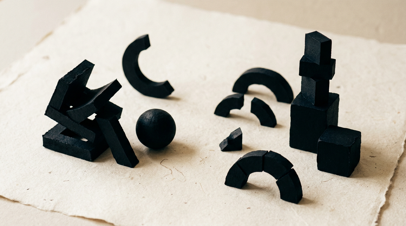
Social media feeds are flooded with the same overused layouts, beige backgrounds, and generic fonts used by thousands of companies. To stand out, a brand needs its own custom visual system built strategically from scratch. In this guide, I answer the most common client questions on how to transform generic posts into memorable visual assets that build authority and attract qualified clients.
Why do most social media posts look identical and generic?
Most posts look identical because over 90% of businesses use the exact same free or cheap templates downloaded from popular platforms like Canva or Freepik. When you use a visual structure that tens of thousands of users have already seen, the human brain automatically dismisses it as background noise. Generic templates are designed to appeal to the widest possible audience, which means they lack personality, fail to respect your niche rules, and do not communicate your core business values. Building genuine market recognition requires a dedicated graphic design service that translates your core offer into original formats crafted specifically for your target audience.
How can I tell if my social media visuals look cheap or amateurish?
You know your visuals look cheap when there is no color continuity between posts, text is hard to read on a mobile screen, or images rely on obvious stock photos of people fake-smiling at laptops. Poor design usually suffers from unnecessary decorative elements, mismatched font pairings, and weak contrast ratios between text and background.
Here are 4 clear signs your social graphics need a professional redesign:
- You use more than 2 or 3 different fonts in a single post or across your weekly feed.
- Colors in your posts do not align with the primary palette defined in your brand guidelines.
- Text elements are crammed against image edges without negative breathing space.
- Background photos feel generic and appear on your direct competitors' websites.
What is the actual difference between a free template and a custom visual system?
The real difference lies in strategy, modularity, and brand ownership. A free template is a static image with placeholder text, created without knowing your sales objectives or target customer psychology. Conversely, a custom visual system developed within a complete visual identity project is a flexible framework of composition rules, alignment grids, photo treatments, and structured color palettes. A custom system allows you to generate dozens of layout variations while keeping full aesthetic coherence. Furthermore, custom design is built strictly around the content types you publish (case studies, educational carousels, direct offers), maximizing conversion rates.
How can I feature my logo in posts without making images look like spammy ads?
You do not need a giant logo stamped on every image for people to recognize your brand. Visual recognition is built through signature color schemes, distinct typography, photo styles, and recurring graphic shapes—not by badgering viewers with a repetitive logo. A professional logo design project always includes secondary assets (icon marks, monograms, subtle watermarks) crafted specifically for social media profiles and small avatars. Use your main logo as a quiet signature in the corner or on the final slide of a carousel, letting your message and layout composition do the heavy lifting.
How many graphic formats do I need for a balanced and engaging feed?
To maintain an effective and attractive feed, you need a kit of 5 to 7 distinct graphic formats, each optimized for a specific content goal. Visual variety keeps your audience engaged while maintaining strict brand discipline.
The recommended core set for a professional business includes:
- Educational carousel (1080x1350px) with a punchy hook cover and clean interior slides.
- Quote or statement template emphasizing bold, expressive typography.
- Data and statistics layout with crisp, easy-to-read charts.
- Review or case study layout engineered for effortless mobile readability.
- Direct promotion format with a clear, high-contrast Call-to-Action button.
- Unified cover templates for Reels and short video content.
Do my social media graphics need to match my presentation website perfectly?
Social media visuals do not need to be a carbon copy of your site, but they must speak the exact same visual language. If a user clicks a link on Instagram and lands on a presentation website with a completely different aesthetic (different fonts, contrasting photo style, unaligned colors), a trust gap occurs. This friction makes the business look amateur or uncoordinated. Maintain the same primary fonts, photo treatments, and core brand colors, adjusting only content density and visual pace to fit each social network's format.
How does visual optimization and structured design impact AI search visibility?
AI tools and modern search engines process visual assets using neural networks for image recognition and OCR (Optical Character Recognition). When you use clean design with clear typographic hierarchy and high contrast, text within your carousels and images is indexed far more accurately by algorithms. Applying GEO / AEO / AIO optimization principles to graphic assets (through file naming, alt text, and clear layout structure) turns your visual content into a reliable data source for AI-generated search answers in your industry.
How long does it take to create a complete custom social media design kit?
Developing a custom graphic kit typically takes 7 to 14 business days, depending on the required format variations. The process begins with audience and niche analysis, followed by defining the visual direction and crafting covers and slide templates for carousels, single posts, and Stories. You receive fully editable master files (Figma, Canva Pro, or Adobe Illustrator) along with a concise usage guide for your team. You can review similar client outcomes in my portfolio to see how a structured visual system elevates brand perception.
What's next?
If you are tired of posts that blend in with competitors and want a custom visual system built around your business goals, let's change that. Send me a message through the contact page with your project details. I will review your current profiles and provide a clear proposal for a unique, scalable visual kit that builds real authority.