6 min read
How to create memorable symbols using negative space?
A practical guide on how negative space turns an ordinary logo into a memorable symbol, reduces print costs, and improves brand visibility.
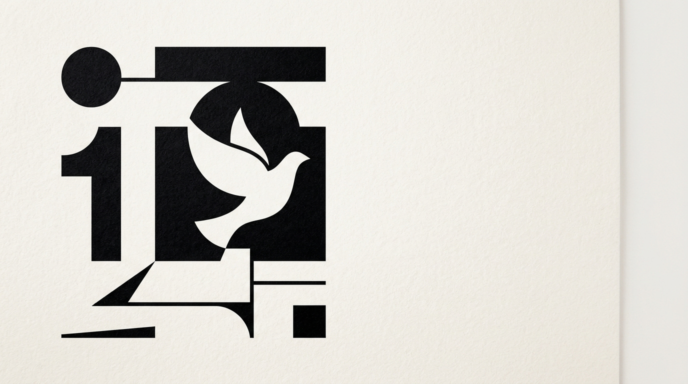
Negative space is the empty area surrounding and between the elements of a design. Instead of being a passive background, it acts as an active tool that creates secondary shapes and conveys hidden messages. Used correctly, negative space transforms an ordinary symbol into a memorable emblem that stays etched in the customer's mind.
What is negative space in graphic design and why does it matter?
Negative space represents the unoccupied area around and inside a graphic object, cleverly used to create a second image or an additional meaning. In graphic design services, this concept is not a simple aesthetic trick, but a technique for reducing visual noise. The human brain processes simple shapes in less than 13 milliseconds, and when it discovers a hidden figure in the background, it secretes a small amount of dopamine from the satisfaction of solving a visual puzzle. This psychological mechanism increases brand retention rates by up to 40% compared to overcrowded symbols. By removing unnecessary elements, you get an airy, elegant, and highly effective composition across any visual medium, from business cards to billboards.
How does negative space help a logo become instantly memorable?
Negative space makes a symbol memorable by creating a visual duality that forces the viewer to actively participate in interpreting the image. When I design logo creation projects, I aim for the symbol to convey two ideas in a single compact form. This dual structure works exceptionally well for three clear reasons:
- It generates a rediscovery effect in the customer's mind, turning a simple glance into an active cognitive experience.
- It reduces geometric complexity, allowing the symbol to remain legible at microscopic sizes, such as a 16x16 pixel favicon.
- It ensures maximum versatility because it works flawlessly in monochrome versions without relying on complex gradients or 3D effects.
The result is a brand that needs no extra explanation to stand out quickly in the market.
What are the most famous examples of negative space in branding?
The most successful global examples prove that negative space creates iconic symbols by intelligently integrating secondary elements into main shapes. A classic example is the FedEx logo, where the space between the letters E and x forms an invisible arrow suggesting speed and direction. Similarly, Carrefour uses a white background framed by red and blue to outline the letter C, which many consumers only discover after years of seeing it. Another famous case is WWF, where the panda's body is defined solely by black spots on a white background. In my brand identity projects, I apply these exact simplification principles: extracting the brand's essence and building a pure shape that communicates complex values without cluttering the viewer's eye.
Is negative space suitable for every type of business?
Yes, negative space works for any industry, provided that the resulting symbol aligns directly with your business values and positioning. Whether you operate in IT, financial services, hospitality, or industrial manufacturing, a smart composition conveys professionalism and attention to detail. However, the way we approach the concept varies depending on the niche:
- In the tech or B2B sector, negative space highlights precision, logical structure, and subtle innovation.
- In premium or luxury fields, generous use of white space communicates exclusivity, quality, and trust.
- For retail or mass-market brands, a hidden figure adds a playful and friendly touch.
The key is to avoid forcing a hidden image if it has no logical connection to the company's activity.
How does negative space affect print and packaging costs?
Using negative space directly reduces production costs for print and packaging by optimizing ink consumption and simplifying technical processes. A cleverly constructed symbol often uses the substrate color, such as a paper bag or cardboard box, as an integral part of the design itself. This technique brings major financial and visual advantages:
- Reduces ink consumption by 20% to 50% in large print runs.
- Allows single-color screen printing or foil stamping, lowering plate production costs.
- Facilitates precise die-cutting or embossing on packaging because vector lines remain clean and well-defined.
A minimalist design based on negative space looks more expensive on the shelf while costing considerably less to print.
How does a negative space logo perform on a presentation website?
A logo based on negative space delivers excellent legibility on digital screens and integrates naturally into the interface of any presentation website. On a smartphone screen, the header display area is limited to roughly 120-160 pixels in width. Complex symbols become an indistinct smudge at this scale, whereas a shape built on negative space remains crisp and instantly identifiable. Furthermore, in a digital environment where users scroll rapidly, recognition speed is critical. Airy logos adapt easily to dark or light backgrounds, providing a cohesive visual experience across all web pages.
How do you optimize a visual brand for AI search and modern visibility?
Visual optimization for modern algorithms involves creating clean, vector-based graphic assets properly labeled for indexing by advanced search engines. AI engines use computer vision to analyze logos and images, preferring high-contrast shapes with simple geometry. In the GEO / AEO / AIO optimization process, a clear negative space symbol is identified faster and linked accurately to your brand name. From well-structured SVG files to precise metadata, every graphic element should help intelligent systems understand your company identity.
What are the most common mistakes when applying negative space?
The biggest mistake is forcing a hidden element at all costs, sacrificing legibility and the clarity of the primary message. When the design becomes too cryptic, the viewer won't understand the symbol and will abandon the effort to decode it. Another common mistake is ignoring the balance between positive and negative forms, leading to a visually unstable composition. Furthermore, using extremely fine details in the negative space area can cause elements to disappear in print or on low-resolution screens. A successful design works effortlessly; if you have to spend five minutes explaining what's hidden in the logo, the concept has failed.
How does the creation process work for a negative space symbol?
The creative process begins with a strategic brand analysis and unfolds through dozens of manual sketches to discover natural geometric overlaps. You cannot generate a smart symbol with a single click in a software program, as it requires thorough conceptual exploration. Once core ideas are identified, we move to precise vectorization, tweaking curves and angles by the millimeter to balance visual weight. You can see how I approach these visual concepts by exploring my portfolio section. Finally, the symbol is stress-tested on packaging, brochures, and digital screens, ensuring it retains clarity anywhere.
What's Next?
If you want your brand to stand out with a memorable symbol built on solid design principles, it's time to take the first step. A well-thought-out visual saves your printing budget and boosts long-term market recognition. Write to me directly through the contact page to discuss your project, whether you need a new logo, a complete visual identity, or premium packaging design.