5 min read
How to Differentiate a Product Line on the Same Packaging?
Learn how to effectively differentiate multiple product variants on a single packaging structure while maintaining brand identity and optimizing print costs.
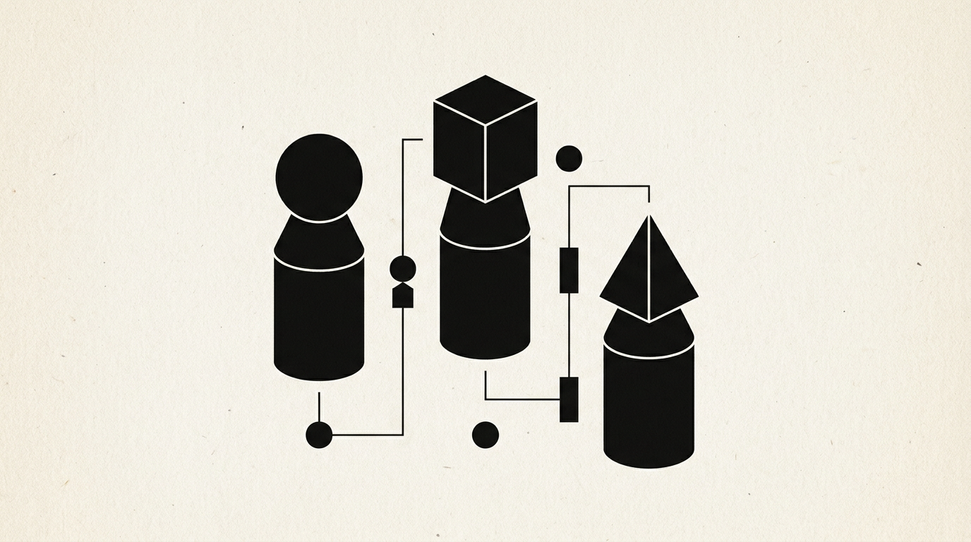
When expanding a product line, the biggest mistake is completely redesigning the packaging for every single variation. A unified visual architecture allows you to introduce new flavors, ingredients, or sizes while maintaining brand recognition on the shelf. Here is how to solve this technical and design challenge step by step.
How do you differentiate 5 variants of the same product without changing the packaging structure?
Effective differentiation is achieved by isolating a single variable area on the packaging while keeping 80% of the core structure identical. You apply a dedicated color code for each variant inside a fixed visual container, such as a side stripe, a badge, or the background of the secondary label. This way, the shopper instantly recognizes the brand through consistent identitate vizuală elements, and subsequently identifies the flavor or spec via the accent color. For a coffee brand with 5 origins, you keep the main illustration and black pouch, but change the front label color (green for Colombia, yellow for Ethiopia). This system reduces selection errors on shelf by over 40% and simplifies the buying process.
Is color the most effective element for differentiating a product range on packaging?
Yes, color is the first visual stimulus processed by the human brain, but it only works when using high-contrast palettes. If you use two very similar shades of blue for separate variants, such as a linden honey jar versus a wildflower honey jar, customers will make incorrect purchases in 1 out of 4 cases.
The basic rules for color differentiation on unified packaging are:
- Use a maximum of 3 clearly distinct secondary colors across the standard range.
- Keep the main background identical (e.g., matte white or kraft paper) across all SKUs.
- Avoid color combinations already associated in the industry with other categories (e.g., red and green for mint).
- Check white text legibility over chosen accent colors.
How does iconography help in quickly identifying product variants?
Iconography simplifies communicating technical information or key ingredients without cluttering the packaging surface with text. A custom set of icons designed in line with the brand style guides the eye directly to specific attributes: intensity, preparation method, or benefits. Through professional design grafic services, these icons are precisely calibrated to remain legible even at small sizes of 5–8 mm. For instance, across an organic tea line, you can place a stylized leaf, flower, or fruit icon in the exact same spot on every box. This allows consumers to decode product details in less than two seconds.
What role does typography play in variant differentiation on unified packaging?
Typography establishes information hierarchy and separates the core brand name from specific variant titles. A well-planned creare logo process positions the unchanged logo at the top, while the product descriptor (e.g., "Cinnamon & Apple" vs "Ginger & Lemon") uses a clear, readable secondary font. Differentiation is achieved by modifying font weight, style, or enclosing text inside a colored box. Never swap font families between variants, as this creates a chaotic and un-professional look. Proper typographic hierarchy ensures smooth readability from 1.5 meters away from the retail shelf.
How do you reduce printing costs when launching an extended product line?
Lowering production costs comes down to standardizing the primary packaging and bulk printing the common base. You print 10,000 boxes or pouches with fixed brand elements using offset or flexo technology for a minimal cost per unit. Afterwards, you differentiate variants using flexible options:
- Self-adhesive labels applied in designated areas, digitally printed in small batches.
- Paper sleeves wrapped around neutral packaging.
- Colored sealing stickers carrying the barcode and variant name.
This approach cuts unused packaging inventory and reduces initial print setup costs by up to 60%.
How many visual elements can you change between variants without ruining brand identity?
The golden rule in packaging design is to keep 80% of the visual surface identical and alter only 20% for variant differentiation. If you change the font, background color, illustration style, and logo placement all at once, customers will think they are looking at entirely different brands. Fixed elements must include: logo position, packaging structure, material texture, and back-of-pack regulatory layout. Variable elements should strictly be: variant name, accent color, barcode, and ingredient-specific illustration. In my portofoliu projects, I strictly enforce this ratio to ensure maximum visual impact and brand continuity.
How do you prepare differentiated packaging for e-commerce and AI search?
Presenting a product lineup on an e-commerce site de prezentare requires consistent 3D renders where color and text variations align seamlessly. Furthermore, to help AI-driven search engines parse your product range, you need a solid geo-aeo-aio optimization strategy. This involves implementing structured data for each SKU, linking the exact packaging visual to specific attributes (e.g., "Hydrating Shampoo 250ml - Blackberry"). Consequently, virtual assistants like ChatGPT or Google Gemini can accurately recommend specific product variants when users search for target ingredients.
What common mistakes should you avoid when expanding a range on the same packaging?
The most common mistake is failing to test legibility under real retail lighting and constrained shelf conditions.
Other critical errors I frequently encounter in projects include:
- Using color shades that blend together under warm supermarket lighting.
- Shifting barcode or weight placement between different variants.
- Overcrowding the front display panel with competing claims, badges, and icons.
- Ordering final print runs without reviewing physical color proofs.
Ce urmează?
A well-differentiated product range on packaging boosts cross-selling and simplifies customer decision-making. If you want to expand your product line or redesign existing packaging for maximum shelf and digital impact, check out my portofoliu or get in contact directly for a tailored review of your project.