5 min read
How to Differentiate a Product Line on Packaging?
Discover how to build a coherent visual system for an extended product line on the same packaging structure without confusing shoppers.
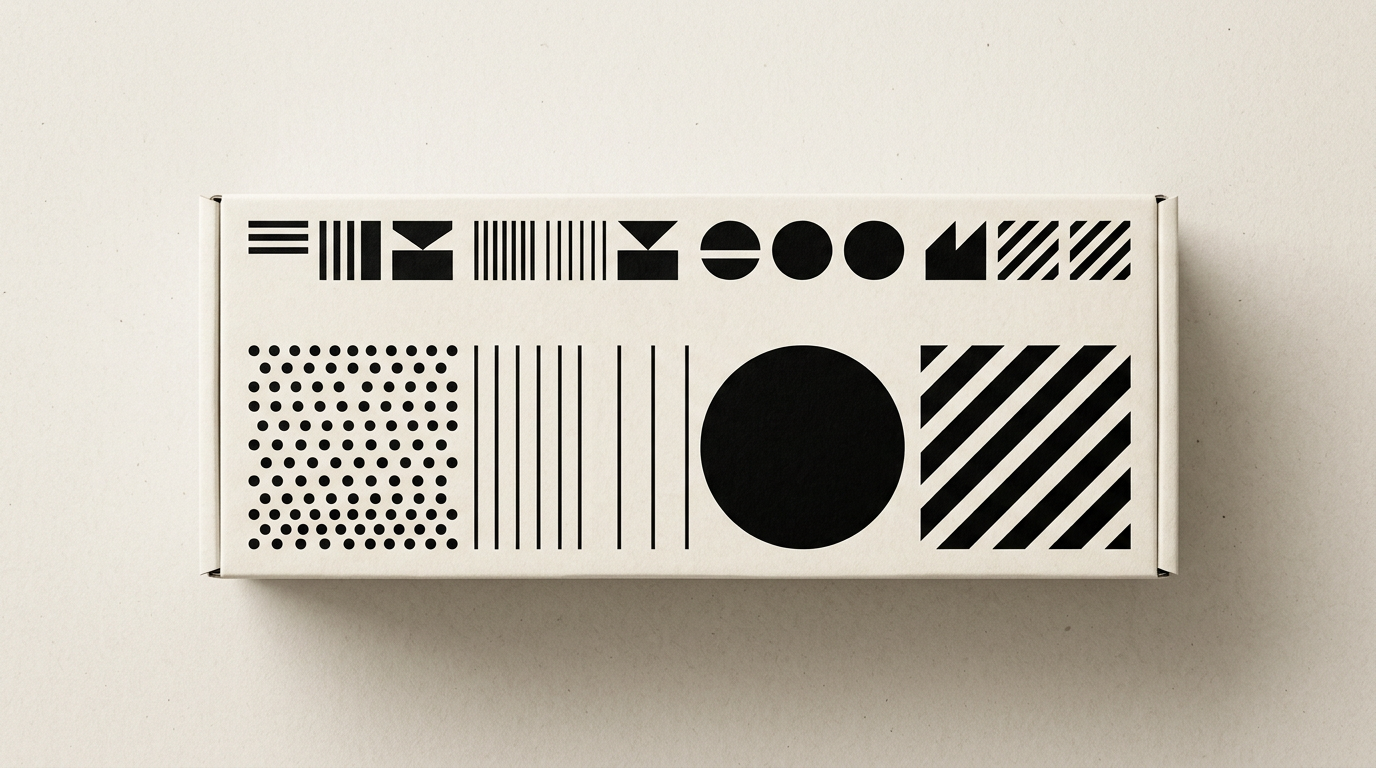
Differentiating a product line on packaging is a fine balance between brand recognition and the specificity of each individual SKU. When a shopper spends less than 3 seconds at the shelf making a decision, the packaging must instantly communicate both brand identity and the precise flavor, ingredient, or purpose of the product. A well-structured visual architecture prevents consumer confusion and optimizes print production costs.
How do I maintain brand architecture when I have 15 different SKUs?
You maintain brand architecture by establishing immutable visual elements (such as logo placement, layout grid, and primary typography) while modulating only secondary elements. In an extended range of 15 SKUs, the visual system operates as a strict matrix where the core identity remains constant across 60-70% of the packaging surface. The remaining 30-40% is allocated to variables: color codes, dedicated illustrations, or specific product names. A mature visual identity defines clear rules in the brand guidelines for alignment, hierarchy, and negative space.
Key methods for structuring an extended product range include:
- Fixed grid layout for brand placement and regulatory information (weight, certifications).
- Secondary color palette strictly assigned to each category or flavor.
- Unified icon system drawn with identical line weight and proportions.
- Secondary typography dedicated to product descriptions while keeping the primary font intact.
Is color coding the most effective differentiation method?
Color coding is the fastest method for shelf recognition, but it only works effectively when applied with high contrast and strategically distinct colors. Humans process color much faster than text or shape, meaning a change in background or accent color immediately conveys the difference between "skimmed milk" and "whole milk". However, relying solely on color is risky for visually impaired customers or under poor retail lighting conditions. To deliver quality graphic design services, I always pair color with distinct geometric shapes, dedicated icons, or numerical indicators. For instance, in a supplement line, along with shifting the accent color from green to blue, we also swap the central icon or the step number.
How do I differentiate products without changing the box structure?
Differentiating products on identical box structures or flexible pouches is achieved using variable label graphics, custom sleeves, or modular print layouts. Using a single structural die-cut across 10 products can cut tooling costs by up to 40%, but the print graphic must compensate for the structural uniformity. You can use vector illustrations or product photography with a consistent style, placed in the exact same focal frame on every label. Additionally, applying selective spot UV or foil stamping on just the variant title offers fast visual and tactile differentiation. This approach works exceptionally well both in retail stores and when presenting your range on a corporate presentation website, where items are displayed side-by-side as digital thumbnails.
How much can I alter typography from one variant to another?
Primary typography (the logo and master brand title) should never change, but secondary fonts used for variant names can vary within the same font family. If you use a geometric sans-serif for the master brand, you can use Bold, Italic, or Condensed weights of that same typeface to distinguish product variants (e.g., "Light", "Extra", "Zero"). Altering the font style entirely from one variant to another is only recommended if the range includes distinct sub-lines—such as an organic vs. a conventional line. Even then, the logo creation and branding framework requires proportions and text positioning to remain identical to maintain shelf alignment.
What role do special finishes play in separating premium product lines?
Special finishes such as embossing, metallic foil, or spot UV coating create an immediate value hierarchy between standard and premium products in the same line. When launching a "Limited Edition" or "Reserve" variant, applying these finishes to existing print layouts adds a tactile and visual tier without altering core graphics. A matte background paired with gold foil stamping for a premium variant instantly signals a higher price point compared to a standard matte print.
Selecting special finishes should follow these guidelines:
- Use metallic foils (gold, silver, copper) exclusively for top-tier or collector editions.
- Apply embossing or debossing on key elements like seals or variant titles.
- Utilize soft-touch lamination on backgrounds to provide a velvety feel.
- Combine selective glossy spot UV with matte finishes to create striking visual contrast under retail lighting.
How do I avoid shopper confusion on the shelf between similar products?
You prevent shopper mistakes by placing differentiating indicators in the upper or central third of the packaging using high visual contrast. Studies show shoppers spend less than 2 seconds scanning a shelf section; if two beverages in the same range have nearly identical backgrounds and differ only by small text at the bottom, mispurchase rates rise by over 25%. Use prominent color blocks, enlarged icons, or clear numerical coding (e.g., 01, 02, 03) to signal variant changes. Always test how your packaging looks in a real shelf environment, and consider how visual search engines index your products via GEO / AEO / AIO optimization for image-based queries.
What are the most common mistakes in packaging differentiation?
The most common mistake is "over-differentiation," where every variant looks like a completely different brand. When you change the font, logo position, illustration style, and background color all at once, you lose shelf impact and brand recognition. Another common error is choosing low-contrast color codes (such as light pink for strawberry and light peach for peach), which become indistinguishable under retail lighting. Furthermore, failing to consult a specialist before production leads to costly printing mistakes. I invite you to explore my portfolio to see how I solved packaging architecture challenges for both local and international brands.
What's next?
If you are planning to launch a new product line or want to restructure your existing packaging for better shelf visibility, the next step is an audit of your current visual architecture. You need a streamlined visual system that lowers printing costs while speeding up consumer purchasing decisions. Visit the contact page to discuss your packaging project and establish the most effective visual differentiation strategy for your product range.