6 min read
How Do You Differentiate a Product Line on the Same Packaging?
Learn how to effectively differentiate multiple SKUs on the same packaging layout using color coding, typographic hierarchy, and visual grids.
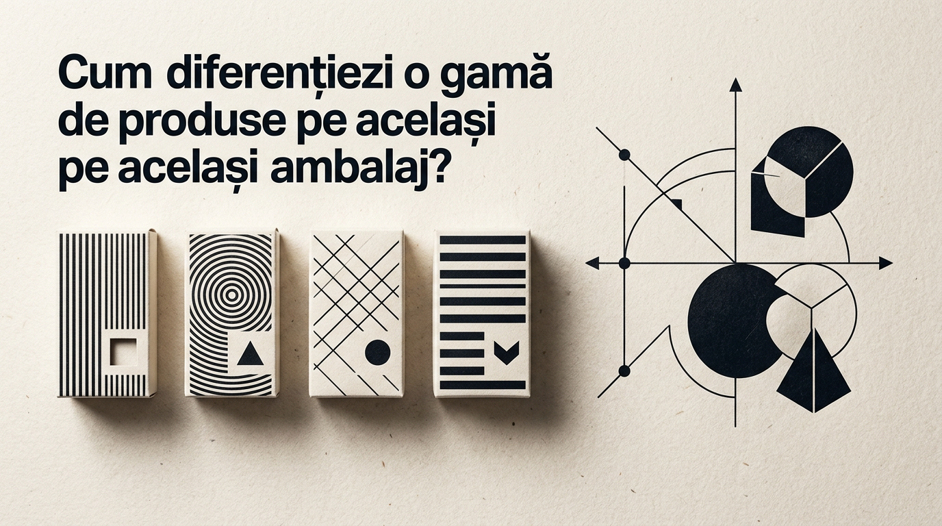
Launching a product range under the same brand requires a fine balance between a unified visual identity and clear differentiation between SKUs. When a shopper has only 2–3 seconds in front of the shelf, packaging must instantly communicate the flavor, formula, or purpose of each item. Below is a practical guide on how we visually and technically approach differentiating a product line on the same packaging structure.
How do you differentiate flavor variants without changing the entire package design?
Effective variant differentiation relies on a strict color-coding system applied to secondary layout elements while keeping the primary structure intact. Instead of changing the entire background color for every single flavor, you keep 60–70% of the packaging surface in a neutral or brand-specific base color and use colored bands, badges, or text containers for differentiation. For example, on a yogurt product line, the white base color remains constant, while the bottom accent strip changes: red for strawberry, yellow for peach, green for mint. Through professional design grafic services, this color matrix is established during the initial concept phase to prevent poor contrast or color overlaps that cause confusion. As a result, consumers immediately recognize the parent brand on the shelf and pick their desired variant in under a second without inflating printing costs.
How important is it for the logo to stay fixed across all products in the line?
The logo must maintain its exact size, position, and color scheme across all SKUs in the product line to guarantee immediate brand recognition. If the logo moves or resizes from one SKU to another, it loses its function as an anchor visual and destroys the "brand block" effect on the shelf. Through proper creare logo guidelines, we define a strict exclusion zone and precise placement rules for primary and secondary packaging from day one. The only allowed exception is when monochrome adaptation (white/black) is needed for contrast on dark backgrounds, but the shape and grid position remain untouched. When the logo stays anchored in the exact same spot across 10 adjacent SKUs, it creates a powerful brand presence that pulls attention from a distance.
Which visual elements must remain strictly fixed on all products?
To maintain cohesion across a packaging family, the layout grid and key brand elements must remain completely unchanged across all SKUs. Generally, we keep the following components locked in place:
- Logo position and dimensions: Occupies the exact same area on the front panel.
- Typographic grid: Brand name, category title, and net quantity remain identically aligned.
- Primary fonts: The exact same font families for titles and primary descriptions.
- Packaging shape and finish: The same die-cut template, paper weight, or foil type.
- Legal and technical elements: Barcode placement, nutrition tables, and recycling symbols.
When these fixed elements are clearly set in your brand guidelines, you can swap secondary accent colors, ingredient illustrations, and variant names without compromising brand unity.
How does typographic hierarchy accelerate shelf readability?
Typographic hierarchy controls the order in which the brain processes packaging information, reducing cognitive friction for the buyer. At the top of the hierarchy sits the brand name, immediately followed by the variant name (e.g., "Lip Balm" - brand, "Strawberry & Honey" - variant). If both pieces of text share the same font size and weight, you create visual noise that slows down purchase decisions. The variant title needs a clean, legible font with generous sizing and a contrast ratio of at least 4.5:1 against the background. Furthermore, for complex ranges with sub-variants, we recommend combining numerical codes or simple iconography alongside text. Proper typographic hierarchy ensures a smooth visual transition from recognizing the brand to selecting the exact product.
Should you use vector illustrations or product photography for differentiation?
Choosing between illustrations and photography depends on the product category, brand positioning, and target audience. Macro photography of real ingredients works best in premium food or skincare lines where appetite appeal or sensory texture must be triggered instantly. On the other hand, vector or custom illustrations offer greater flexibility for modern, artisanal, or kid-focused product lines, allowing you to build an unmistakable visual style. Regardless of your choice, the golden rule is maintaining visual consistency across the entire range. If you select high-end photography for the vanilla SKU, you must use photography (shot under matching lighting and angles) for chocolate or hazelnut variants as well. Mixing styles creates a messy, unprofessional shelf appearance.
How do you adapt packaging graphics for a Premium or Limited Edition variant?
Adapting for a premium variant retains the baseline visual structure while elevating background tones, material textures, and typography finishes to signal higher value. Within a well-structured identitate vizuală, a premium tier shifts from light backgrounds to rich black, matte, or deep navy hues, enhanced by gold foil stamping, spot UV, or embossing. Instead of colorful illustrations, subtle metallic line art or engraved details are applied. The higher price point must be visually justified before the customer even picks up the package. However, logo positioning and font placement remain untouched so the premium item is immediately recognized as part of the core brand architecture.
What common mistakes cause product confusion within the same range?
Shelf confusion happens when variant differentiation relies on overly subtle details or poor color pairings. Here are the most frequent mistakes we identify and fix during the design process:
- Using overly similar color shades: For example, using two nearly identical shades of blue for "Sugar Free" and "Light" variants.
- Tiny variant typography: The consumer must be able to read the variant name from at least 1 meter away.
- Switching visual styles between SKUs: Shifting from photography to vector art within the same product line.
- Ignoring background contrast: Placing yellow text over a light green background makes text unreadable under store lighting.
- Cluttering the panel with claims: When everything is highlighted (Organic, Gluten-Free, Vegan), nothing stands out.
How do you test if buyers quickly distinguish variants on physical shelves and online?
Variant testing is conducted through 1:1 scale physical shelf mockups as well as digital legibility checks for e-commerce environments. In physical tests, we place 5–10 SKUs side by side on a retail shelf mock-up at a distance of 1.5 meters, checking if variants are distinguishable in under two seconds. For digital channels, packaging artwork must remain readable at small thumbnail dimensions (200x200 px) on mobile screens. When showcasing products on a site de prezentare or online shop, clear 3D renders and high-contrast imagery are required. Additionally, incorporating optimizare GEO / AEO / AIO strategies helps structure SKU data for search engines and AI assistants, making sure specific variant attributes are correctly indexed and cited.
How much does visual adaptation cost for a 5–10 SKU packaging range?
The cost of expanding a packaging range depends on the complexity of the master concept (hero SKU) and how many elements vary between products. Designing the primary master concept takes up most of the budget (typically between €800 and €2000 based on project scope), while adapting secondary SKUs usually costs 20% to 35% of the initial master concept price per variant. For instance, on a range of 6 beverage flavors where only colors, illustrated fruits, and ingredient panels change, roll-out adaptation ranges from €150 to €300 per SKU. Explore my portofoliu section to view real-world packaging projects developed across extended product lines with structured pricing models.
What's next?
If you are planning to launch a new product range or want to restructure your existing packaging for clearer shelf impact, the first step is reviewing your current product portfolio. A well-engineered packaging system reduces printing costs, eliminates buyer confusion, and boosts conversion right at the point of sale.
Visit the contact page to discuss your packaging project and receive a customized quote tailored to your SKU count and production specs.