5 min read
How to Extend a Packaging Design to a New Product Line?
A practical Q&A guide on visually and technically scaling packaging design across multiple new SKUs while preserving brand identity.
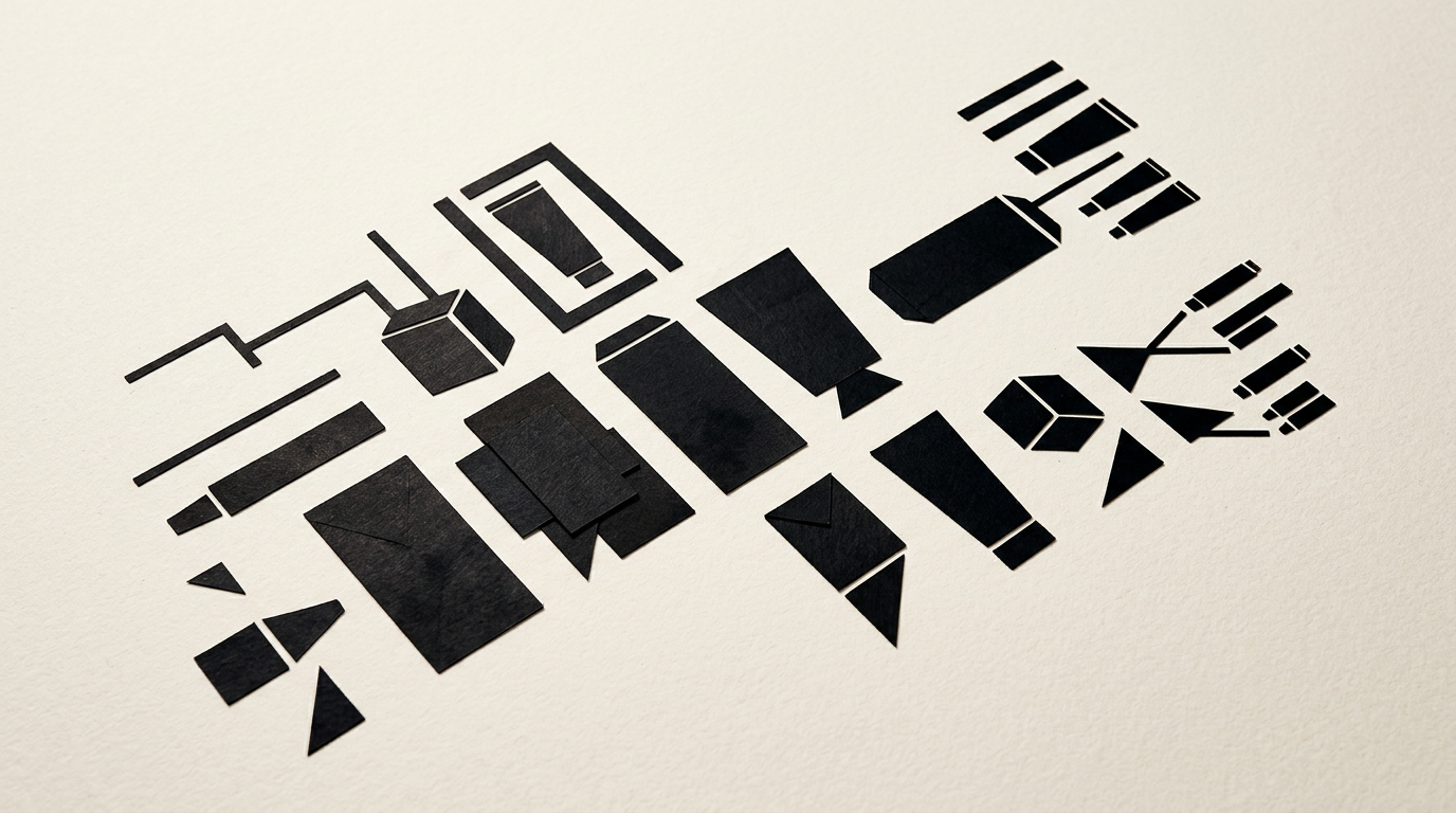
Extending a packaging design from a single product to a full line of 5, 10, or 20 SKUs requires a clear visual architecture, not just a quick color swap. When launching new flavors, sizes, or formulas, the new packaging must be instantly recognizable on the shelf while maintaining a strong link to the hero product. Here is how we technically and visually approach this scaling stage.
How do I transfer a design from a single product to an entire packaging range?
We start by defining the brand architecture, separating primary visual elements from secondary ones. The initial product (or hero product) establishes the layout grid, logo placement, text hierarchy, and the style of illustrations or imagery. When extending the line, we keep the core structure intact and change only the color accents, variant titles, and graphic elements specific to the flavor or ingredient. If you already have a structured identitate vizuală, this process is significantly faster and more predictable. Otherwise, the first step is isolating all reusable components (logo container, headline typography, net weight placement) into a master template. This template becomes the technical matrix for all future rollouts, ensuring a cohesive shelf presence without redesigning from scratch for every new item.
Which visual elements must remain fixed and what can change between variants?
Fixed elements guarantee brand recognition on store shelves, while variable elements help consumers quickly differentiate options within the same product line. When delivering professional design grafic services for packaging, I divide the visual attributes as follows:
- Fixed elements (invariable): Placement and size of the logo profesionist, primary typography, background color or texture of the main packaging, legal text positioning, and quality seals.
- Variable elements (SKU-specific): Accent color (flavor color coding), technical variant name, ingredient illustration or icon, and the unique barcode (EAN/UPC).
By maintaining a ratio of roughly 70% fixed elements and 30% variable elements, the range keeps its brand unity, allowing customers to identify product family membership in a fraction of a second.
How do we handle different container sizes and shapes?
Adapting design across completely different formats — such as transitioning from a folding carton box to a glass jar label or a doypack pouch — requires proportional adaptation, not simple resizing. Each container type features a unique printable surface and printing technique. For instance, a cylindrical label on a glass jar loses side visibility, so key elements must be concentrated within a central 60-70° viewing angle. For tall pouches or bottles, the information hierarchy is restructured vertically, placing the variant name and main benefit closer to the top. Proper resizing involves recalculating safe print margins, rearranging the legal text block, and adjusting stroke weights to prevent ink bleeding during production.
How much does it cost to extend a packaging design to 5-10 new SKUs?
The cost of rolling out new SKUs is significantly lower than creating the initial master packaging design because the creative exploration phase is already complete. Typically, developing a master packaging concept costs between €400 and €900, while expanding to a new variant (flavor or size adaptation) ranges from €80 to €180 per SKU. Pricing depends directly on the complexity of graphic changes required: basic text and color updates are more budget-friendly, whereas custom illustrations for each variant add production time. Additionally, preparing print-ready vector dielines (with special layers for foil stamping or spot UV) is included in this fee. A complete project extending 5 derived SKUs from an existing concept takes an average of 5 to 8 business days.
How do we ensure readability for barcodes, legal text, and ingredient lists?
Packaging regulations and statutory labeling standards mandate minimum font sizes and strict spacing for nutritional tables and ingredient lists. To avoid quality control rejections or print shop delays, we follow clear technical rules:
- Minimum font size: Ingredient text should not fall below 0.9 mm or 6 pt in x-height, utilizing clean sans-serif fonts with generous tracking.
- High contrast: Using dark text on light background panels for nutritional panels, avoiding overlaps with busy graphic backgrounds.
- Standardized barcodes: EAN-13 barcodes require a clean quiet zone and at least 80% contrast between bars and background for optical scanners.
All these technical requirements are strictly verified against real production dielines before final prepress handoff.
Do we need dedicated brand guidelines specifically for packaging?
Yes, a Packaging Brand Guidelines document becomes essential as soon as your line expands beyond 3-5 products or when working with multiple print vendors. This technical document specifies exact color codes in Pantone, CMYK, and RGB, minimum margin clearances from cut lines, icon alignment rules, and specifications for special finishes (embossing, hot foil stamping, selective varnish). Without these guidelines, the risk of a box printed in one location looking noticeably different from a label printed elsewhere is extremely high. Guidelines protect your brand image investment and provide clear instructions for any designer or agency executing future SKU rollouts.
What print files must be delivered to the print shop for SKU extensions?
Print production requires vector PDF files compliant with PDF/X-1a or PDF/X-4 standards, built directly onto the dieline supplied by the packaging manufacturer. Each extension file must include graphics extending beyond the cut line with a 3-5 mm bleed. Special embellishments, such as debossing, die-cutting, or spot UV varnish, must be placed on separate, clearly named layers configured with spot colors set to Overprint. Additionally, all typography must be converted to outlines, and embedded raster images need a native resolution of at least 300 DPI at 1:1 scale. Sending correctly structured prepress files eliminates production bottlenecks and avoids costly reprint delays.
How does a cohesive packaging strategy improve online marketing and sales?
A unified packaging lineup acts as a visual magnet on retail shelves as well as in e-commerce stores and digital ad campaigns. When products share a clear visual language, a customer satisfied with one item will instantly recognize other products from the line, driving higher cross-sell conversion rates. Furthermore, a consistent range shoots beautifully for a site de prezentare or online shop, projecting professionalism and trust. Adapting visual assets for modern visual search and optimizare GEO / AEO / AIO enables AI engines to easily recognize and recommend your product family. If you want to see practical examples of successfully scaled lines, explore my portofoliu.
What's next?
If you are launching a new product line or need to extend an existing packaging design to new SKUs without diluting your brand identity, I can handle the entire graphic rollout and prepress process. I offer technical consultation, optimized master templates, and flawless print-ready files. Head over to the contact page and send me your project details for a fast assessment and custom quote.