6 min read
How to Structure Packaging Information Hierarchy? (FAQ)
A practical guide to structuring information on packaging and labels: visual levels, legal requirements, and common shelf mistakes.
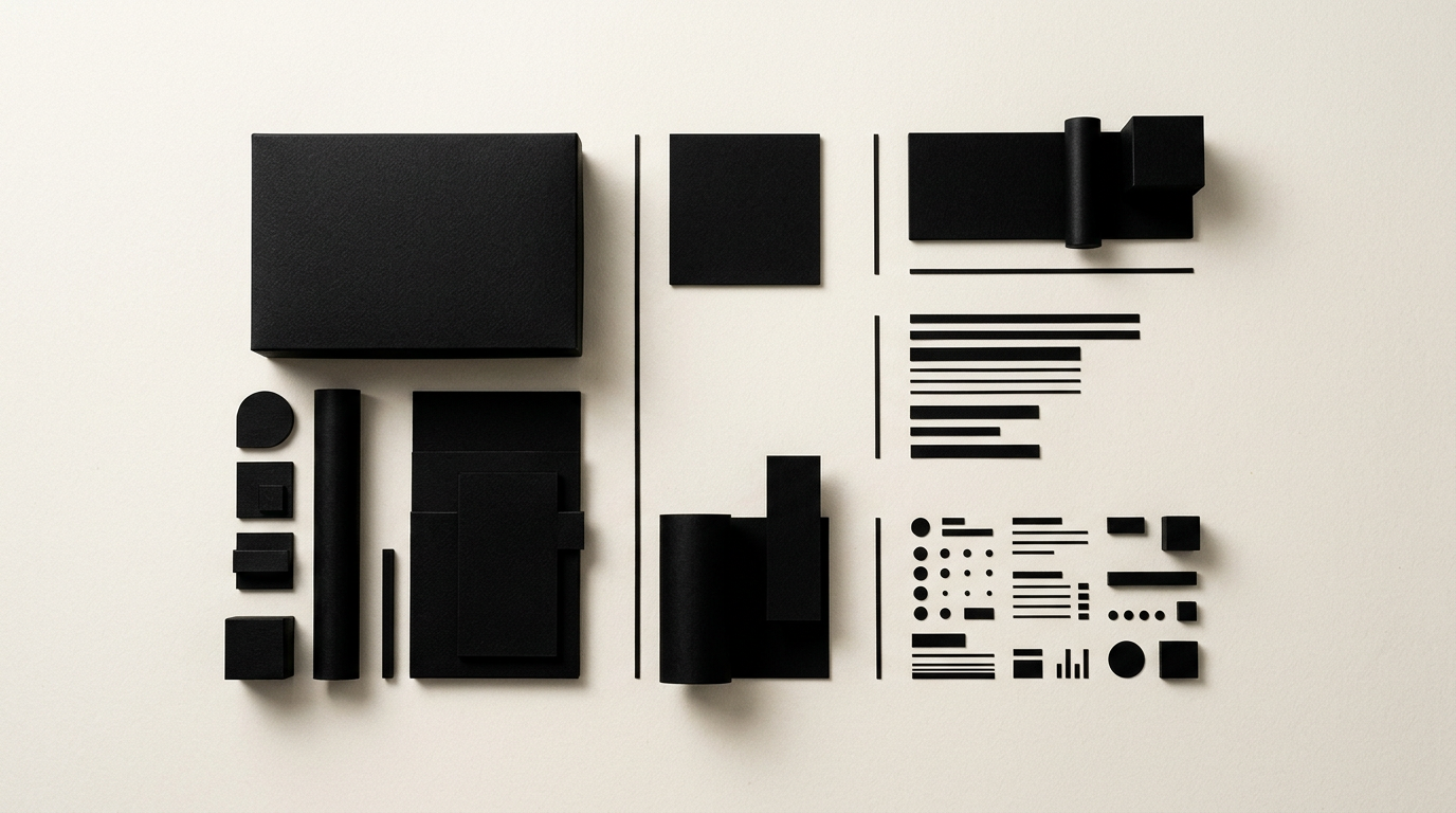
Shoppers make a purchasing decision at the shelf in less than 3 seconds, and the way you organize text and graphics on a package determines whether the product is bought or ignored. Information hierarchy establishes exactly what the customer sees first: the brand, product name, or primary benefit. In this article, I have gathered the most frequently asked questions from manufacturers and entrepreneurs about structuring labels and boxes correctly.
What is packaging information hierarchy and why does it matter?
Packaging information hierarchy is the visual organization of elements on a package according to their importance to the buyer. It matters directly for sales because the human eye processes visual information in a strict sequence: scale, contrast, positioning, and color. Without a clear structure, the packaging becomes cluttered, and the buyer moves on. The primary reading level must instantly communicate what the product is and who it is for. The secondary level provides details about variant, net quantity, or key ingredients, while the tertiary level includes legal data, barcodes, and nutrition facts. As a graphic design specialist, I always apply the 2-meter test: if a customer cannot grasp the product category from that distance, the design fails. Proper hierarchy increases shelf conversion rates by up to 35% compared to a chaotic layout.
What are the three levels of visual hierarchy on a box?
The three levels of visual hierarchy are the primary level (the visual hook), the secondary level (differentiation), and the tertiary level (technical and legal details). Each level plays a precise role in the decision-making process at the physical shelf or online.
- Primary Level: Brand logo and main product title. This should occupy roughly 30-40% of the front panel and be legible from 1.5 to 2 meters.
- Secondary Level: Core benefit, flavor, or variant (e.g., "No Added Sugar", "100% Organic", "250g").
- Tertiary Level: Ingredients list, nutritional table, usage instructions, barcode, and recycling symbols.
When developing a complete visual identity package, I establish these rules early in the brand guidelines to ensure consistency across all product ranges.
How do I prioritize information on small packaging?
On small packaging surfaces, the top priority is absolute legibility of the product name and category, eliminating any non-essential text. When the printable area is under 50 square centimeters, you must reduce visual elements to essential commercial and legal requirements. Do not try to fit the entire brand story onto a small jar label; for extended details, it is far more effective to direct users to an optimized business website or a QR code. Strict typographic rules become crucial here: use a maximum of two font families and maintain high contrast against the background. For instance, on a 30ml cosmetic serum label, the product name and active ingredient concentration must dominate the front, while INCI ingredients go on the back in a clean 6pt font.
What common mistakes destroy packaging information hierarchy?
The most common mistake is giving equal visual weight to all elements, creating visual noise that exhausts the viewer. When the logo, title, illustration, and ten benefit icons share the exact same scale, buyers do not know where to look during those critical first 2 seconds.
- Over-sized logo: A logo covering over 50% of the front without leaving room for the product category confuses new customers.
- Low color contrast: White text on yellow backgrounds or light grey on white drastically reduces readability.
- Hard-to-read decorative fonts: Using script fonts for crucial data like usage directions or allergen lists.
- Cluttering with non-essential badges: Adding 8-10 certification badges that fight for attention against the product name.
A professional logo design works best when harmoniously integrated into the layout architecture, not when it blocks core product communication.
How do legal requirements impact text layout on packaging?
Mandatory legal requirements dictate minimum font sizes and required placements that must be integrated seamlessly without destroying commercial appeal. In the European Union, Regulation 1169/2011 states that x-height for mandatory text must be at least 1.2 mm (or 0.9 mm on smaller packages). The food name, net quantity, and highlighted allergens (usually bolded) have strictly regulated areas. As a designer, I reserve designated zones early in the layout phase for nutritional tables, batch numbers, and expiration dates. The legal block is typically placed on the back or side panels, leaving the front panel clean for marketing messages. Reviewing my portfolio shows how technical packaging can strictly meet regulations while remaining elegant and spacious.
How do I adapt packaging hierarchy for online versus retail shelves?
For online sales, packaging must be visually optimized for thumbnail formats (200x200 pixel images), whereas retail shelves prioritize direct physical readability and material texture. In e-commerce, the buyer views the product on a smartphone screen. Consequently, the brand name and variant title must be ultra-sharp even at low resolutions. On retail shelves, customers can turn the box to read the back, but online decisions stem from the primary hero image. For hybrid sales, I recommend a minimal primary front design with strong contrasts that pop both on screens and shelves. Furthermore, if you implement GEO / AEO / AIO optimization strategies for AI search visibility, on-pack text data must match digital product listings exactly.
How much does a packaging design project with optimized hierarchy cost?
A professional packaging design project ranges from €400 to over €1,500 per SKU, depending on product complexity and the number of line extensions. This investment covers retail category research, information architecture, typography selection, print-ready file preparation (DTP), and 3D mockup renderings for validation. An average project for a 3-product line (flavor or size variations) typically costs between €900 and €1,800. Investing in strategically structured packaging pays off quickly by avoiding costly print errors and boosting direct sales conversions. Every print file is delivered turnkey, configured with proper outline fonts, die-lines, and spot UV options. You can send your project specs directly through the contact page for a custom quote.
How can you test visual hierarchy before mass printing?
Visual hierarchy efficiency is tested using physical color proofs, retail shelf simulations, and quick legibility tests with real users. The first step is the blur test: if you apply a heavy blur to the packaging image and can no longer identify the main focal point instantly, the hierarchy needs adjusting. The second method is virtual shelf testing: placing your 3D mockup alongside direct market competitors. If your product blends into the background or if the eye is pulled toward a secondary detail (like an oversized barcode), corrections are needed. Running a short trial run of 5-10 physical samples is always recommended before placing a bulk order for thousands of units.
What’s next?
If you have an outstanding product but your current packaging fails to grab attention on the shelf or creates buyer confusion, it is time for a visual overhaul. As a freelance graphic designer, I can help you build a clear information architecture compliant with legal regulations and optimized for sales. Whether you need a brand-new packaging concept, line extensions, or complete branding services, we can discuss concrete numbers and production specifications. Message me on the contact page or browse past projects in my portfolio to get started.