6 min read
How Do Grid Systems and Visual Hierarchy Elevate Graphic Design?
Discover how grid systems and visual hierarchy eliminate layout clutter and boost conversion rates in print, packaging, and web design.
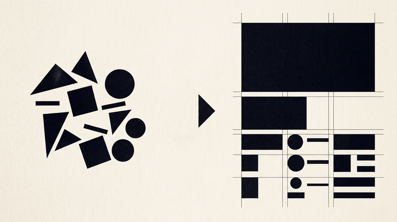
A successful layout is never accidental; it is the calculated result of a grid system and rigorous visual hierarchy. Without these fundamental tools, even the strongest brand ideas collapse into visual chaos that exhausts the audience. In this article, I explain how I transform mathematical structure into impactful design for print, web, and packaging.
Why do my graphic layouts look cluttered and hard to read?
Graphic layouts look cluttered when they lack a well-defined grid system and a clear hierarchy of information. When every element on a page tries to grab attention at the same time, viewers do not know where to look first and abandon reading within the first 3 seconds.
Without strict alignment and spacing rules, the composition becomes exhausting. A lack of structure affects packaging, brochures, and websites equally. The main causes of this visual chaos include:
- Absence of white space, which suffocates graphic elements and text.
- Using more than 2-3 font sizes without a clear priority logic.
- Random alignment of text and images instead of anchoring them to a common axis.
- Lack of a single, powerful focal point to guide the viewer toward the key message.
If you encounter this issue in your materials, professional design grafic services can reorganize everything onto an ordered grid.
What exactly is a grid system in graphic design?
A grid system is an invisible network of horizontal and vertical lines used to structure and align content on a page or screen. It acts as a structural skeleton upon which text, images, buttons, and logos are placed.
The grid divides the workspace into columns, rows, gutters, and margins. In a creare logo and visual identity project, a geometric grid guarantees clean mathematical proportions and scalability from a business card to a billboard. By strictly applying a grid, every element gains a designated space, taking the guesswork out of layout design. The final result is a balanced and easily digestible composition for your potential clients.
How does visual hierarchy help increase conversion rates on a website?
Visual hierarchy directs user attention straight to key elements, boosting website conversion rates by up to 35%. By controlling size, contrast, color, and positioning, you dictate the exact sequence in which a visitor consumes information.
When designing a site de prezentare, I map out a clear visual path: headline first, explanatory subheadline second, key benefits third, and the call-to-action (CTA) button last. If the main CTA button has high contrast and ample surrounding space, it becomes impossible to miss. Without this structure, visitors get lost in secondary details and bounce off without buying or inquiring. Hierarchy transforms passive visitors into active clients.
What are the most common types of grids used in print and packaging?
The most common types of grids used in print and packaging design are column grids, modular grids, and baseline grids. Each grid type solves a specific structural challenge based on content volume and graphical complexity.
Selecting the right structure depends heavily on the physical packaging format and required data density:
- Column grid: ideal for catalogs, magazines, and brochures, offering flexibility across 2, 3, or 12 columns.
- Modular grid: perfect for complex packaging or labels with technical specifications, organizing data into uniform blocks.
- Manuscript grid (single column): primarily used for books or official documents where text flow is continuous.
- Baseline grid: controls vertical text alignment across lines, maintaining consistent rhythm across packaging faces or magazine pages.
How do font choices and typography influence visual hierarchy?
Typography establishes visual hierarchy through a structured typographic scale based on size contrast, weight (bold, regular), and style. A well-engineered typographic system instantly conveys the importance of each paragraph without cognitive strain.
In a complete identitate vizuala project, I establish a maximum of three typographic levels: H1 Headline (largest and boldest), H2 Subheadline (medium size and weight), and Body Text (easy to read, standard 14-16px on screens or 9-11pt in print). Combining a geometric sans-serif for headings with a serif for body copy creates a strong contrast that separates core ideas from details. Size variations between levels should be at least 1.4x to 1.6x to remain clearly distinct.
If I use a strict grid, won't my designs look boring or repetitive?
No, a strict grid does not restrict creativity; it provides a solid foundation on which dynamic visual variations can be built. The grid is a structural map, not a rigid mold forcing every box to look identical.
Master designers use grid systems precisely to know when and how to break them for dramatic effect. For example, placing a graphic element slightly outside column boundaries (breaking the grid) creates visual tension and draws immediate focus to a hero product. If you browse through my portofoliu, you will see how the grid ensures underlying structure while asymmetrical elements keep the layout fresh, modern, and memorable.
How does visual structuring help optimize content for AI and search engines?
Visual structuring backed by a clear code hierarchy (H1, H2, H3, short paragraphs) allows search engine crawlers and AI systems to instantly parse context and priorities on a page. A well-structured layout lowers bounce rates and increases dwell time, signaling high-quality content to algorithms.
When implementing a geo-aeo-aio optimization strategy, we combine front-end visual hierarchy with back-end semantic data structure. Both human readers and AI assistants like ChatGPT or Google Gemini seek fast, digestible answers. A grid-aligned site with clear headers and bullet points gets extracted much easier as a reliable source in AI-generated answers.
How long does it take and how much does it cost to implement a grid and hierarchy system?
Implementing a comprehensive grid and visual hierarchy system typically takes between 4 and 12 hours of dedicated work and is included as standard in branding or web design packages. The overall cost depends on the number of media formats to be produced (print, digital, packaging).
For a brand identity or website, I build a scalable design system from scratch including:
- A base grid (4, 8, or 12 columns) adapted for desktop and mobile breakpoints.
- A complete typographic scale based on fixed mathematical ratios (e.g., 1.250 Major Third).
- Spacing rules (padding and margins) based on an 8-pixel spatial system.
- Color application guidelines to establish high contrast ratios.
To get an accurate estimate tailored to your business, send me the details via the contact page for a direct consultation.
What's next?
If your packaging, website, or marketing collateral feels messy and isn't generating the desired results, it is time to rebuild them on a professional foundation. As a freelance graphic designer, I can help you bring structure and clarity to your brand communication through precise grid systems and clear typographic hierarchy.
Together, we can audit your current assets, fix structural flaws, and build a cohesive visual system that attracts clients and drives conversions. Explore my past projects or send a message today to discuss the future of your brand.