5 min read
Dark Mode in Web Design: When Is It Worth It?
Dark interfaces have become a popular standard, but they don't fit every project. We analyze the technical, visual, and financial impact of dark mode.
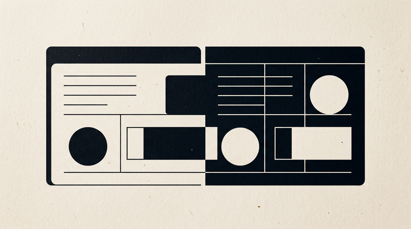
Dark mode has evolved from a niche feature for developers into a frequent client request for modern interfaces. However, implementing a dark theme isn't just about inverting colors; it is a strategic design decision that directly impacts readability, conversion rates, and brand perception. In practice, the right choice depends on the type of content, the environment in which it is consumed, and the target audience of the project.
Is it worth adding dark mode to a standard corporate website?
Not always, because a standard business or site de prezentare focused on B2B services benefits more from a bright, spacious, and readable light layout. While night-use applications or entertainment platforms boost user retention with dark mode, text-heavy corporate websites can cause eye strain when using dark backgrounds during the day. Users scanning service packages or articles in a brightly lit office environment find light text on dark backgrounds harder to follow due to halation effects. Therefore, unless your project involves heavy night-time usage or rich multimedia content, a well-structured light theme delivers better conversion rates.
How much battery power does dark mode actually save?
Dark mode saves between 10% and 60% of battery power, but this reduction applies exclusively to OLED and AMOLED displays. On traditional LCD screens, the backlight stays active whether pixels are displaying white or black, resulting in identical energy consumption.
This energy efficiency translates to concrete numbers on modern screens:
- At maximum brightness (100%), switching from light to dark mode on an OLED screen reduces power draw by up to 58-60%.
- At medium brightness levels (30-50%), real-world battery savings range from 9% to 15%.
- Pure black pixels (#000000) are completely turned off on OLED displays, drawing 0 mWA, whereas dark grey (#121212) draws minimal lighting power.
Does dark mode affect the readability of long-form text?
Yes, dark mode reduces reading speed and increases visual fatigue for long blocks of text read in illuminated rooms. Ergonomic studies show that the human eye processes dark text on a light background (positive polarity) more easily because the pupil naturally constricts, yielding a sharper focus. When reading white text on a black background, the pupil dilates to admit more light, causing fuzzier focus and visual blurring (transient astigmatism). If your website features case studies, technical articles, or long documentation, a light gray or white background remains the superior choice for legibility.
What changes does dark mode require for an existing visual identity?
Adapting to dark mode requires a complete review of your color palette within your existing identitate vizuală system, as saturated brand colors designed for white backdrops can appear overly harsh on dark backgrounds. Primary brand colors often need to be desaturated by 20-40% to prevent chromatic vibration and visual fatigue.
Key design adjustments include:
- Softening vibrant primary colors into lighter or pastel variants to meet WCAG contrast ratios of at least 4.5:1.
- Replacing pure black (#000000) with dark gray tones (#121212 or #1E1E1E) to reduce harsh contrast with white body text.
- Reconfiguring drop shadows—which disappear on dark backgrounds—with subtle borders or elevated surface tones.
- Updating vector illustrations and icons so they function seamlessly without residual white background boxes.
Is a colorful logo affected when placed on a dark background?
Yes, a logo designed exclusively for a light background can lose contrast or look out of place when the background turns dark. A professional creare logo service always delivers dedicated assets for dark backgrounds, ranging from monochrome white variants to adjusted color palettes that maintain symbol legibility. Logos with dark text or subtle gradients become unreadable on dark backgrounds if left unadjusted. Without dedicated vector files prepared for inverted dark backgrounds, key logo elements will fade out, undermining brand consistency.
How does dark mode impact search engine optimization?
Dark mode is not a direct Google ranking factor, but it directly influences user retention metrics like bounce rate, time on page, and Core Web Vitals. An improperly coded dark mode can degrade performance due to bloated CSS files or heavy JavaScript theme-switchers. Furthermore, from the perspective of optimizare GEO / AEO / AIO pentru vizibilitate în AI, AI engines evaluate how accessible and clean your page DOM is. If switching themes inadvertently hides text content or delays page loads beyond recommended thresholds (2.5 seconds), your organic search visibility will suffer.
How much time and money does it take to implement dark mode correctly?
Implementing a native dark mode increases website development time and budget by approximately 25% to 40%. This increase accounts for setting up dual CSS design token systems, adjusting all component states (hover, active, disabled), and testing across diverse displays. Mechanically inverting colors via CSS filters is never sufficient, as it corrupts images and custom graphics. A proper implementation automatically detects user OS settings via prefers-color-scheme while offering a manual override toggle stored in localStorage.
How can I test if my website needs a dark interface option?
The easiest method is analyzing your user traffic data in Google Analytics regarding session times and device types. If over 60% of your mobile traffic occurs between 7:00 PM and 8:00 AM, introducing dark mode can significantly improve session duration. You can also explore similar specialized projects in my design grafic portfolio to see how other brands handle theme switching. If your users interact with complex dashboards or data-dense web tools, a dark interface reduces visual strain and improves overall user experience.
What's Next?
If you want to determine whether your site needs a dual-theme architecture or need to update your graphic assets for modern displays, explore recent projects in my portofoliu. Every digital project demands a tailored strategy based on your audience. For a detailed review of your current site or a new web design inquiry, send a message directly through the contact page.