5 min read
Why Doesn't Your Logo Work on Dark Backgrounds?
Discover why your logo loses legibility on dark backgrounds and how to optimize your graphic assets for dark mode screens and print materials.
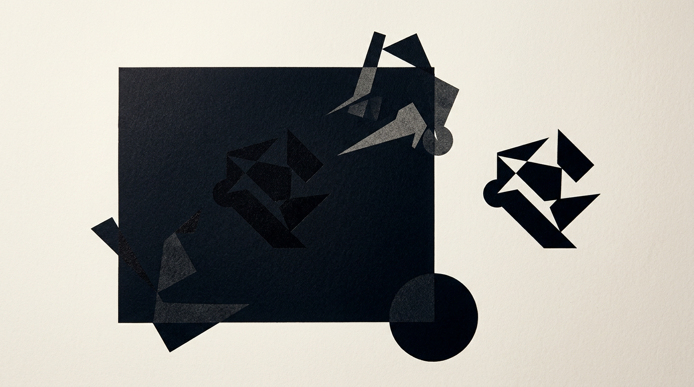
I have seen dozens of businesses trying to place a standard light-background PNG logo onto a dark website or a black t-shirt. The outcome is almost always terrible: invisible text, weird white edges, and an amateurish look. Flexible graphic assets require clear visual rules and technically adapted versions for dark environments.
Why does my logo look washed out or invisible on a dark background?
Your logo looks washed out because it was designed exclusively for light backgrounds without calculating contrast ratios for dark mode. When you place dark elements, such as navy blue or black text, on a dark gray or black background, luminance contrast drops far below the recommended 4.5:1 ratio. Proper creare logo design always includes a dedicated negative or pure white version from the start. Without this custom adaptation, graphic mark details get lost, and body text becomes unreadable from a meter away. The proper solution is not just an automatic color inversion in Photoshop, but a manual adjustment of every visual component so the overall optic weight remains balanced and clear.
What is luminance contrast and how does it affect my logo's readability?
Luminance contrast is the difference in perceived brightness between your background color and foreground elements. In professional design grafic, this ratio directly determines whether your logo can be scanned quickly on mobile screens or physical print materials. If you put a dark red icon on a black background, the contrast is often inadequate, around 3.1:1, creating eye strain. Human eyes react differently to light on dark surfaces: warm colors seem to bleed outward, while cool colors shrink. Without tweaking stroke weight and color saturation, your logo will appear distorted or thin on dark screens. An optimal contrast ratio for logo text is at least 7:1 for seamless legibility across all digital devices.
Do I have to pay extra for a dark mode or white version of my logo?
You should not pay extra if you originally purchased a full identitate vizuala package, because a negative version is an essential industry standard. A professional designer will provide all necessary visual variations within your brand guidelines at no additional cost. However, if you bought a cheap logo from an automated generator or an AI tool, you usually receive only a single JPG on a solid white background. In that scenario, adapting the asset for dark backgrounds requires a full vector reconstruction of the original graphic. This manual vector cleanup and optimization process takes 2 to 4 hours of design work and will incur additional service fees.
What should I do if my logo has gradients, drop shadows, or borders that look bad on black?
Special visual effects like dark drop shadows, realistic photorealistic gradients, or automatic stroke outlines must be removed or completely rebuilt for dark backgrounds. Shadows created for light surfaces turn into dirty gray smudges on dark mode, while gradients lose smooth color transitions due to digital compression. The technical solution is to simplify the vector geometry into a clean flat version. Instead of adding a thick white border around dark logo text, adjust the internal color palette: convert primary text to pure white while reserving accent colors for key brand symbols. This keeps your brand identity crisp while avoiding the cheap look of low-quality sticker outlines.
How can I check if my logo meets visual accessibility standards?
You can test your logo's visual accessibility using simple contrast measuring tools and vector analysis. International WCAG 2.1 guidelines define strict rules for legibility across digital interfaces.
Here are practical steps to verify your dark mode logo version:
- Measure the contrast ratio using a free online tool like WebAIM Contrast Checker and target at least 4.5:1.
- Scale the logo down to 16x16 pixels (favicon size) on a mobile screen to see if letters remain crisp.
- Convert the image to grayscale to ensure shapes retain visual separation without relying on color.
- Export the asset as SVG and test its rendering across dark theme settings on iOS and Android devices.
If your logo fails any of these tests, it requires immediate structural redesign.
What logo variations should I receive in a complete branding package?
A professional graphic design delivery must include a comprehensive master file matrix suited for every medium, from print collateral to digital apps. Missing specific layout files creates immediate friction for marketing execution.
A complete visual asset package must include:
- Primary logo version full color on light background in vector EPS, SVG, and transparent PNG formats.
- Secondary inverted version optimized color or white for dark backgrounds.
- Monochrome versions 100% black and 100% pure white for special printing, engraving, or screen printing.
- Compact mark or standalone icon for small scale display contexts.
- Brand guidelines documentation specifying explicit background color rules for each variation.
Review your delivered archive to ensure you possess all these necessary formats.
How does an unoptimized logo affect my website design and product packaging?
An unoptimized logo degrades your brand's visual credibility and lowers conversion rates on a modern site prezentare. In today's digital environment, a huge portion of web visitors browse with System Dark Mode enabled on mobile phones. If your logo appears inside an ugly white rectangle in the header, the overall user experience suffers instantly. On physical product packaging or print collateral, lacking a negative logo variation forces printers to use awkward white background boxes, ruining your premium packaging aesthetic. Furthermore, poor graphical rendering on screens can negatively impact visual search indexing, interfering with advanced geo-aeo-aio strategies for AI assistant visibility.
Can an existing logo be adapted for dark backgrounds without changing its identity?
Yes, an existing logo can be perfectly adapted for dark backgrounds through careful vector cleanup and visual rebalancing without compromising brand recognition. The process involves removing unnecessary noise that gets lost at small scales and crafting a dedicated Dark Mode asset. We maintain the original core symbolism while tweaking color values to pop on dark surfaces, giving your business a clean, modern aesthetic. In my freelance workflow, updating existing brand assets is a frequent service for clients modernizing their online presence. You can explore concrete design transformations in my design portofoliu to see how small technical adjustments preserve brand heritage.
Ce urmează?
If your logo loses readability on dark backgrounds or you only have a flat white JPG limiting your marketing campaigns, it is time to optimize your visual assets. I provide dedicated logo reconstruction, vectorization, and brand asset optimization services so your business looks professional on any screen or print medium. Visit the contact page to submit your current visual files. I will review your logo contrast for free and provide a clean, technical solution tailored for modern digital platforms.