5 min read
Why Are Grid Systems and Visual Hierarchy Essential in Design?
Discover how grid systems and visual hierarchy turn chaotic layouts into clear, structured, and high-converting design assets.
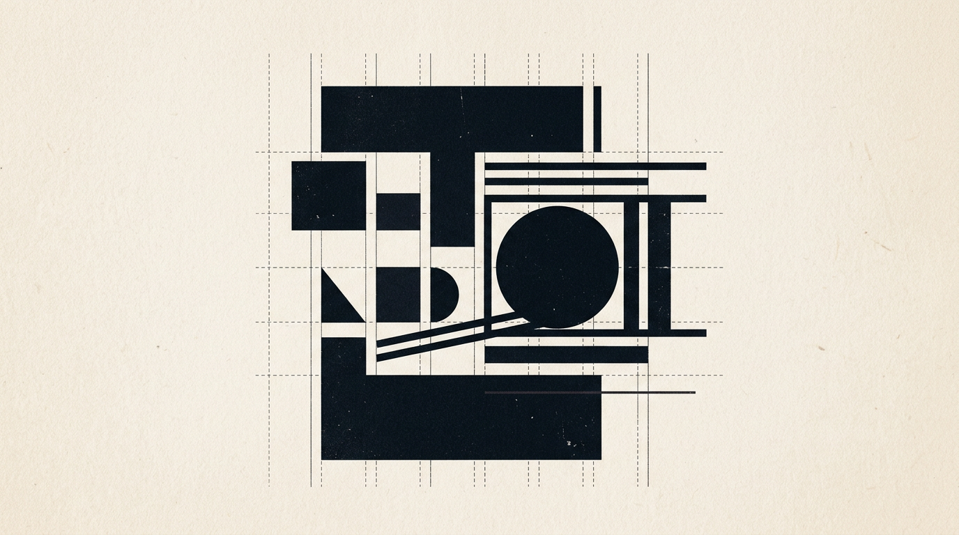
Effective design is not a random collection of pretty visual elements, but a calculated mathematical structure built to communicate a clear message. Grid systems and visual hierarchy control the precise sequence in me which the human brain processes information, turning visual chaos into an intuitive experience. As a freelance graphic designer, I use these core principles to craft everything from 50-page print catalogs to high-converting web interfaces.
What exactly is a grid system and why do I need one?
A grid system is an invisible structure composed of columns, rows, and gutters that organizes content across a page or screen. It does not restrict your creativity; instead, it provides a rational framework where visual elements can breathe naturally. Without a grid, a flyer or product label looks disorganized because the human eye instantly spots 2-3 pixel misalignments. When I work on a design grafic project, a modular grid allows me to place text, images, and action buttons in balanced mathematical proportions, such as the golden ratio. The outcome is a clean layout where prospective clients find key information in seconds without cognitive fatigue. A well-structured grid speeds up document scanning by up to 40%.
How does visual hierarchy help increase sales on a website or flyer?
Visual hierarchy guides the viewer's eyes directly toward the action you want them to take, prioritizing elements according to business value. If every item on a page shares the exact same size and color, nothing stands out. By strategically adjusting font sizes, color contrast, and white space, I establish a clear visual path: headline first, key benefit second, and call-to-action button last. For a site de prezentare, an impeccable visual hierarchy can double conversion rates by removing user friction. People do not read line-by-line; they scan pages in specific F or Z patterns. Hierarchy structures this scanning process, ensuring your core commercial offer hits the mark within 3 seconds.
What are the most common types of grids used in modern design?
Choosing the right grid system depends entirely on the medium and the density of information we need to organize effectively. The primary grid structures I use include:
- Single-column (manuscript) grid: best suited for books, essays, or long-form blog posts where linear reading flow is paramount.
- Column grid (4, 8, or 12 columns): the industry standard for web design and magazine layouts, offering flexible arrangement of images and text blocks.
- Modular grid: a network of columns and rows creating equal spatial units, ideal for complex product catalogs, menus, or data tables.
- Baseline grid: an invisible horizontal rhythm upon which all lines of body text rest, ensuring typographical alignment across columns.
Why do my print materials or packaging look unprofessional?
The root cause of an amateurish design is almost always a lack of strict grid alignment and cluttered layouts with no room to breathe. When auditing packaging or print collateral, I frequently notice text pressed against borders or 5 different font sizes crammed onto one panel. An improperly configured layout grid leads to awkward printing trims and a sense of visual imbalance. Furthermore, without clear typographic hierarchy (e.g., Title 24pt, Subtitle 16pt, Body 10pt), the reader's brain gets overwhelmed fast. Professional packaging relies on hierarchy to highlight the brand name from 2 meters away, product variation from 1 meter, and ingredient lists from 30 centimeters.
What concrete methods can create a strong visual focal point?
Establishing a focal point means crafting a visual magnet that commands immediate attention when someone views your brand asset. You can achieve this effect by applying several foundational techniques:
- Scale and size contrast: the largest element on the canvas will naturally be read first, regardless of placement.
- Color contrast: a pop of warm color (like vibrant orange or red) against a neutral background immediately draws the eye.
- Isolation via white space: surrounding a key graphic or statement with empty space makes it appear premium and critical.
- Directional cues: lines or subject gaze direction pointing directly toward your call-to-action or key value metric.
When designing a complete identitate vizuala, I leverage these exact techniques so your brand collateral consistently captures and holds audience attention.
Do grid systems also apply when creating brand logos?
Yes, geometric construction built upon a precise grid is the secret behind the world's most iconic and memorable brand marks. Even when a logo appears organic or freehand, using aligned circles, precise angles at 45 or 60 degrees, and modular grids imparts visual balance and optical harmony. When I execute a creare logo project, I use a grid system to define exact proportions between the mark and the logotype. This guarantees that your logo maintains absolute crispness whether scaled down to a 16x16 pixel favicon or blown up on a 6-meter outdoor billboard. Grid-based logos radiate reliability and professional quality.
Can we ever break the rules of grid and visual hierarchy?
Grid rules can certainly be broken, but only after you have mastered them completely and only with a deliberate strategic purpose. Breaking the grid creates instant visual tension and highlights an element by forcing it out of the expected pattern. For example, overlapping a card container over column margins or rotating a caption at an unexpected angle breaks editorial monotony. However, breaking rules randomly leads to pure chaos and unreadable layout design. In my client work, I apply intentional grid-breaking sparingly, around 5-10% of total composition area, to craft moments of surprise without compromising structure.
How can I test if my current design has a proper visual structure?
There is a simple diagnostic test you can run right now: the squint test. Step back one meter from your screen or printout, and squint your eyes until the visual details become blurry. If you can still clearly identify the main headline, product image, and call-to-action button, your hierarchy works. If everything merges into a uniform grey block, your visual structure has failed. Furthermore, for businesses looking to stay ahead in search, clean design hierarchy indirectly supports optimizare GEO / AEO / AIO by allowing AI web crawlers to better interpret information architecture.
What's Next?
If your promotional materials, packaging, or current site lack structural clarity, it is time for a strategic upgrade. Take a look at my past work in my portofoliu to see how these grid systems apply to real business challenges. Then, visit the contact page and send me your project details. Let us build a pixel-perfect design that delivers real, measurable results for your brand.