6 min read
Wordmark vs Symbol Logo: How Do You Choose the Right One?
A practical branding guide on choosing between a wordmark and a symbol logo, tailored to your business name, industry, and budget.
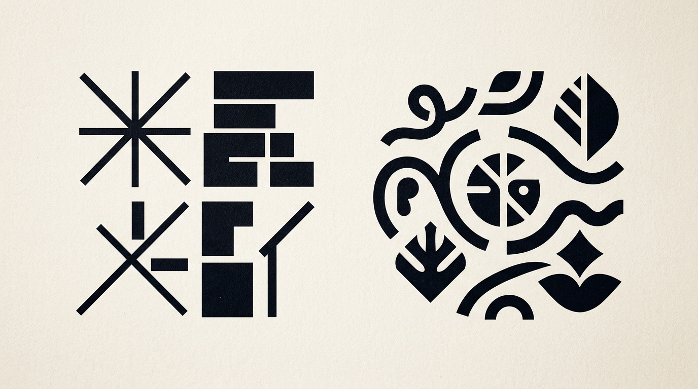
Choosing between a wordmark (text logo) and a symbol-based logo directly impacts how customers perceive your brand and how easily they remember you. There is no universally correct option, only the right choice for your specific business name, industry, and marketing budget. In this guide, I address the most common questions I get from clients before starting a branding project.
What is the main difference between a wordmark and a symbol logo?
The fundamental difference lies in how the brand message is visually delivered: a wordmark relies purely on typography, while a symbol logo uses a stylized icon alongside or above the name. A wordmark (like Google, Sony, or Coca-Cola) turns the business name itself into the core visual element through custom font adjustments, kerning, and unique letterforms. On the other hand, a symbol logo adds a distinct mark (like Apple, Nike, or Target) that can function independently from the text. This choice changes how people read and recall your brand. Building a cohesive visual identity requires deciding early on whether your business name needs a graphic icon or if it can stand strong on its own.
When is a text-only wordmark the best choice?
A wordmark is the ideal choice when your business has a short, distinct, and memorable name, or when you want to build immediate name recognition in a crowded market. If your initial marketing budget is focused on direct conversion, a text logo prevents confusion because customers read your exact name without having to decipher abstract imagery.
Here are concrete scenarios where a wordmark works best:
- Your brand name is short (under 10 characters) and easy to pronounce (e.g., Braun, Canon, Ray-Ban).
- You operate in a legal, financial, consulting, or premium sector where clarity and trust are paramount.
- You want 100% of your visual marketing efforts concentrated on fixing the brand name in the customer's mind.
- You don't have the advertising budget required to associate an abstract icon with a new brand name.
Investing in professional logo design focused on custom typography guarantees maximum legibility across all touchpoints.
When do I definitely need a symbol or icon in my logo?
You definitely need a symbol when your business name is long, complex, or generic, or when you plan to expand internationally across different language barriers. A graphic symbol acts as a quick visual anchor in extremely restricted spaces, such as mobile app icons, social media avatars, or small product packaging.
A symbol becomes essential in the following cases:
- The business name consists of three or more words or generic descriptive terms.
- Your physical products require engraving, stamping, or embroidery on small surfaces (e.g., apparel, jewelry, tools).
- You want to visually communicate a core value or metaphor (speed, growth, security) instantly before the user reads the text.
- You need a versatile graphic element for favicons, app icons, and social profile pictures.
What works better for a brand new business or startup?
For a brand new startup or local business, a wordmark or a combination mark (text + symbol) is almost always more effective than a standalone symbol. A standalone abstract icon requires massive advertising spending for consumers to associate the graphic with your name. When launching a new company, your primary goal is for customers to remember your exact name so they can search for you online. A well-designed text logo removes visual friction and communicates directly who you are. As the company grows, you can easily extract a standalone mark or monogram from your visual system for packaging and secondary uses.
How does the logo type affect my website design?
How your logo behaves on screen directly affects user experience on a modern presentation website. A horizontal wordmark integrates seamlessly into a navigation header because it takes up minimal vertical space, keeping the menu compact on both desktop and mobile screens. Conversely, a tall symbol logo forces the header to expand, pushing key content down the page. Furthermore, in today's search landscape, having a well-structured visual identity supports clear brand recognition. Implementing GEO / AEO / AIO optimization works hand-in-hand with clean design: search engines and AI assistants can validate brand consistency across all digital touchpoints more efficiently when your visual assets are clear and structured.
What happens when printing the logo on packaging or print materials?
Physical production introduces strict technical limits that a poorly designed logo will fail to meet. A wordmark with ultra-thin lines or an icon with complex gradients can become impossible to print cleanly on corrugated packaging, screen-printed tote bags, or small promotional items. Professional graphic design accounts for these manufacturing constraints right from the concept phase.
Key technical factors to consider include:
- Scalability: Fine details in an icon disappear when scaled down to 1 cm on a pen.
- Print color limits: Complex gradients increase costs when printing with spot colors (Pantone) or screen printing.
- Monochrome performance: A solid logo must work perfectly in pure black and white for laser engraving, blind debossing, or foil stamping.
Can I combine a text logo with a symbol and use them separately?
Yes, this is the modern standard known as a responsive logo system. Rather than restricting your brand to a single static file, the designer creates a flexible set of brand assets tailored for different contexts and sizes.
A complete responsive set usually includes:
- Primary Combination Mark: The icon and text positioned together, used on official documents, signage, and brochures.
- Horizontal Layout: Optimized for website navigation bars and digital ad banners.
- Standalone Symbol (Icon): Used for Instagram profile pictures, app icons, and favicons.
- Monogram or Submark: A circular or stacked arrangement of initials, perfect for packaging stickers, stamps, or social media tags.
How much does each logo type cost and how long does it take?
The cost and timeline depend on research depth, typography customization, and delivered brand assets—not simply whether the logo is a wordmark or a symbol. A seemingly simple text logo often requires dozens of hours of manual typographic tweaking (lettering, kerning, vector cleanup) to make it unique and legally protectable. On average, developing a professional logo takes between 2 to 4 weeks. Prices for a complete identity package start around €400 – €800 for small businesses and can reach several thousand euros for brands requiring full brand guidelines, brand architecture, and print-ready production files.
What's Next?
If you're unsure which logo style fits your business goals best, the easiest step is to evaluate your brand name and print/digital requirements together. Take a look at my portfolio to see real-world examples of wordmarks and symbols created for clients across various industries. When you are ready to build a distinct and long-lasting visual brand, reach out via the contact page for a direct, straightforward conversation.