6 min read
Wordmark vs Symbol Logo: How Do You Choose the Right One?
Learn whether your business needs a wordmark text logo or a graphic symbol. A practical guide covering costs, examples, and production rules.
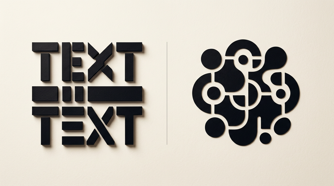
Choosing between a purely text-based logo and one accompanied by a graphic symbol directly impacts how customers remember your brand. It is not a purely aesthetic decision, but a strategic one, determined by your name length, marketing budget, and the physical or digital media where the visual will be used.
What is the fundamental difference between a text logo and a symbol logo?
The main difference lies in how your audience identifies your business: a text logo (wordmark) relies on custom typography to communicate the name, while a symbol logo uses a icon or abstract shape to anchor the identity. A professional creare logo process analyzes whether your business name needs immediate clarity or a metaphoric representation. Text logos like Google, Sony, or Braun work directly because the name itself is the core message. On the other hand, standalone symbols like Apple or Nike required decades and millions of dollars in advertising to achieve instant recognition without text. If your business has a short and distinct name, a wordmark saves time in building awareness. If the name is generic, a well-crafted graphic symbol can deliver necessary market differentiation.
When is a text-only wordmark the right choice for a new brand?
A text-only logo is the ideal choice when your business is new and you need every single customer touchpoint to fix your company name in the client's memory. Adding an abstract symbol to an unknown brand can distract from the name itself, making recall harder.
A wordmark is strongly recommended in the following practical scenarios:
- Your company name is under 8 letters and easy to pronounce (e.g., Coca-Cola, Canon, Ray-Ban).
- Your launch budget is limited and does not support massive campaigns to pair an abstract symbol with the name.
- You operate in a sector where simplicity signals high professionalism, such as legal, consulting, or architecture.
- The business name already includes a descriptive keyword explaining what you do.
When is it worth investing in an abstract or figurative symbol logo?
Investing in a symbol logo makes sense when you have a long name, plan to expand into international markets, or need a strong visual emblem for product packaging and digital icons. Developing a complex mark requires a well-structured identitate vizuală system where the icon acts as a quick visual anchor. For example, a symbol works exceptionally well as a social media avatar or app icon, where space is restricted to 32x32 pixels. Furthermore, a graphic symbol allows for an extended brand universe across packaging, workwear embroidery, or outdoor signage. If your business name is difficult to translate across foreign languages, a universal graphic mark overcomes language barriers without relying on text reading.
Does a text logo work equally well on a mobile phone screen?
A long text logo does not perform efficiently on small mobile screens unless it is engineered with a responsive design system. On a smartphone screen with a 375-pixel width, a 12-character text logo becomes illegible when placed inside the navigation header of a site-prezentare. The technical solution is not discarding the text logo, but designing responsive variants like a monogram or favicon mark (a shortened initial-based version). For instance, your brand maintains its full wordmark on desktop sites and formal contracts, but displays a clean single-letter icon in a 40x40 pixel frame on mobile screens. Proper design planning establishes these scalable assets right from the initial sketching phase.
How much does physical production cost for a complex symbol vs. a simple text logo?
Physical production for a simple text logo is significantly cheaper and easier to manage over time compared to a logo featuring a complex symbol with gradients or micro-details. Printing, engraving, and embroidery costs depend directly on color counts and vector line complexity.
Practical cost differences appear across these manufacturing channels:
- Apparel Embroidery: A symbol containing gradients or lines thinner than 1mm increases stitch counts, raising unit production costs by 30–50%.
- Screen Printing & Vinyl Cutting: Text logos with solid letterforms require single stencils and cut rapidly with minimal material waste.
- Laser Cutting / 3D Signage: Symbols with multiple separated pieces require significantly longer CNC router time and manual assembly.
- Comprehensive design grafic services prepare print-ready vector files specifically to eliminate unnecessary print shop fees.
Can I combine a text logo with a symbol later as my business grows?
Yes, the most versatile layout in branding is a combination mark, which pairs a graphic symbol with typographic text. Many prominent brands started with a clean wordmark to establish name recognition, later integrating an icon or isolating a mark from their typography. Looking at real cases in my portofoliu, building a modular brand system allows you to use elements together or separately based on medium. On formal invoices and letterheads, you can apply the full horizontal lockup (symbol + text), while on small box packaging, tape, or app icons, you can display only the standalone mark. This approach provides total visual adaptability without requiring a full rebrand later.
How does logo type selection affect AI models and visual search engines?
Your logo style directly impacts how computer vision algorithms and AI search engines index and identify your brand assets online. Text logos are parsed instantly by OCR (Optical Character Recognition) engines, whereas an abstract symbol requires precise metadata and consistent image tagging to link back to your business name. In modern optimizare GEO / AEO / AIO workflows, alignment between your icon, text typography, and image ALT tags ensures correct entity mapping across AI-driven discovery platforms. If you publish an untextured abstract mark on product photos without explicit text tagging, AI algorithms are far less likely to attribute those visuals to your brand name.
What common mistakes do business owners make when choosing between text and symbol?
The most frequent mistake is choosing a logo solely based on personal aesthetic taste without calculating how that logo renders on real products. Founders often request an overly detailed symbol that attempts to tell their entire company backstory, resulting in a cluttered illustration that turns into a blurry blob at small sizes. Another common error is choosing a text logo using an unaltered, popular free font without custom kerning or modified letterforms, which leaves the brand looking generic and hard to trademark. Finally, forgetting to create solid monochrome and single-color vector variations creates immediate bottlenecks when printing on stamps, pens, or recycled corrugated cardboard.
What's next?
Deciding between a text logo and a graphic symbol shouldn't be left to guesswork or template generators. Every business needs a practical audit of its brand name, industry standards, and intended production materials. If you want to build a clear, scalable, print-ready brand identity, visit my contact page and send me your project details for a direct evaluation.