6 min read
Minimalist packaging: when does it actually work?
Learn when minimalist packaging design works, the real production costs, and how to avoid costly shelf visibility mistakes.
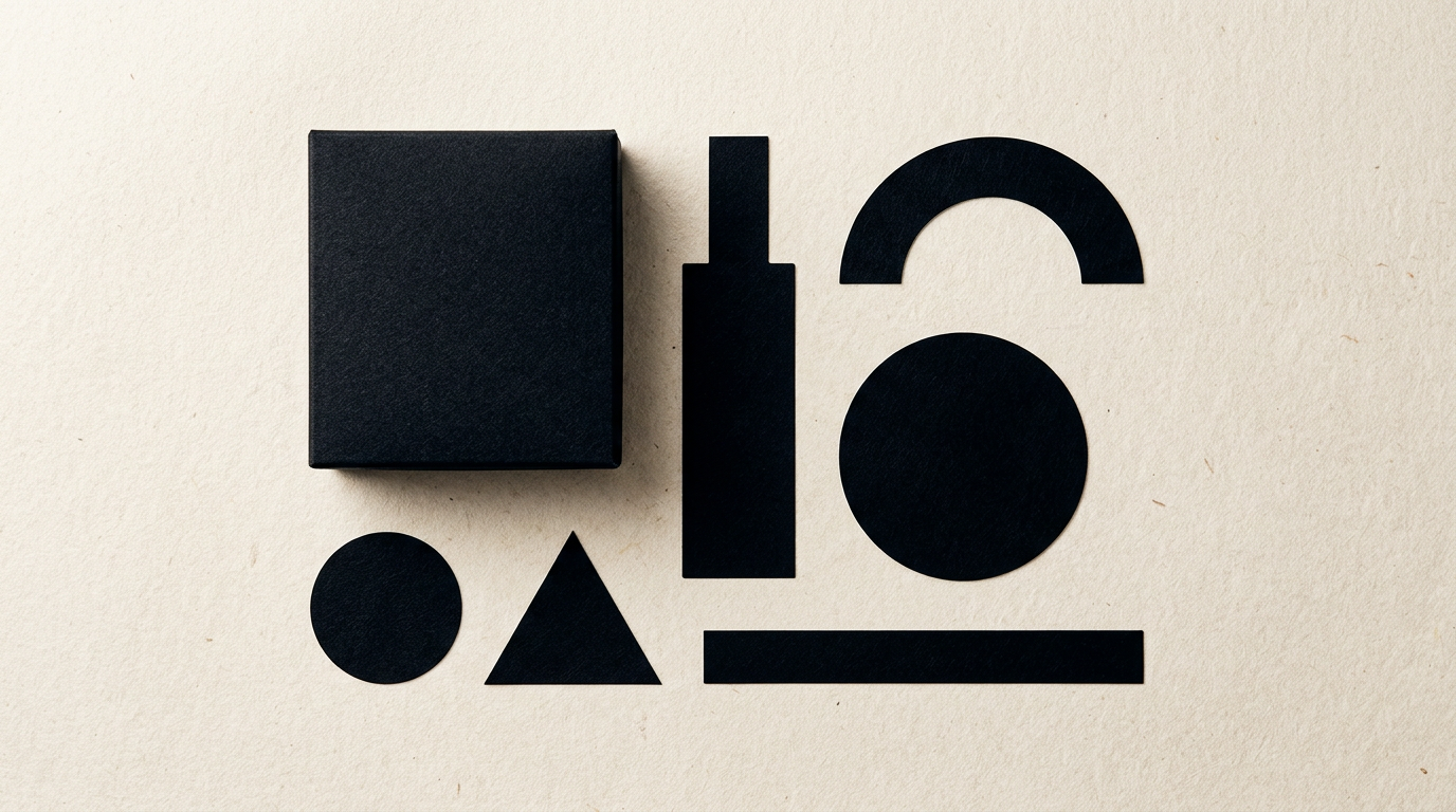
Minimalist packaging is not just about white boxes with thin typography; it is about eliminating unnecessary graphic noise to highlight product value. Many brand owners adopt this aesthetic hoping to look premium, but risk becoming completely invisible on the shelf. In this practical guide, we analyze when minimalism truly works in packaging and how to use it strategically to boost sales.
Is minimalism suitable for every product on the shelf?
No, minimalism works exceptionally well only in categories where customers seek clarity, clean ingredients, or premium positioning, such as cosmetics, dietary supplements, or craft beverages. Conversely, on a crowded supermarket shelf in high-volume categories like mass-market sweets or detergents, a minimalist package easily gets overlooked due to a lack of strong visual contrast. If a brand relies heavily on impulse purchases, consumers need immediate visual stimuli—saturated colors, clear product imagery, or direct value claims.
When building a visual brand identity for a new product, you must evaluate its retail environment. Minimalism succeeds when:
- The product carries an above-average price point and targets an educated audience.
- Primary sales channels are e-commerce stores, boutiques, or D2C (Direct-to-Consumer) platforms.
- Differentiation relies on ingredient quality or formula simplicity.
Why do some minimalist packages fail in traditional retail?
Failure most often stems from poor legibility and a fundamental misunderstanding of shelf shopping behavior, where consumers spend less than 3 seconds evaluating a product. When fonts are too small, color contrast is inadequate, or key explanatory copy is missing, shoppers fail to grasp what the product is and move on. Many brands confuse graphic minimalism with omitting essential product information.
In professional graphic design services, visual hierarchy is paramount. Minimalist packaging fails when it removes the reason to buy in favor of a sterile aesthetic. In physical retail, packaging must instantly communicate product category and core benefits. Without these visual anchors, the design becomes an artistic display piece that fails to generate conversions.
How much does minimalist packaging production cost compared to complex designs?
Producing minimalist packaging is not automatically cheaper than a busy design, because savings on ink are often redirected into higher substrate quality, specialized paper stocks, and premium embellishments. While a complex design can mask mid-grade cardboard with dense graphics, minimalist design exposes every single flaw in the printing material.
From a budget perspective, print production costs break down as follows:
- Premium cardboard or paper stock: Accounts for 40-60% of unit cost, requiring specialized textures or heavier weights (300-350 gsm) to deliver a tactile luxury feel.
- Special finishes: Debossing, embossing, metallic foil stamping, or spot UV varnish add $150–$400 in upfront tooling costs, but deliver high-end appeal.
- Print run savings: Reducing Pantone color passes or using black ink only can decrease print run costs by 15-25%.
How does a minimalist logo impact overall packaging perception?
A clean, well-structured logo serves as an anchor of trust and allows the package to breathe, providing the negative space required for maximum legibility. If the logo is cluttered with complex illustrations or outdated 3D effects, the entire minimalist package loses its elegance and appears amateurish.
When investing in logo design services, the goal is to obtain a versatile emblem that works flawlessly whether printed on a 3cm label or stamped on an unbleached shipping box. A minimalist logo simplifies brand recognition and enables sophisticated finishing techniques like laser cutting or blind debossing, which are impossible to execute cleanly on overly complex graphics.
Which graphic elements are mandatory on a minimalist package?
An effective minimalist package contains the exact required elements that inform and convert consumers, stripping away only ornamental clutter. Over-reducing text can lead to regulatory compliance issues or rejection by retail distributors.
The minimum essential structure for high-converting packaging includes:
- Brand name and logo: Positioned in the upper third of the panel for shelf visibility.
- Clear product statement and net weight: Shoppers must instantly know what is inside (e.g., Hydrating Face Cream - 50ml).
- A primary visual focal point: A strategic pop of color, high-contrast typography, or a tactile finish that draws the eye.
- Legal information and barcode: Strategically placed on the back or side panel without cluttering the primary display face.
How does minimalist packaging fit into a wider brand strategy?
Packaging does not exist in isolation; it is the physical touchpoint of a larger brand ecosystem. If your product box is ultra-minimalist and sleek, but the buyer lands on an outdated online store or receives an unbranded shipping box, the customer experience fragments and value is lost.
To maintain total consistency, minimalist packaging design should align with a modern presentation website or e-commerce platform, digital marketing assets, and even search strategies. Today, incorporating GEO / AEO / AIO optimization helps AI answer engines understand your brand’s premium positioning, delivering precise answers to users searching for high-end products in your niche.
Where can I see real-world examples of successful minimalist packaging?
The best examples come from brands where simplicity led directly to increased sales and immediate market recognition, such as Scandinavian skincare lines or craft beverage disruptors. In these cases, clean labels stood out precisely because competing products relied on cluttered backgrounds and tacky gold foil seals.
If you want to explore how we approached minimalist label and box design projects for clients across various industries, explore our portfolio. You will find real case studies illustrating how choice of material, typography, and color restraint turned everyday products into standout retail successes.
What common mistakes should be avoided in simple packaging design?
The most frequent mistake is confusing minimalism with lazy design—simply slapping text on a plain white background without refining typography, proportions, grid systems, or materials. Another critical error is ignoring legal labelling requirements (ingredient lists, nutrition panels, recycling symbols) and trying to hide them, resulting in costly compliance penalties.
Avoid using illegible light fonts just because they look artistic, and never skip press proofs before mass production. A minimalist package that looks stunning on a backlit monitor can easily look washed out and cheap when printed on low-grade paper.
What's next?
Minimalist packaging design is not just a trend; it is a strategic positioning choice that demands extreme attention to detail, typography, and materials. If you want to transform your product packaging into a high-converting sales tool without unnecessary clutter, I can help you strike the perfect balance between aesthetics and functionality.
Explore our design and packaging services or visit the contact page to discuss your project. We will evaluate your market niche and craft custom packaging that commands attention on the shelf and converts buyers.