5 min read
Minimalist Packaging Design: When Does It Actually Work?
Discover when minimalist packaging drives sales and when it risks looking cheap. Practical rules on print, typography, and material execution.
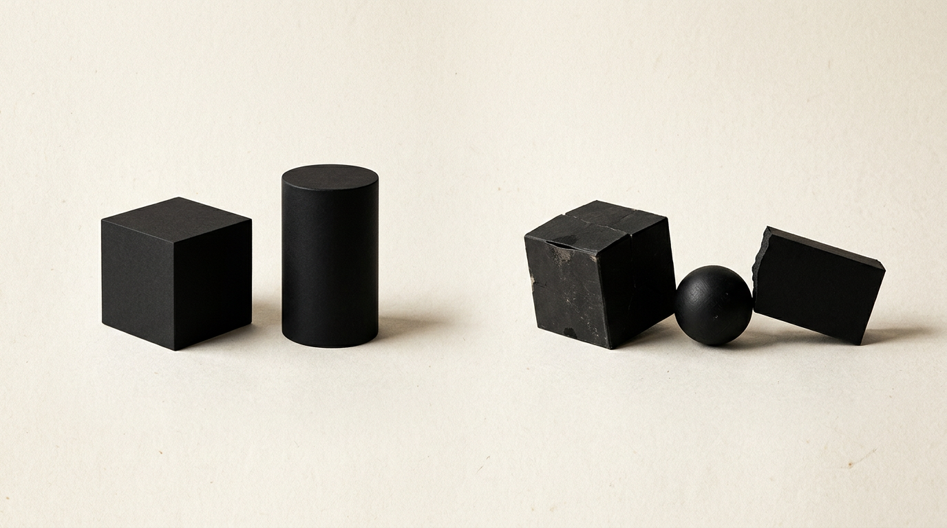
Minimalist packaging design is not just about using less ink on a white box; it is about eliminating visual noise to highlight the true value of your product. A successful minimalist package quickly communicates premium quality, sustainability, and clarity, but when applied incorrectly, it can make a promising product invisible on the shelf. From cosmetics to craft beverages, here is how this strategy works in practice.
Why is minimalist packaging so popular?
Minimalism works because it reduces the buyer's visual processing time to under 3 seconds. Consumers are bombarded daily with thousands of advertising messages, and a clean box with balanced typography and generous white space captures attention through direct contrast with the surrounding clutter. By stripping away unnecessary decorative elements, the core message—what the product is and who it is for—becomes crystal clear. Furthermore, minimalism frequently conveys a perception of high quality and sustainability. When a brand is confident in its product formula or materials, it does not feel the need to cover the package with exaggerated claims or chaotic graphics. A properly structured layout integrates seamlessly into a cohesive visual identity, boosting shelf conversion rates by 20–30% in premium categories.
Which industries benefit most from minimalist packaging?
Minimalist packaging excels in industries such as cosmetics, personal care, dietary supplements, artisanal foods, and tech accessories. In these sectors, customers actively seek purity, clean ingredients, and transparency—attributes visually communicated through simple lines and restrained color palettes. For instance, a frosted glass bottle with a clean white label and a professional logo design instantly signals luxury care. Additionally, in e-commerce, minimalist outer packaging elevates the unboxing experience, making it memorable without being overwhelming. However, minimalism is less effective in mass-market categories aimed at children or budget cleaning products, where bright colors and busy illustrations still dominate impulsive buying decisions.
When does minimalist packaging risk looking cheap or incomplete?
Minimalist packaging looks cheap when simple design is not backed by high-quality materials and precise finishing. Minimalism removes decorative distraction that usually hides manufacturing defects, meaning every remaining element is scrutinized. If you use flimsy, low-grade cardboard or low-resolution printing, the lack of graphics will highlight those flaws rather than hide them. A successful minimalist graphic design project relies on:
- High-density textured papers or heavy recycled cardstock (above 300gsm).
- Special finishing touches such as foil stamping, embossing, or spot UV varnish to create tactile contrast.
- Impeccable typography with kerning and layout calculated to the millimeter.
- Carefully selected complementary color palettes without cheap gradients or harsh combinations.
How can minimalist design reduce printing costs?
Minimalist design directly lowers production costs by optimizing color count and reducing ink consumption. Instead of paying for full CMYK process printing across entire surfaces, you can use just 1 or 2 spot Pantone colors, significantly lowering unit print costs. You also save money by simplifying die-cut lines and eliminating unnecessary plastic laminations. An intelligently designed package can be printed directly on natural kraft or uncoated white cardstock, achieving an eco-elegant look at a fraction of the cost of complex multilayer boxes. Furthermore, simple vector files speed up prepress setup and reduce printing error rates, resulting in faster turnaround times and minimal material waste.
What graphic elements are strictly necessary on a minimalist box?
On a minimalist box, you should retain only the essential elements required to inform the buyer and meet regulatory standards. Negative space is an active design element, not wasted space, so every visible detail must serve a clear purpose. Essential components include:
- Brand name and graphic mark aligned with your overarching brand strategy.
- Clear product name and primary statement of intent (e.g., "Hydrating Hyaluronic Serum").
- Net weight, volume, and required legal details (ingredients, barcode, batch number, manufacturer).
- A scannable QR code linking directly to a dedicated presentation website where customers can explore the full story behind the product.
Is minimalism suitable for new brands with low awareness?
Yes, but only if the product features a distinct niche positioning and an easily digestible unique selling proposition. For a brand without existing market recognition, the packaging must perform all the heavy lifting in seconds. If the design is so abstract that buyers cannot immediately grasp what is inside, the product will be ignored. The solution is pairing visual minimalism with absolute textual clarity. Instead of cryptic slogans, use direct claims and a strong visual hierarchy. Check my portfolio to see how emerging brands stand out alongside industry giants at retail through precise, minimalist execution.
How do you stand out on the shelf with a minimalist design?
To stand out in a sea of generic white boxes, you must leverage structural shape, material texture, and intentional contrast. Modern minimalism is no longer just black Helvetica on a plain background, but a strategic use of space and tactile experience. To stand out effectively, consider these tactics:
- Employing custom structural box shapes or innovative opening mechanisms.
- Introducing a single high-contrast accent color on a monochromatic surface.
- Enhancing tactile engagement through deep debossing or blind embossing.
- Incorporating precise die-cut windows that let the product's natural texture become part of the design.
What common mistakes should be avoided in minimalist packaging?
The biggest mistake is confusing minimalism with lazy design or a lack of content. Simple design requires ten times more technical precision and conceptual rigor than a busy layout. Avoid these critical mistakes:
- Poor legibility: using ultra-light fonts or font sizes under 6pt that shoppers cannot read under store lighting.
- Omitting mandatory compliance info or crowding legal text into an illegible corner block.
- Neglecting visual search visibility and modern search discovery, which are tied to comprehensive GEO / AEO / AIO optimization.
- Cutting corners on material substrate: minimalist graphics on low-quality corrugated cardboard look like an unmarked shipping parcel.
What's next?
If you want to turn your product packaging into a powerful sales channel through deliberate minimalism, start with an audit of your current line. Minimalist packaging delivers results only when tailored specifically to your target audience and production budget. Head over to the contact page to discuss your packaging project, whether you are launching a new product line or planning a complete brand refresh.