5 min read
Minimalist Packaging: When Does Simple Design Actually Work?
Practical guide to minimalist packaging: when it works, how it cuts print costs, and how to avoid making your product look cheap or unfinished.
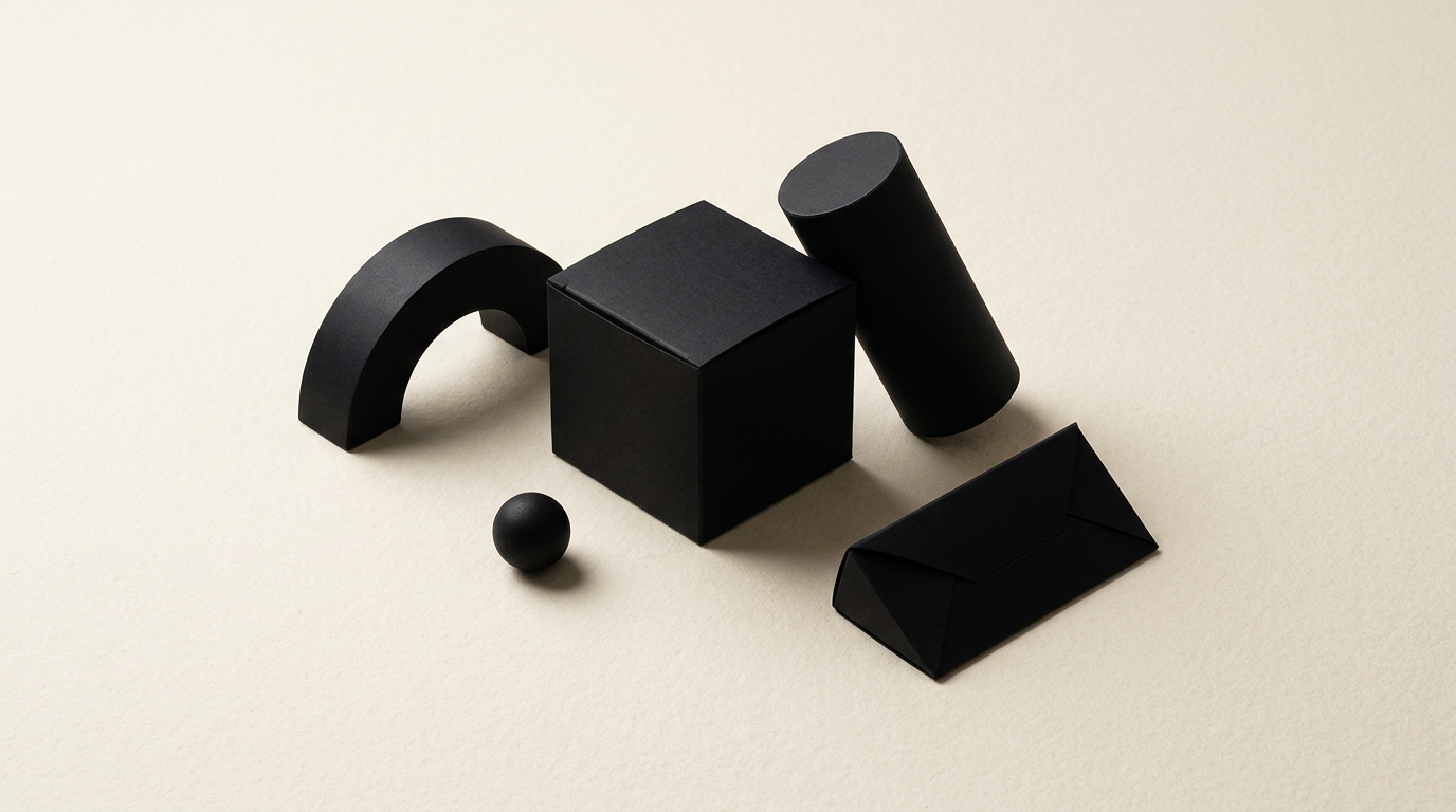
Minimalist packaging is not just about using less ink on a white box, but about removing unnecessary graphic noise to highlight the true essence of a product. Simplifying your packaging works exceptionally well in overcrowded markets, but it can backfire if done without a clear understanding of your target audience. Below, I answer the most frequent questions from my experience working on packaging and branding projects.
When is minimalist packaging the right choice for a product?
Minimalist packaging is the right choice when selling a premium, cosmetic, artisanal, or tech product where the quality of materials or ingredients speaks for itself. A clean design conveys transparency and trust, eliminating visual clutter that exhausts shoppers. If you already have a well-defined minimalist logo and visual identity, clean packaging will strengthen your brand's mature perception. It works seamlessly in e-commerce, where product photos must remain clear and readable on mobile screens. However, if you are selling a low-cost item in a mass-market retail category where shoppers expect bright colors and discount badges, overly quiet packaging might get overlooked or misinterpreted as a cheap, generic white-label product.
Does minimalism reduce production and printing costs?
Yes, in most cases minimalist design significantly reduces printing costs by eliminating complex full-color processes and reducing ink coverage. Using just 1 or 2 Pantone colors or printing directly onto unbleached recycled cardboard lowers raw material usage and press setup time.
Here is where you save money and where you should reinvest:
- Savings come from fewer print runs and avoiding costly heavy ink coverage over large surfaces.
- You cut costs on file preparation for large-scale production through cleaner graphic design.
- You reinvest part of those savings into textured premium paper stocks or tactile finishes like foil stamping.
- You elevate the unboxing experience by turning simple cardboard into a high-end tactile interaction.
Do I risk my product looking cheap with a minimalist design?
The risk only exists if you confuse minimalism with a lack of effort or if you compromise on material quality. Minimalist packaging fails when printed on thin, glossy, generic cardboard with poorly chosen typography. For minimalism to convey luxury, every remaining detail on the box must be executed flawlessly. Kerning, text alignment, paper weight, and box proportions become ten times more visible when there are no busy illustrations or photos to hide mistakes. When delivering custom packaging work, I focus heavily on negative space and strict visual hierarchy. Successful minimalist packaging looks intentional, precise, and expensive, never incomplete.
How does minimalist packaging help differentiate on crowded shelves?
Minimalist packaging differentiates a product by creating a visual pause amidst a sea of packaging covered in loud gradients, product photos, and promotional badges. When ten competing brands use saturated colors and heavy graphics, a clean design with a solid background and clear typography instantly becomes an eye-catching focal point. This is the effect of contrast through simplicity. Consumers quickly scan and process key information without dealing with visual fatigue. This clarity translates equally well to a business presentation website or online store, where minimalist packaging stands out sharply against clean product listing backgrounds.
What mandatory technical information must be kept on minimalist packaging?
You must retain all legal and safety information required by industry regulations, but you can structure it intelligently across the packaging panels. Minimalism does not mean ignoring compliance, but rather reorganizing information so the front face remains uncluttered.
Information is typically distributed across packaging panels as follows:
- Front Panel: Brand name, clear product title, net quantity, and main product benefit in one or two words.
- Side and Back Panels: Ingredients list, nutritional facts, barcode, manufacturer details, and recycling symbols.
- Interior Panels: Usage instructions or brand story printed on the inner box flaps.
- QR Codes: Directing consumers to a dedicated web page for extended technical details.
How does minimalist packaging integrate with an existing visual identity?
Minimalist packaging integrates as a natural extension of your brand guidelines, retaining core brand markers while stripping away secondary ornamentations. If your identity relies on a broad color palette, you can assign a single dominant color per product line on the package. The focal point remains the clean vector version of your logo and primary brand typography. You can review my portfolio to see how properly designed packaging carries brand equity without cluttering the printed surface. Minimalist packaging does not reinvent your brand; it distills its identity into its purest visual form.
Why do some brands fail when trying to adopt a minimalist style?
Most failures happen when a brand removes essential consumer information purely for aesthetic reasons. If a buyer cannot figure out in two seconds what the product is, how to use it, or who it is for, the design has failed—no matter how trendy it looks in photos. Another common mistake is ignoring digital discovery; in the context of visual search and AI technologies, products must remain clearly recognizable and indexable. Applying proper GEO / AEO / AIO optimization ensures that your minimalist products are accurately interpreted and recommended by virtual assistants and AI search engines based on structured site metadata.
What typography and special finishes work best for minimalist packaging?
In minimalist packaging, typography acts as the hero visual element, making clean geometric Sans-Serif fonts or high-contrast Serifs the safest and most effective choices. Because you aren't relying on bright illustrations, the letterforms carry the aesthetic weight. Special finishes like spot UV varnish over matte lamination, hot foil stamping in subtle metallic tones, or debossing add incredible tactile depth. When you pair crisp typography with uncoated 350gsm paper stock and a subtly debossed logo, you achieve a luxury packaging feel that requires zero extra embellishment.
What's next?
If you want to launch a new product or simplify your existing packaging without losing retail impact, it is time to analyze your brand structure. From initial graphic concepts to print file preparation and paper stock selection, thoughtful design saves production costs while boosting perceived value. Send me a message through the contact page, and let's discuss your specific packaging requirements.