5 min read
Food Packaging: How to Balance Appetite and Trust on the Shelf?
Learn how color psychology, visual hierarchy, and technical food packaging design can increase shelf sales by over 30%.
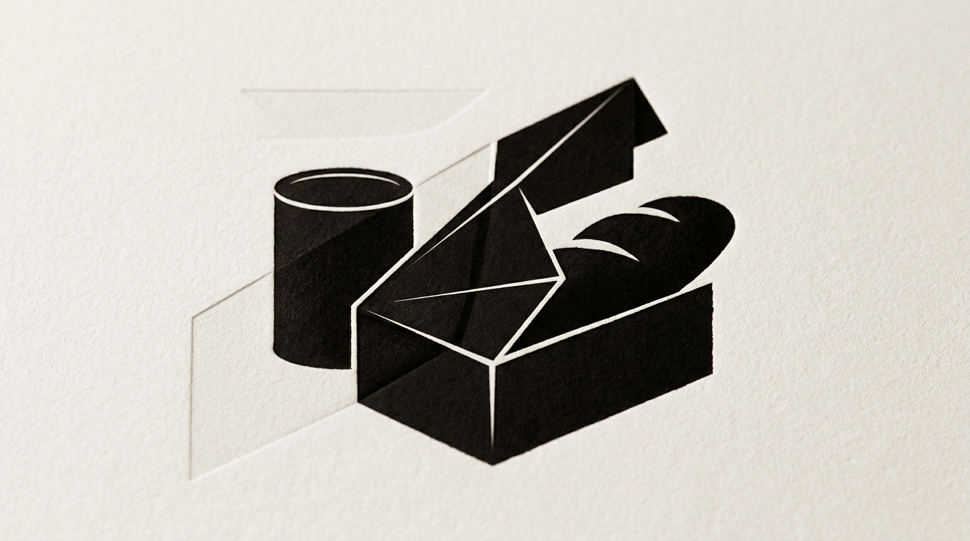
Food packaging has only 2 seconds on the supermarket shelf to convince a shopper to put it in their basket. A successful product design combines visual appetite stimulation with the transmission of safety and premium quality. The right adjustment of colors, typography, and print finishes can increase shelf sales by over 30%.
How do packaging colors influence shopper appetite?
Colors trigger direct and instantaneous psychological reactions in the human brain before the label is even read. Warm shades like red, yellow, and orange stimulate metabolism and increase appetite, making them heavily used across the fast-moving food industry. Green communicates freshness, natural origin, and organic ingredients, while brown or earthy tones suggest an artisanal, handcrafted process. Blue is rarely used for foods because it suppresses appetite, but it works exceptionally well for mineral water, frozen items, or low-fat dairy. When I work on design grafic services for packaging, I use high-contrast color combinations to guarantee legibility at a distance of 1.5 meters from the shelf. Contrast between text and background must exceed 70% for maximum visual impact.
What graphic elements build trust on food packaging?
Trust is built through information transparency, clear visual hierarchy, and high-quality print finishes. Modern shoppers are skeptical and quickly scan the back label before purchasing. To convey safety and quality, food packaging should include:
- Clear recipe and ingredient lists typed in a minimum 6–8pt legible font without clutter.
- Transparent cutout windows in foil or cardboard that allow shoppers to view the actual product.
- Clear certifications (Organic, Non-GMO, Gluten-Free, ISO) placed on the front face as simplified icons.
- A QR code pointing shoppers to a site-prezentare with details about ingredient sourcing.
Building trust means never hiding technical data behind unreadable fonts or low-contrast backgrounds.
How can I lower print costs without sacrificing visual quality?
Print costs can be significantly reduced by optimizing the number of spot colors (Pantone) and selecting standardized die-cut shapes. Using a well-calibrated CMYK color space eliminates the need to pay for extra printing plates for Pantone shades, saving up to 25% of production budgets on large print runs. Additionally, designing packaging to fit standard printer sheet dimensions cuts cardboard or film waste by 15–20%. Another effective method is applying self-adhesive labels to generic outer packaging for small batches, saving special finishes like spot UV or foil stamping for primary branding elements.
Is it necessary for packaging to reflect the brand's entire visual identity?
Yes, food packaging is the main physical touchpoint between a brand and its consumers, and it must be fully aligned with the company's visual architecture. If a product packaging looks completely disconnected from online ads or the brand website, shoppers experience cognitive friction. Packaging inherits core elements such as secondary fonts, brand colors, and a properly positioned creare logo. When I build a complete identitate-vizuala system, I provide a clear brand guide specifying clear space rules, minimum logo sizes for small labels, and adaptations across various materials.
What major design mistakes can ruin food product sales?
The most common mistakes occur when trying to cram too much information into a small surface or selecting improper packaging materials. Critical design errors that push customers away include:
- Overcrowding the front packaging face with lengthy text, multiple taglines, and competing visuals.
- Unrealistic photo editing on food imagery, creating a massive gap between the picture and the actual product inside.
- Low contrast between body text and background, making nutritional tables unreadable under store lighting.
- Selecting weak materials that crumple, lose structural shape, or allow internal oil to stain the outer cardboard.
- Omitting the legally required space for EAN-13 barcodes, which leads to retail rejection.
How does product photography help on packaging, and what are the alternatives?
Appetizing product photography increases conversion rates by up to 40%, but it must be executed flawlessly. Professional food styling photos focus on texture, freshness, and juiciness. However, if budgets do not support a professional food shoot, custom vector illustrations or hyper-realistic 3D renders serve as great alternatives. Custom illustrations work exceptionally well for organic items, craft sweets, or award-winning beverages, adding a human touch and standing out from competitors using generic stock photos. The key is ensuring the graphic representation remains truthful to the physical product inside.
How does physical packaging connect to online marketing and AI optimization?
Physical packaging now serves as a bridge to a brand's digital ecosystem through interactive features like QR codes and smart batch numbers. When a buyer scans the package code, they arrive at an optimized page featuring recipes, preparation videos, or supply chain certificates. To get your brand recommended by visual search engines and AI assistants, applying geo-aeo-aio optimization strategies to product pages is essential. This allows AI platforms to accurately pull structured data regarding ingredients, nutritional values, and allergens to present to users searching online for food recommendations.
How long does food packaging design take from concept to print?
A professional food packaging design project typically takes between 3 to 6 weeks, depending on product range complexity. Market research and competitor analysis take about one week, followed by the development of 2-3 initial design concepts during week two. Once the final direction is approved, diacritics, legal copy, barcode integration, and DTP print prep take another 1-2 weeks. Testing physical mockups with the printing facility is recommended to review color proofing on actual substrates. You can explore similar completed packaging projects in my portofoliu to see final print-ready deliverables.
Ce urmează?
If you are launching a new food product or redesigning an existing line to boost shelf performance, you need packaging that balances color psychology with precise DTP technical standards. Explore my work style in the portfolio section and send your project details through the contact page. I will get back to you within 24 hours with a realistic timeframe, transparent cost estimates, and clear design directions to make your packaging stand out on crowded store shelves.