5 min read
Cosmetic Packaging: What Are the Unwritten Rules You Must Know?
A cosmetic packaging guide for new brands and rebrands. Discover unwritten rules, technical requirements, and how to avoid costly printing mistakes.
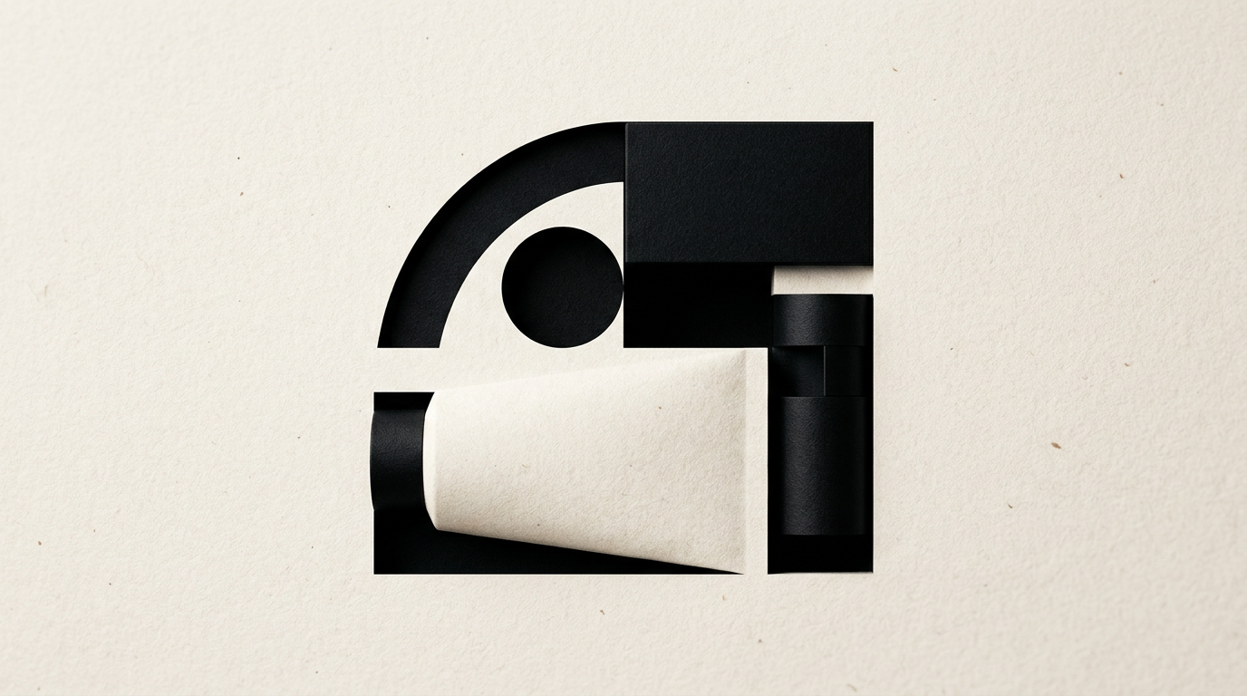
Cosmetic packaging design requires more than aesthetics; it involves ergonomics, strict compliance, and a clear shelf positioning strategy. In my work as a graphic designer, I frequently encounter the same technical and visual dilemmas from beauty brand founders. Below are direct answers to the most common questions about the unwritten rules of cosmetic packaging.
Why doesn't minimalist design always work on cosmetic packaging?
Minimalist design fails when it strips away information hierarchy and the distinctive elements needed to differentiate a product on the shelf. Founders often confuse white space with a lack of information. A plain white container with tiny typography looks stunning in a 3D render, but on a physical store shelf, it becomes invisible next to visually aggressive competitors. For minimalism to sell, you need strong contrast, tactile finishes like foil stamping or screen printing, and a well-placed minimalist logo. Without a clear visual anchor (a bold icon or color block), your product will look cheap or unfinished rather than premium. Furthermore, the 5pt font sizes used in extreme minimalism create major readability issues for shoppers in physical stores.
What mandatory or legal details do manufacturers forget to put on the box?
Manufacturers most often forget the PAO symbol, the INCI list in the correct order of concentration, and the complete EU responsible person details. Professional graphic design services factor in these technical compliance rules before even starting the visual concept.
Here are the main legal elements frequently overlooked:
- The PAO symbol (open jar with month number, e.g., 12M) or date of minimum durability.
- Net quantity indicated with the standard-sized e-mark (estimated sign).
- Special precautions for use and the batch number, embossed or printed separately.
- Barcode sized at a minimum of 80% of standard with a dedicated white quiet zone.
Omitting these details forces you to reprint or apply correction stickers, destroying the appearance of the final product.
How does the choice of packaging material affect the graphic design?
Material selection directly dictates the printing technology, how the paperboard absorbs ink, and the legibility of small text. Kraft or uncoated stock will absorb offset ink, darkening colors by up to 15-20% compared to the digital version on screen. If you choose clear glass or dark PET, white screen-printed text requires a double pass of white ink to stay opaque and readable. Before investing in printing, review a packaging portfolio to understand how colors perform on real substrates. Specialty papers, like velvet board or soft-touch lamination, enhance tactile perception, but require flawlessly prepared DTP files with precise spot UV or foil stamping layers.
What is the real cost difference between a custom box and a stock container with a label?
The initial cost difference can be 1 to 5, but custom packaging reduces unit costs at larger production runs and increases profit margins. A label applied to a 50ml stock bottle costs on average $0.08 - $0.20 per unit, with the bottle adding another $0.70 - $1.20 for a small 500-unit run. Conversely, custom dies for a textured box or custom die-cut folding carton can cost $350 to $900 in upfront tooling fees. However, when ordering 5,000 custom boxes, the cost per box drops significantly below $0.35. For a new brand, the optimal setup is a stock container with a high-end label inside a custom offset-printed outer box.
How does packaging impact online sales and new AI search engines?
Packaging is no longer just a physical shell, but the main visual anchor in product photos on a business website and in AI visual searches. Modern visual search systems identify products by shape, contrast, and readable packaging text. If your typography is too small or contrast is low, AI cannot "read" your container in images.
To be optimized for digital environments and AI, packaging must include:
- Brand name and product function written in high-contrast typography against the background.
- A distinct category accent color that stands out in 100x100 pixel thumbnails.
- Clean 3D renders or photography on neutral backgrounds that allow GEO / AEO / AIO optimization for AI visibility.
A photogenic packaging design increases e-commerce conversion rates by over 25%.
Why do colors look different on screen compared to the printed packaging?
Screens use the RGB color space (light), while printing relies exclusively on CMYK or Pantone inks (pigment). A neon green or electric blue seen on a monitor cannot be recreated accurately using standard 4-color CMYK process inks. Additionally, screen backlighting creates a brightness impossible to achieve on physical paperboard without specialized fluorescent or spot Pantone inks. If you fail to unify your packaging colors with your overall visual identity, you will see glaring discrepancies between packaging, your web store, and social ads. For color accuracy, always request a physical press proof on the actual material.
What structural and sizing errors ruin a cosmetic packaging project?
The single worst mistake is designing a box based on nominal container dimensions without measuring actual tolerances and closure mechanisms. Glass bottles can vary by 0.5-1 mm between production batches. If the box is too tight, glue seams will split; if it's too loose, the bottle rattles inside, giving an impression of poor quality. Furthermore, skipping internal protective inserts causes glass bottles to break during courier shipping. Another frequent error is placing crucial text too close to die-cut or fold lines, resulting in ugly text trimmings during finishing.
How do I test legibility and visual impact before sending files to print?
Testing requires 1:1 scale physical prototyping and 3D mockups placed in a competitive retail environment. Never approve a design based solely on a PDF file zoomed to 300% on a 27-inch monitor.
Recommended steps for testing include:
- Print the box dieline on a desktop printer on similar weight cardstock, then cut and fold it manually.
- Stand 5 feet away from the prototype in both natural light and warm store lighting.
- Place the mockup on a shelf alongside 3 direct competitor products in your price tier.
- Verify whether the key ingredient and primary benefit are legible within 3 seconds.
What's next?
Launching an unblemished cosmetic product line requires an integrated approach, from error-free technical dielines to renders ready for online sales. If you need professional guidance for your new product line or want to avoid costly print mistakes, reach out on my contact page. I will analyze your project and build packaging that captures attention, complies with technical standards, and drives sales.