5 min read
Restaurant Print Design: How to Create a Menu That Sells?
Discover how menu architecture, paper selection, and menu engineering techniques can increase your restaurant's average check size.
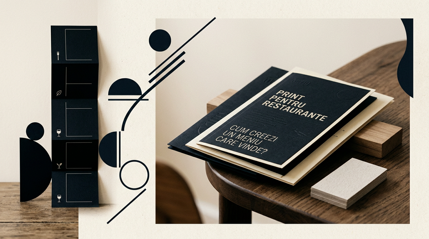
A printed menu is not merely a list of dishes and prices, but the primary sales tool inside a restaurant. The way items are structured, paper texture, and font legibility directly impact average check size and perceived quality. In this article, I answer the most frequent questions about designing, structuring, and printing highly profitable restaurant menus.
Why do restaurants still need a printed menu when QR codes exist?
Printed menus deliver significantly higher conversion rates compared to digital QR menus because they eliminate technological barriers and keep customer attention focused on the dining experience. Behavioral studies show that over 65% of diners prefer physical menus for better legibility and a tangible tactile experience. Furthermore, a menu printed on premium stock reinforces a well-defined visual identity and shows respect for the guest. While QR codes serve well for quick daily specials or secondary lists, they cannot replicate the psychological impact of an elegant physical menu. Holding a well-crafted menu instantly elevates the restaurant's perceived value before the first order is placed.
What paper type and finishes best withstand daily wear in a restaurant?
For a durable menu that resists water spills, grease, and surface disinfectants, the best choice is 350 gsm coated cardstock with matte or soft-touch lamination, or waterproof synthetic paper. Matte or soft-touch lamination adds an invisible protective layer while preventing fingerprints, unlike glossy lamination which creates harsh glare under dining lights. During the graphic design process, material choice depends on your venue's concept:
- Synthetic Paper (Polyester 300 microns): 100% waterproof, washable, tear-proof, ideal for outdoor terraces, bistros, and burger spots.
- 350 gsm Cardstock + Soft-Touch Lamination: Delivers a velvety feel with high physical protection, perfect for casual fine dining.
- Recycled Paper or Uncoated Kraft Card: Best suited for single-use placemat menus or daily insert sheets in leather covers.
How should dishes be organized to increase the average order value?
Your menu's focal point should follow the Golden Triangle rule, placing high-margin items in the center and top-right corner where eyes naturally land first. Additionally, removing currency symbols (like "$" or "EUR") and listing clean numbers (e.g., 24 instead of $24.00) reduces the negative psychological trigger associated with spending money.
Proven menu engineering techniques include:
- Visual Boxes: Framing profitable items with subtle borders draws immediate visual attention.
- The Rule of 7: Limit each category to 7–8 items maximum to prevent decision paralysis for guests.
- Sensory Descriptions: Replacing simple item names with descriptive language (e.g., "Pan-seared salmon with rosemary butter") can boost sales of that item by up to 27%.
How many pages should an effective restaurant menu have?
An effective restaurant menu should be between 2 and 4 pages, allowing guests to scan the entire offering in under two minutes. Multi-page booklet menus with 10–12 pages overwhelm customers, slow down decision-making, and decrease table turnover rates. If you offer an extensive wine or dessert selection, keep them in separate dedicated menus. A single bi-fold menu (4 faces) or a double-sided single card provides maximum legibility and effortless navigation. To see practical layouts in action, feel free to browse through my portfolio showcasing compact and functional print formats.
Should I use food photography on my menu or keep it text-only?
Food photography works exceptionally well for casual dining, fast-casual, or family-oriented restaurants, but can diminish the perception of exclusivity in fine dining establishments. The golden rule is straightforward: if you include imagery, it must be professionally shot by a food photographer, otherwise it does more harm than good.
Practical guidelines for using menu photos:
- Flawless Quality: Poor lighting or unappealing staging will make dishes look unappetizing.
- Strategic Selection: Limit photos to 1–2 per page, highlighting high-margin signature dishes only.
- No Stock Photos: Never use generic online stock photos; guests will immediately spot discrepancies between the picture and their plate, eroding trust.
How can I align the printed menu design with the restaurant's online presence?
Alignment is achieved by strictly maintaining the color palette, typography, and visual language across both print collateral and a custom presentation website. When customers experience consistent fonts, logos, and tone across your website, social media, and physical menu, your brand projects trust and professionalism. Ensure mobile PDF menus match the visual identity of the printed version. Additionally, if you implement GEO / AEO / AIO optimization strategies for AI search visibility, dish names on the printed menu must match indexed web listings.
How much does professional menu graphic design and prepress cost?
Professional graphic design and prepress layout for a restaurant menu typically costs between EUR 300 and EUR 800, depending on page count, custom illustration work, and photo editing needs. This fee covers information architecture, typography selection, DTP proofing, and press-ready vector file preparation (bleeds, CMYK color profiles, print specs). Investing in a strategic layout pays off within weeks by steering diners toward higher-margin offerings. For a tailored quote specific to your project, feel free to reach out via my contact page.
What typography and legibility mistakes should be avoided on a menu?
The most common mistake is using hard-to-read decorative script fonts or body text smaller than 10 points, making reading difficult in dim restaurant lighting. Another major flaw is placing prices in a dotted line column on the right, which encourages guests to scan from cheapest to most expensive item rather than reading descriptions. Keep body copy at 10–11pt minimum and dish titles at 13–15pt, ensuring high contrast between background and text (e.g., dark text on light backgrounds, avoiding red text on black).
What's Next?
If you are ready to transform your restaurant menu into a proactive sales driver, the next step is evaluating your current setup. Feel free to contact me for a menu audit or to design an optimized, print-ready menu from scratch.