5 min read
Typography for Print vs Digital: What You Need to Know?
Learn the technical differences between typography for print and web. A practical guide covering measurement units, licenses, legibility, and resolution.
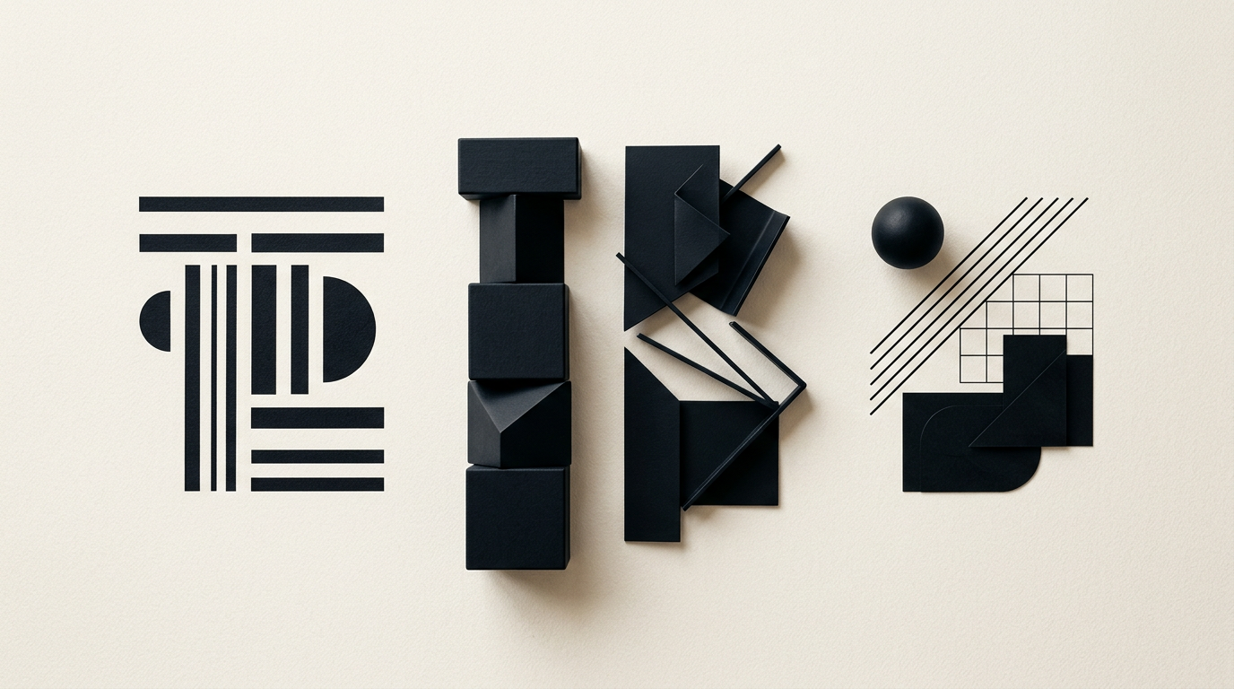
Choosing the right typography for a project is not just about aesthetics, but about the physics of the medium displaying the text. Print uses pigments on reflective paper, while screens emit direct light through pixels. In this guide, I answer the most frequent practical questions about the technical differences between typography for print and digital media.
Why does the same font look different on paper compared to a screen?
The difference stems from how each medium renders detail and its native resolution. Offset or digital print operates at 300-2400 DPI (dots per inch), allowing razor-sharp rendering of fine details like sharp serifs or subtle stroke contrast. Conversely, screens operate at variable resolutions between 72 and 450 PPI (pixels per inch) and rely on anti-aliasing to simulate curves. Consequently, a light weight font with delicate details that looks perfect in a printed brochure might become blurry or invisible on a standard HD monitor. Furthermore, paper absorbs ink, whereas emitted screen light visually expands white letters against dark backgrounds. For complex design grafic projects, these technical factors dictate legibility adjustments before going to print or publishing online.
What are the key differences between print and web typography units?
Print relies on absolute, fixed units, whereas web typography uses relative, dynamic units. Printing demands millimeter precision because physical paper dimensions are immutable, while web layouts must adapt to everything from 27-inch monitors to 6-inch smartphones.
Key typographic measurement units include:
- Points (pt) and Millimeters (mm): Absolute print standards; 1 pt equals 1/72 of an inch (approx. 0.352 mm).
- Picas (p): Standard in book and magazine layout, where 1 pica equals 12 points.
- Pixels (px): Digital raster units, fixed relative to screen density.
- EM and REM: Relative web units; 1rem equals the root font size, enabling fluid scaling on mobile devices.
When developing a site de prezentare, we convert the typography scale from pt to rem to preserve optical proportions across screens.
Can I use the exact same logo font for business cards and my website?
Yes, you can maintain the same visual identity, but the licensing and technical files involved are completely different. For a creare logo project intended for print, you use vector OTF or TTF font files where letter contours are mathematically calculated in pristine Bézier curves. For a website, you need web-optimized WOFF2 or WOFF formats designed for fast loading and compression, paired with a Webfont license tied to pageviews. Additionally, certain display fonts crafted for print feature hairline serifs that break at low mobile resolutions. During an identitate vizuala project, I select font families containing both print-optimized cuts and screen-ready variants.
Which font styles work best for long body text in print versus digital?
For printed books and brochures, classic serif typefaces remain the golden technical standard. Serifs form an invisible horizontal baseline that guides the reader's eye smoothly across printed lines. Conversely, for lengthy text on screens, sans-serif fonts or modern serifs with high x-heights are far more legible. Emitted backlight causes eye strain, and clean sans-serif letterforms reduce visual complexity at lower PPI. A font with generous lowercase x-height and open counters (like c, e, a) retains strong legibility even at 14px on budget mobile screens.
How does the printing process affect color setup and light font weights?
Tiny or thin text rendered in multi-channel CMYK colors is a recipe for blurry, unreadable print output. If you set a 7pt hairline font using 60% Cyan, 50% Magenta, 50% Yellow, and 100% Black, even a microscopic plate misregistration on press will blur the text outline.
To prevent major printing defects, follow these core technical rules:
- Pure Black (K 100%): Set all text under 12pt to 100% Black with overprint enabled.
- Minimum Stroke: Avoid Hairline or Ultra Light cuts below 8pt on uncoated or recycled stock.
- Vector Outlines: Convert tiny text on packaging or small die-lines directly into vector paths.
- Avoid Rich Black on Small Type: Limit rich black to large display headings over 24pt for dense coverage.
In my project showcase on the portofoliu page, you can review real packaging and print collateral designed with these precise print specifications.
How do kerning and tracking adjustments differ between paper and screen?
On physical paper, ink bleeds slightly into paper fibers (dot gain), meaning letters require slightly wider tracking than standard digital text. On dark digital interfaces (Dark Mode), white text on black backgrounds experiences light halation: light emission makes letters appear bolder than they actually are. To offset this, I increase letter-spacing by 2-5% for dark mode digital body text and occasionally step down font weight from Semibold to Medium. In high-end print design, manual optical kerning on awkward letter pairs is mandatory for headlines, a detail web rendering engines often calculate imperfectly.
How does modern typography impact AI search visibility and web performance?
Web typography performance directly affects user experience as well as how search engine crawlers and AI models interpret content. Clean typographic hierarchy, semantic HTML tags linked to clear CSS scale, and fast-loading WOFF2 webfonts directly influence page speed metrics and legibility scores. A robust optimizare GEO / AEO / AIO strategy includes optimizing webfont loading to eliminate Cumulative Layout Shift (CLS). If body text jumps during font swap, AI algorithms may flag the layout as unstable.
How do I test a typographic system before sending it to production?
Testing must accurately simulate how end users will consume the information. For print, never rely solely on your desktop screen; always print a 1:1 scale proof on the actual paper stock chosen for the job. For digital products, test across physical devices with varying screen sizes, pixel densities, and brightness levels. If you need technical guidance or design direction for your brand, reach out via the contact page.
Ce urmează?
Selecting the right typography bridges memorable visual identity with flawless technical execution. Whether you need a cohesive brand identity, print-ready packaging, or a website with performance-driven typography, explore my design services. Let us turn your brand vision into a functional asset across print and digital media!