Mug
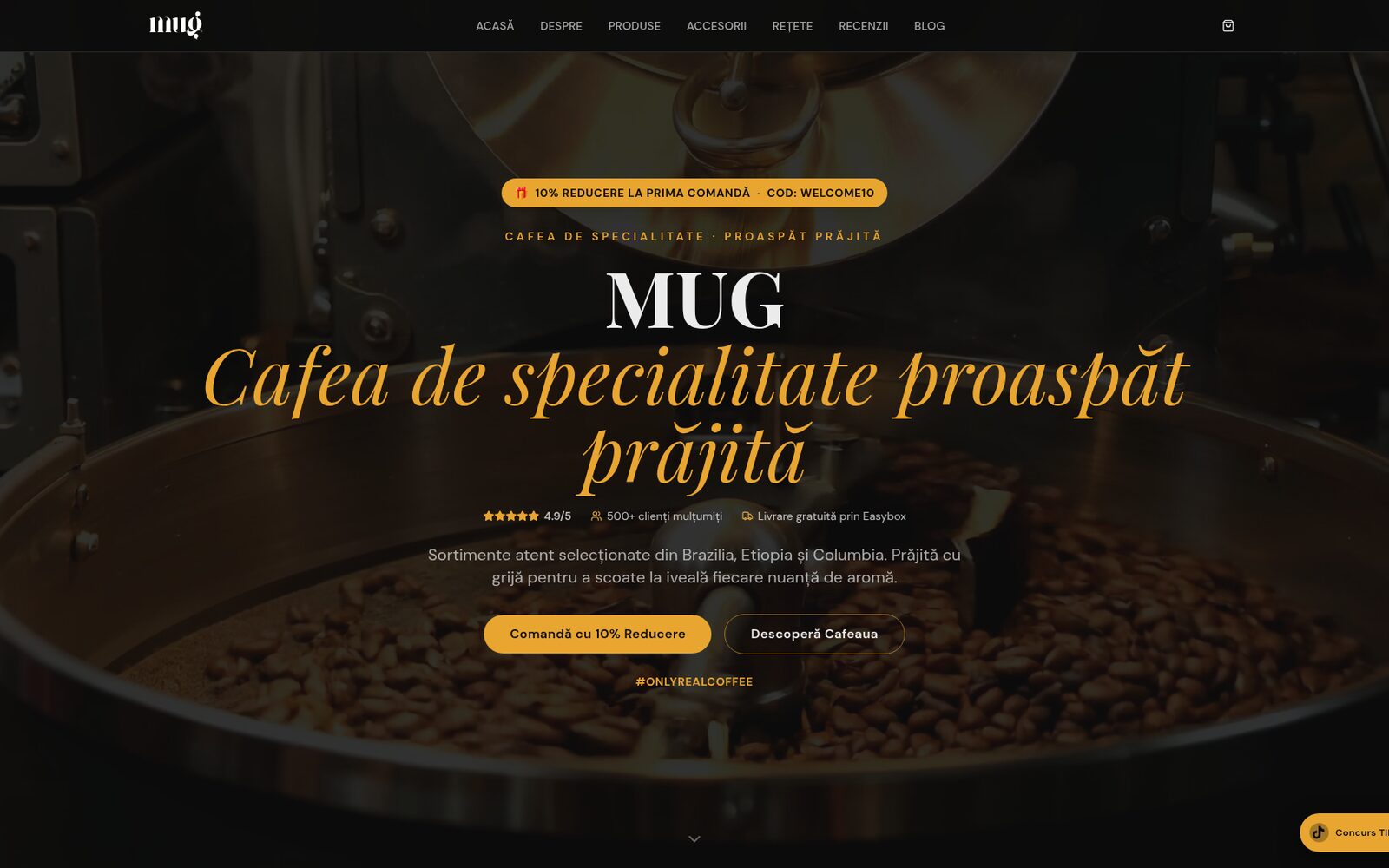
A warm identity and a website that tells the story of the beans — from origin to cup.
01The brief
Mug is a local roastery passionate about specialty coffee and direct relationships with farmers. Before the redesign, the brand had a fragmented online presence with no clear visual voice to convey product quality.
02The challenge
Clear differentiation from generic local cafés. Communicating bean origin and roasting process. Slow site with a menu that was hard to update
03Creative approach
We built an editorial system — classic serif typography, warm photography, a palette drawn from roast tones. The website foregrounds story, menu and location, with a mobile-first structure.
04The visual identity
A logotype with a stylized cup releasing a wisp of steam that subtly forms the initial "M". A serif typeface with classic cuts, evoking European neighbourhood cafés. A roasted-brown palette with cream accents — a direct nod to roasting tones and the feel of a warm mug in hand.
05The outcome
Mug brings its visual identity and project deliverables into one coherent brand experience.
What we deliver
- Logo & visual system
- Typography & palette
- 6-page website
- Analytics & on-page SEO setup