Cube
Sober, geometric identity for a procurement consulting firm.
01The brief
Cube — Proscure Consulting provides procurement and supply-chain optimisation consulting for mid-to-large companies. They needed an identity that conveys structure, rigour and trust within the first seconds.
02The challenge
Communicating expertise without corporate clichés. A symbol that works on official documents and pitch decks. Typography that keeps legibility on dense reports
03Creative approach
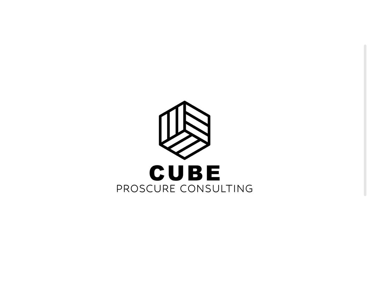
An isometric cube symbol built from parallel lines — suggesting structure, transparency, depth. Geometric sans wordmark, monochrome palette, a system for official documents (reports, proposals, presentations).
04The visual identity
An isometric cube drawn exclusively from parallel lines of equal weight — no shadows, no closed volumes. The shape stays open and transparent, suggesting analytical rigour and openness to audit. A geometric sans wordmark with uniform spacing, a monochrome graphite-on-white palette — a sober visual that performs identically on an 80-page report and a pitch deck.
05The outcome
Cube brings its visual identity and project deliverables into one coherent brand experience.
What we deliver
- Logo & symbol
- Typographic system
- Report & proposal templates
- Digital identity